Branding
Branding
Branding
Layout
Layout
Layout
Print Design
Print Design
Print Design
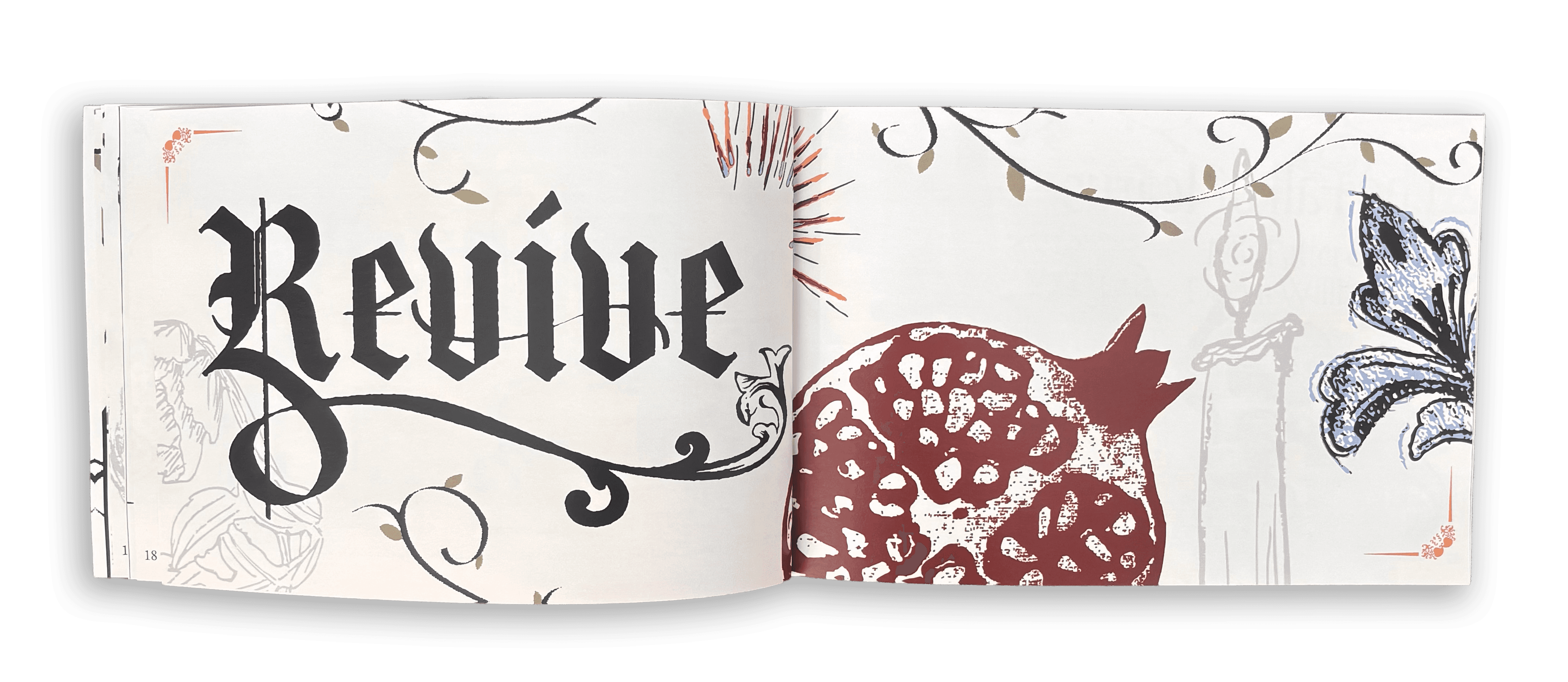
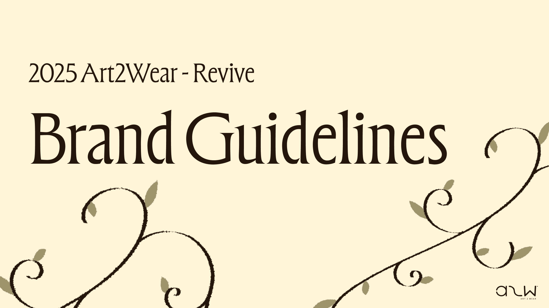
Art2Wear 2025 Show Theme and Booklet: Revive
Art2Wear 2025 Show Theme and Booklet: Revive
Art2Wear 2025 Show Theme and Booklet: Revive
Overview
Overview
Overview
Art2WearTM (A2W) is an educational event where students gain experience by coordinating and producing an annual wearable art production. Within the organization are different student-led committees in charge of certain tasks. The communications committee is in charge of creating the branding for the shows yearly theme and the show booklet displaying the designed garments.
I was one of the communications committee co-heads for A2W's 2025 theme of "Revive," and led a small team of 4 designers in the ideation and creation process for the brand that year. The designers who were a part of the team joined voluntarily, as this was an extracurricular for students.
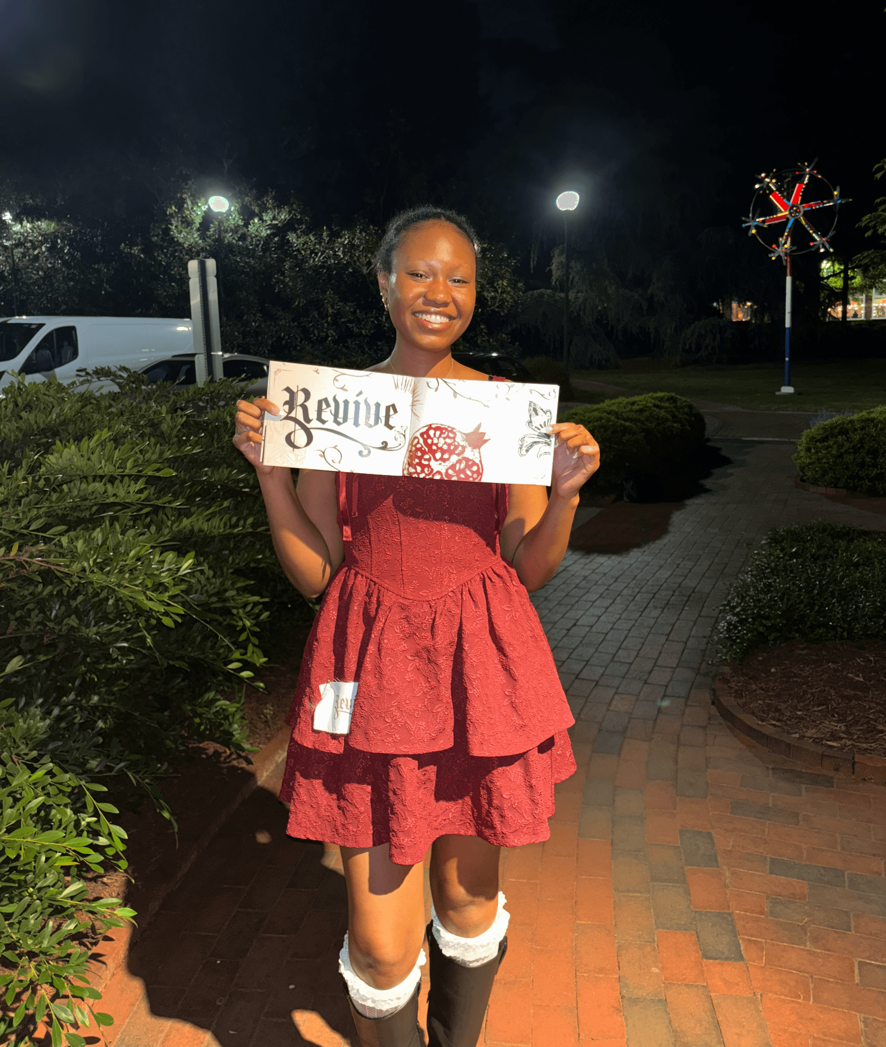
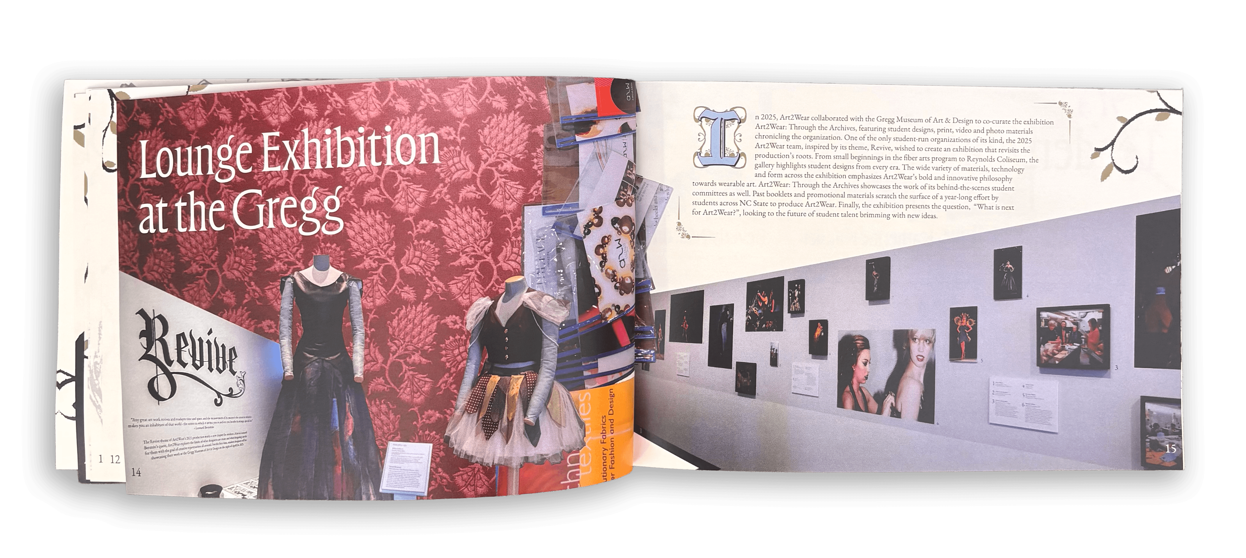
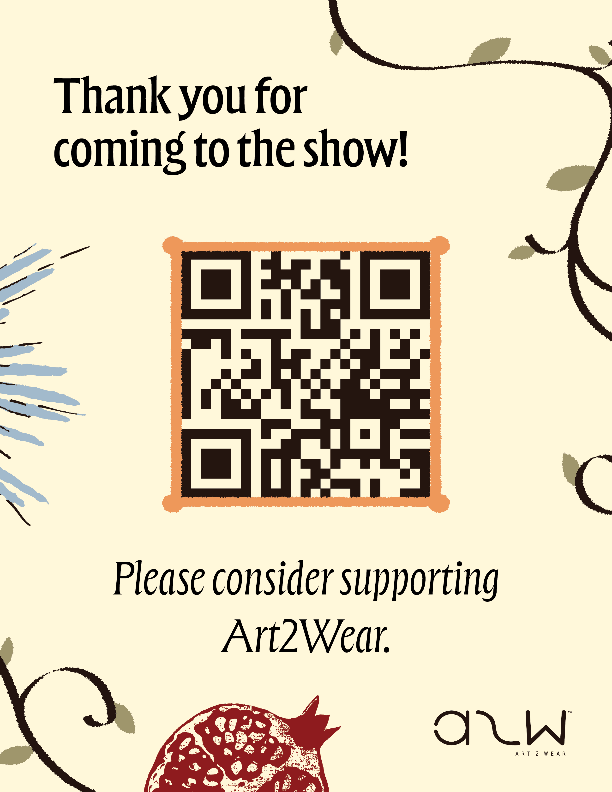
The 2025 show was formatted as a interactive walkthrough fashion show and not the traditional runway show. The event was held in the Gregg Museum of Art and Design, as well as the pre-show exhibit Art2Wear Through the Archives, which revived older show pieces and highlighted the theme for that year. The branded materials for the show were designed by the communication committee collectively and as a co-head I designed the Through the Archives gallery title, Thank you sign, and a sticker design.
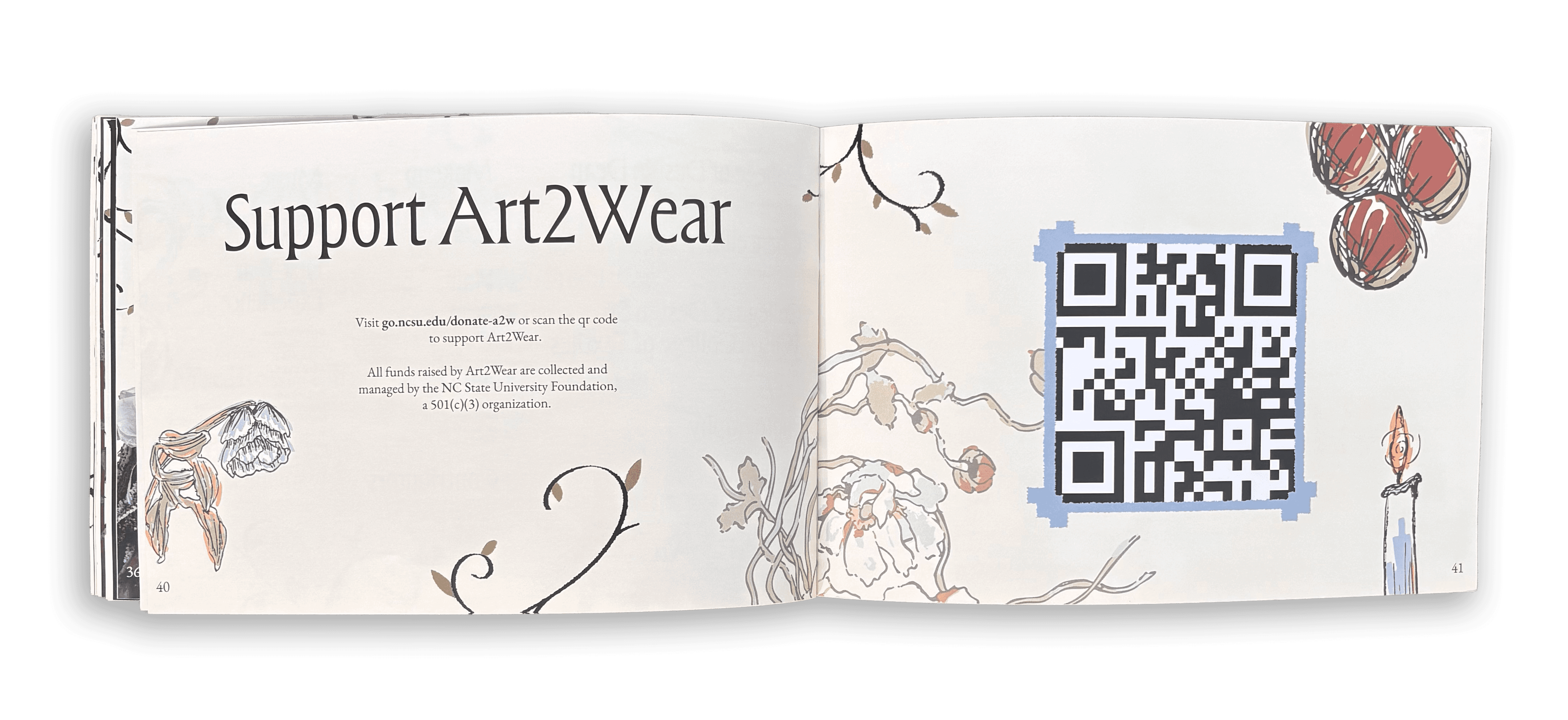
The event booklet was given to about 750 attendees and received praises for the design from the attendees as well. More about the event can be found on the A2W Revive Website.
Art2WearTM (A2W) is an educational event where students gain experience by coordinating and producing an annual wearable art production. Within the organization are different student-led committees in charge of certain tasks. The communications committee is in charge of creating the branding for the shows yearly theme and the show booklet displaying the designed garments.
I was one of the communications committee co-heads for A2W's 2025 theme of "Revive," and led a small team of 4 designers in the ideation and creation process for the brand that year. The designers who were a part of the team joined voluntarily, as this was an extracurricular for students.
The 2025 show was formatted as a interactive walkthrough fashion show and not the traditional runway show. The event was held in the Gregg Museum of Art and Design, as well as the pre-show exhibit Art2Wear Through the Archives, which revived older show pieces and highlighted the theme for that year. The branded materials for the show were designed by the communication committee collectively and as a co-head I designed the Through the Archives gallery title, Thank you sign, and a sticker design.
The event booklet was given to about 750 attendees and received praises for the design from the attendees as well. More about the event can be found on the A2W Revive Website.
Art2WearTM (A2W) is an educational event where students gain experience by coordinating and producing an annual wearable art production. Within the organization are different student-led committees in charge of certain tasks. The Communications Committee is in charge of creating the branding for the shows yearly theme and the show booklet displaying the designed garments.
I was one of the Communications Committee co-heads for A2W's 2025 theme of "Revive," and led a small team of 4 designers in the ideation and creation process for the brand that year. The designers who were a part of the team joined voluntarily, as this was an extracurricular for students.
The 2025 show was formatted as a interactive walkthrough fashion show and not the traditional runway show. The event was held in the Gregg Museum of Art and Design, as well as the pre-show exhibit Art2Wear Through the Archives, which revived older show pieces and highlighted the theme for that year. The branded materials for the show were designed by the Communication Committee collectively and as a co-head I designed the Through the Archives gallery title, Thank you sign, and a sticker design.
The event booklet was given to about 750 attendees and received praises for the design from the attendees as well. More about the event can be found on the A2W Revive Website.


Booklet
Booklet
Booklet
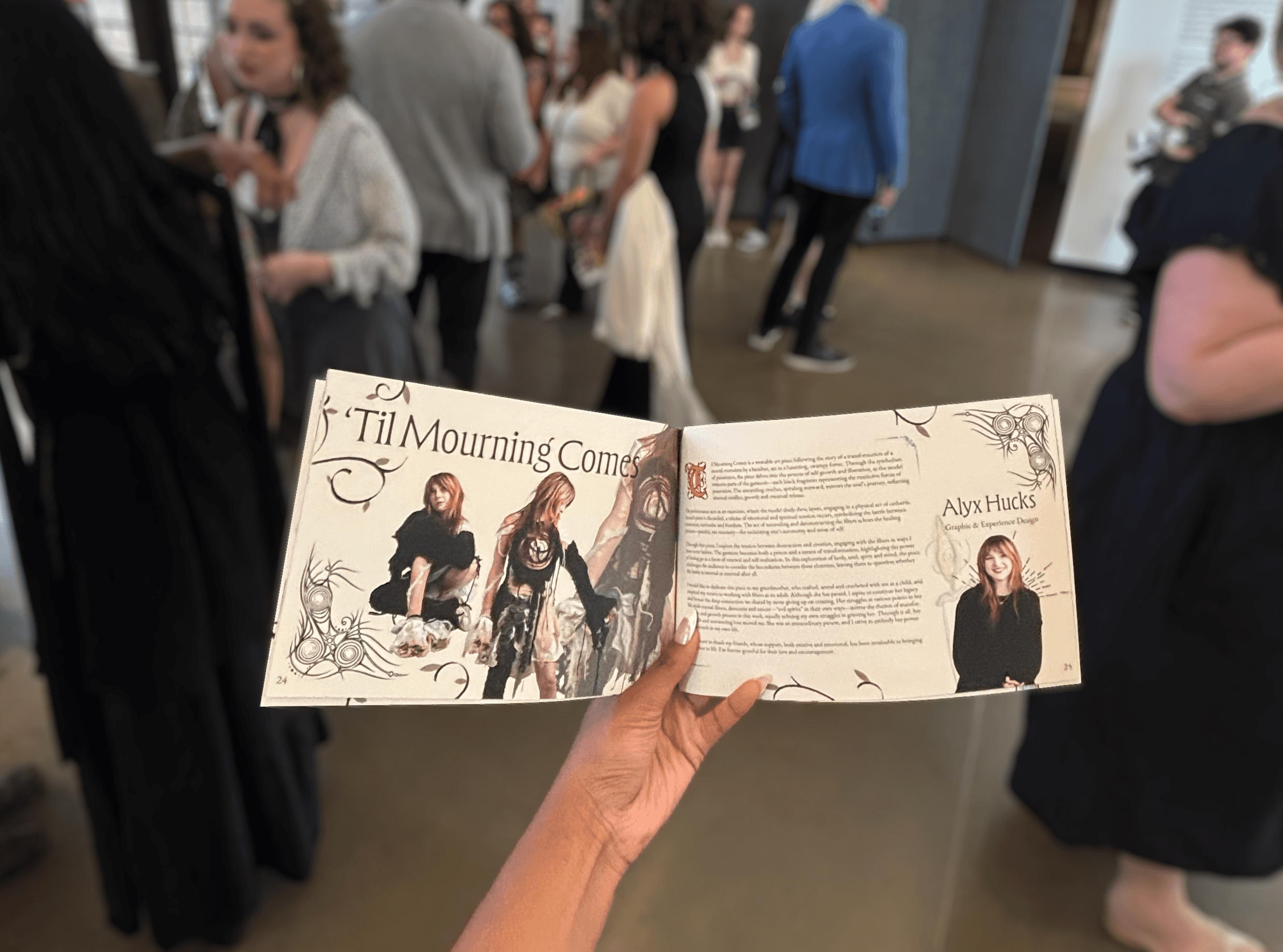
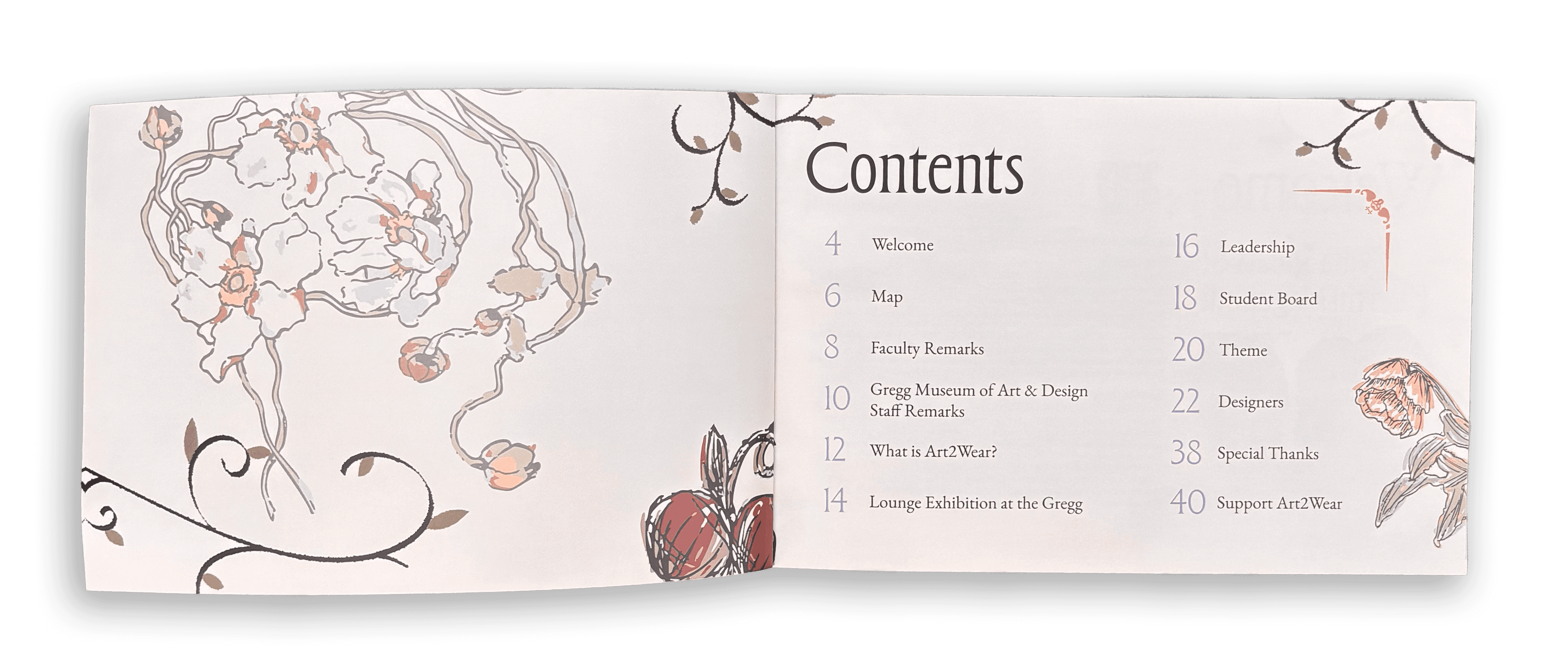
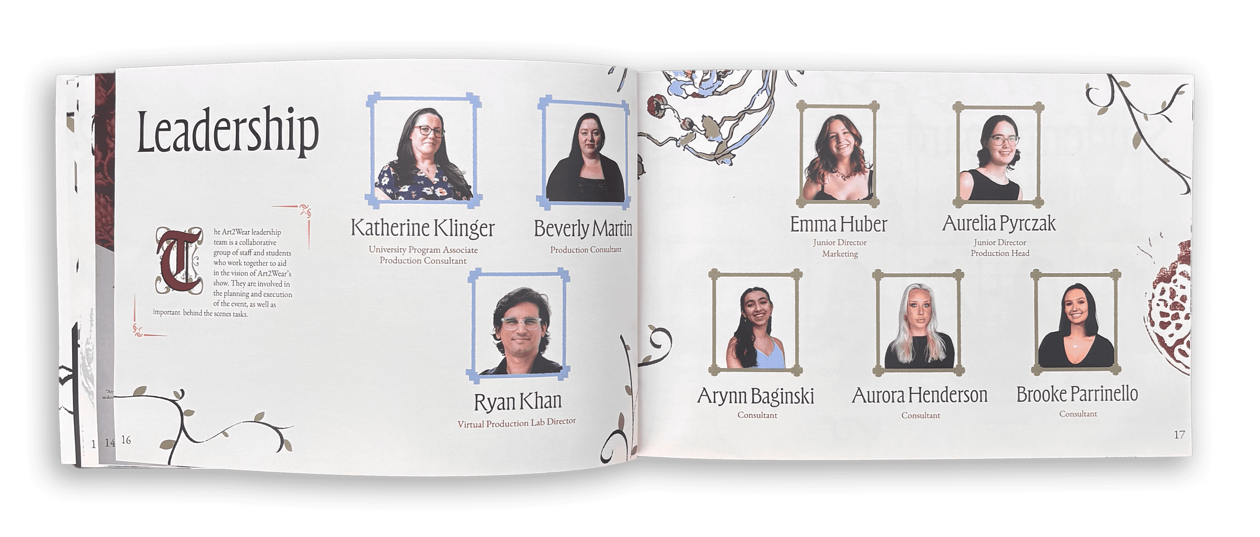
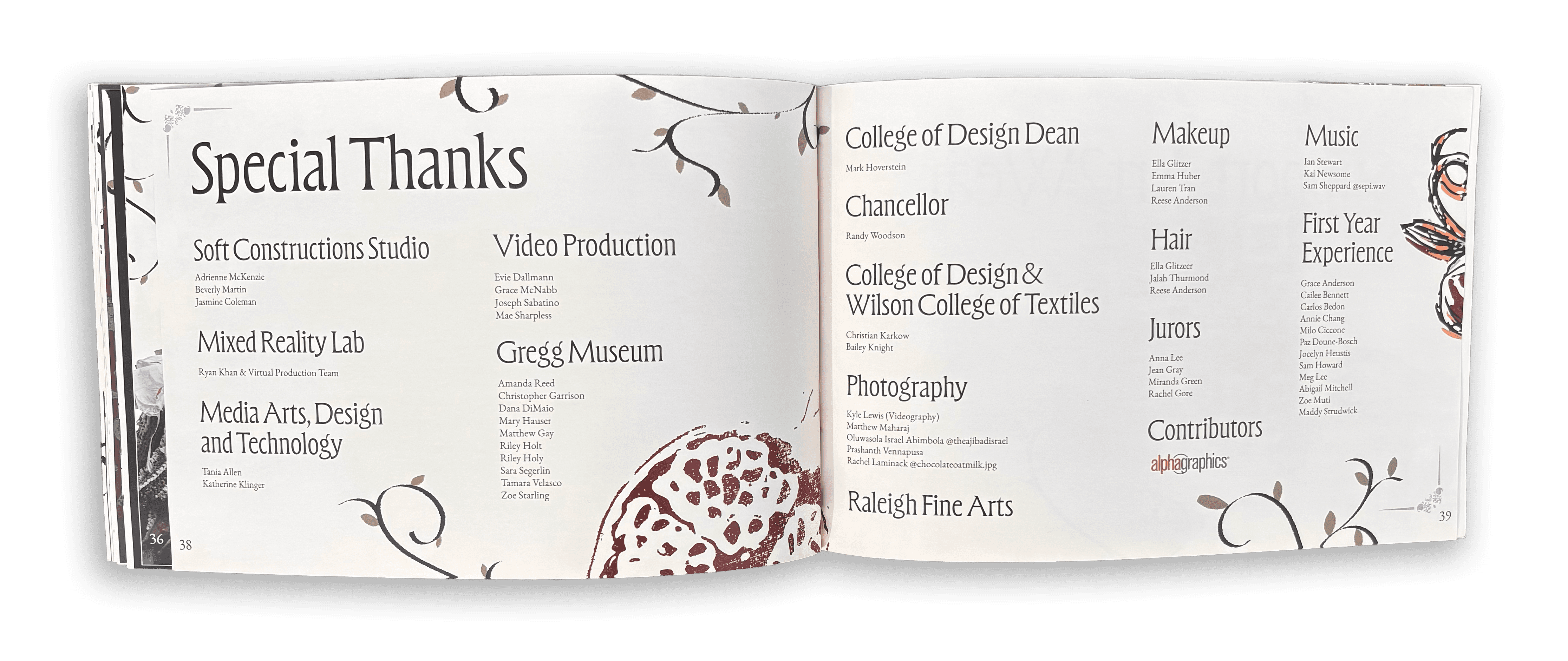
The booklet served as a program guide that included a map of the gallery as well as an explanation of the collections being displayed. It also credited the leadership and student board as well as the faculty who were involved in the planning and execution of the show.
The booklet was designed by the communications committee with each member being assigned two spreads for a collection and the other co-head and I designed one collection spread and divided up the remainder of the booklet. I designed the map, faculty remarks, Gregg statements, leadership, logo, "'Til Mourning Comes," and the special thanks spreads.
At the end of the design process the student directors, my co-head, and I looked through all the pages and made edits to ensure overall coherence within the booklet. I was also in charge of compiling all the pages into one document and making any final edits before it went to print.


To view full booklet click here.
To view full booklet click here.
To view full booklet click here.
Brand Guidelines
Brand Guidelines
Brand Guidelines
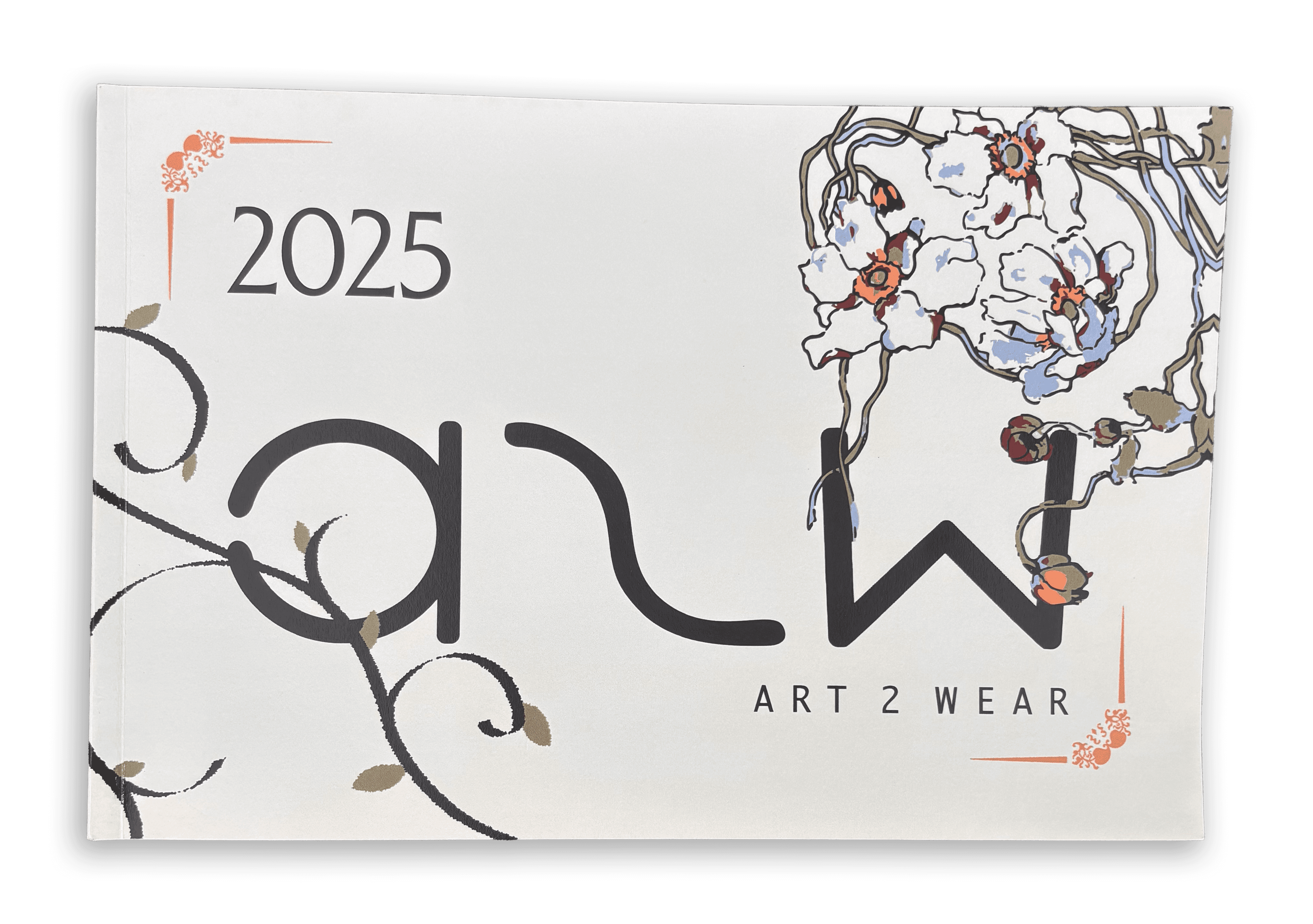
At the beginning of our design process, we were given the word "Revive" and had to come up with a brand around that word. The committee started by finding imagery that aligned with the theme and that could inspire us when designing. We were inspired by nature and religious imagery because the look of old books and old forms of art like sculpting and screen printing often depicted those things. Looking back onto the older forms of art and printing and using it in some form in our brand was a revival of old techniques. The idea of old books and nature also influenced our color palette and led us to choose a light yellow as our background color to mimic the color of yellowed old papers.
Members of the committee individually made mood boards for the theme then collectively compiled a mood board that would inspire the brand which is shown in the picture on the right. The picture on the left is a pintrest moodboard we created that also greatly influenced the brand as well.

We built the brand from our combined ideas and critiques from the leadership team. For the font choice we choose medieval-looking serif fonts because older books and manuscripts used decorative serif fonts.
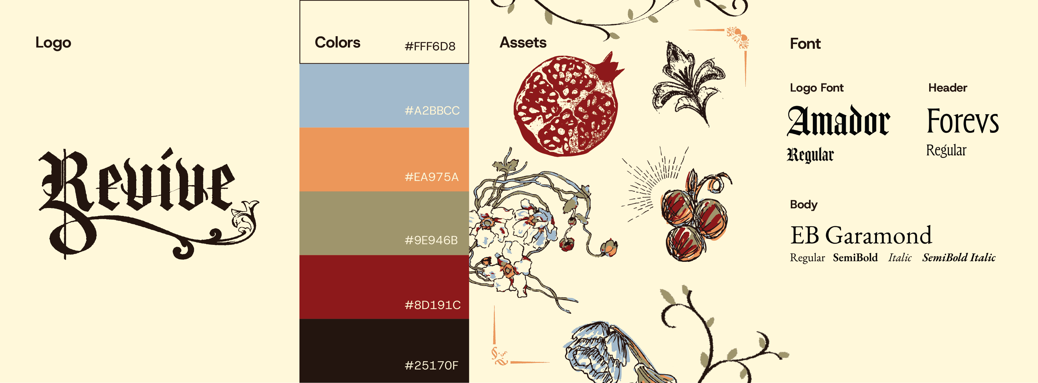
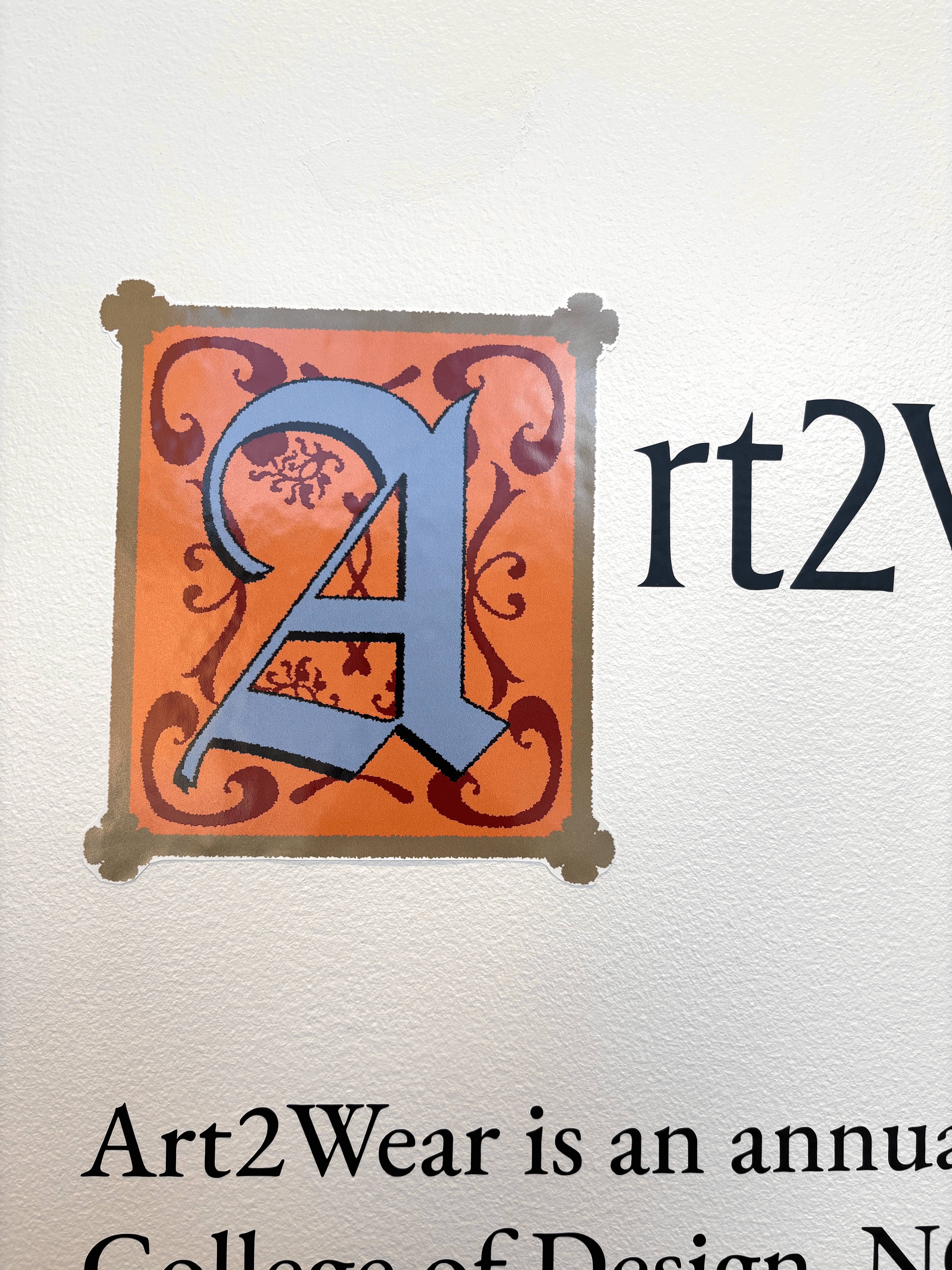
To ensure cohesion for the brand, I created brand guidelines for the use of our logo, fonts, colors, and assets that was given to the student board for anyone who designed anything related to the Revive brand. The guidelines also helped the communications committee when designing the booklet and posters.
We built the brand from our combined ideas and critiques from the leadership team. For the font choice we choose medieval-looking serif fonts because older books and manuscripts used decorative serif fonts.
To ensure cohesion for the brand, I created brand guidelines for the use of our logo, fonts, colors, and assets that was given to the student board for anyone who designed anything related to the Revive brand. The guidelines also helped the communications committee when designing the booklet and posters.


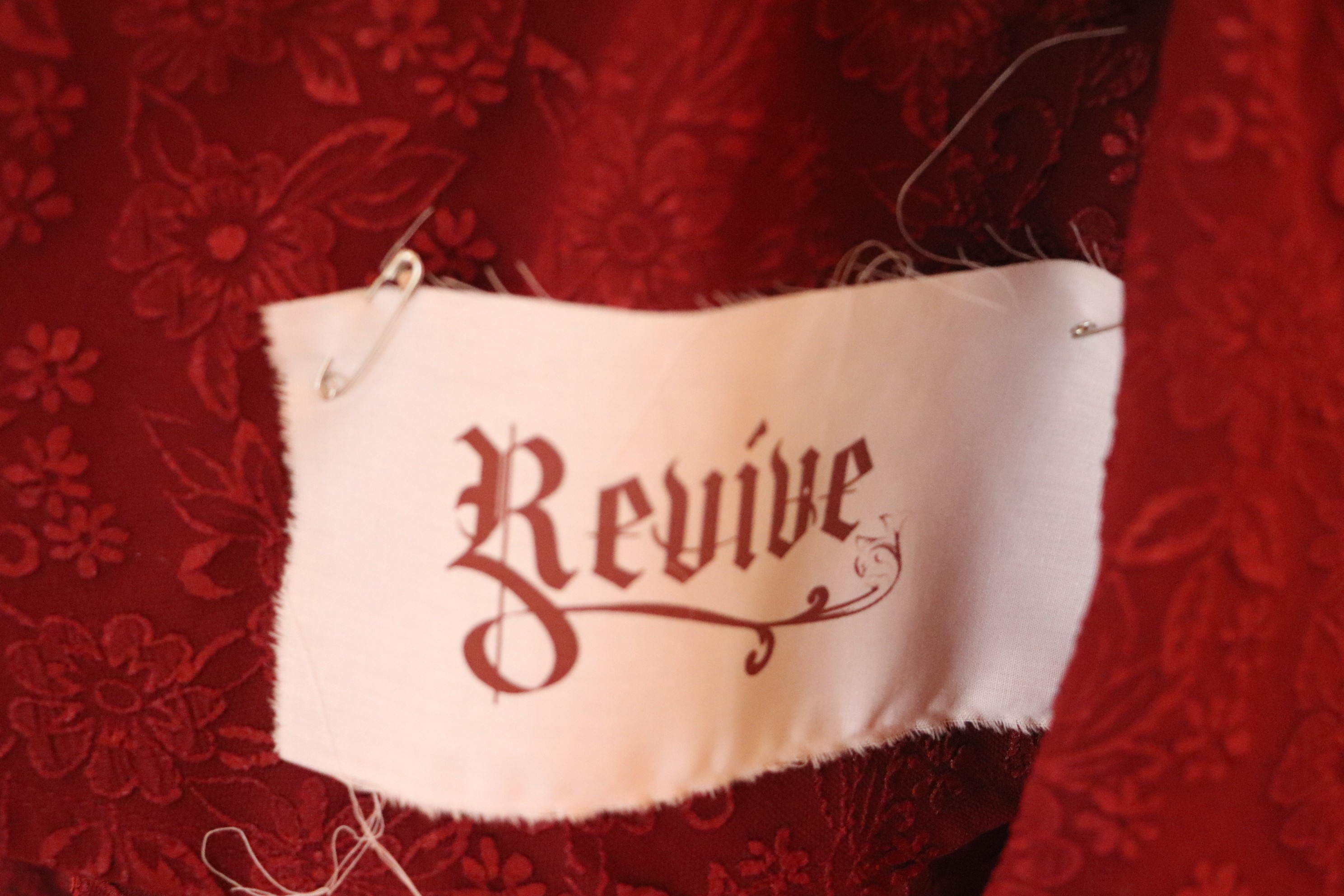
Logo Design
Logo Design
Logo Design
To develop the logo, members of the committee created sketches that involved stylistic fonts. My initial sketches are shown on the top left of the first photo, with revive written in various ways from a hand sketched font. I was inspired by old english lettering's combination of thick and thin lines. I experimented a lot with decorative lines since they were seen frequently in older manuscript fonts. I experimented with the idea of having the logo split into outlines and solid to represent the process of something being built up or revived.
As a group, we left comments on each sketch and decided on the parts of the sketches we liked and how to incorporate it into a single logo. My co-head's sketch of the logo was our favorite as a group, so we decided to move forward with the font she used and build on it to create our logo.


We decided to incorporate the tail of the "R" and the leaf-like drawings into the Amador font based logo.
We decided to incorporate the tail of the "R" and the leaf-like drawings into the Amador font based logo.
We decided to incorporate the tail of the "R" and the leaf-like drawings into the Amador font based logo.
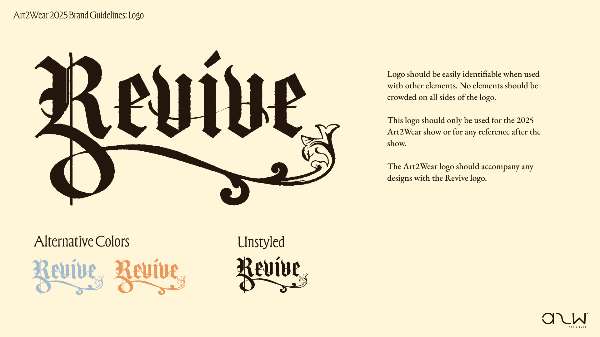
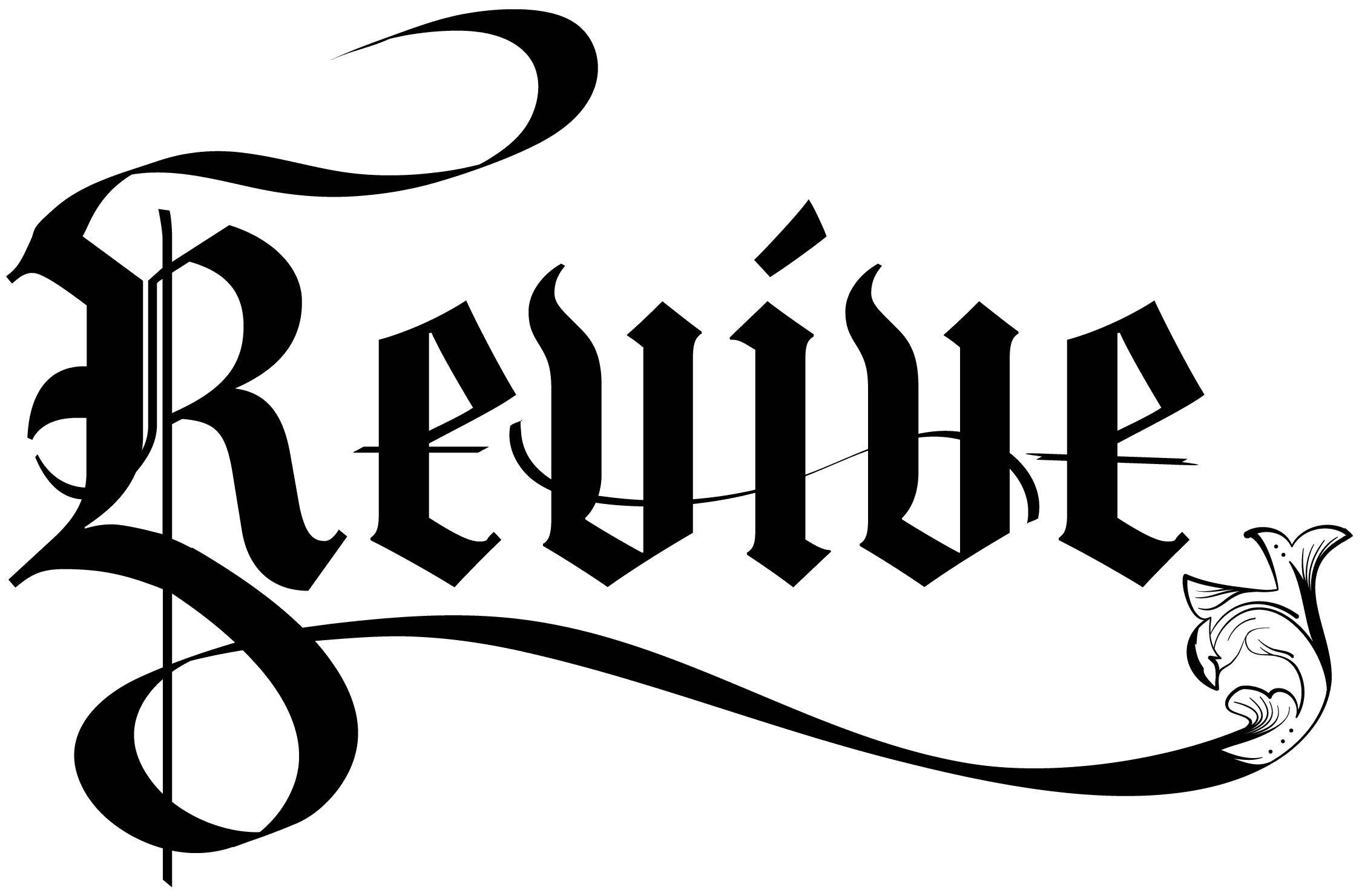
My task was to combine the ideas from the sketches into one logo. I sketched the leaf from the tail of the "R" and simplified some of the decorative lines into one thicker line at the top of the logo. But after speaking with my co-head, we decided the logo was still too complex to be used on merch or for the booklet, so we simplified it further by removing the top line and lines in the decorative leaf. We also decided to add an ink blot effect to the logo to make it look like it was created with a brush pen. The finalized logo is shown on the right.
My task was to combine the ideas from the sketches into one logo. I sketched the leaf from the tail of the "R" and simplified some of the decorative lines into one thicker line at the top of the logo. But after speaking with my co-head, we decided the logo was still too complex to be used on merch or for the booklet, so we simplified it further by removing the top line and lines in the decorative leaf. We also decided to add an ink blot effect to the logo to make it look like it was created with a brush pen. The finalized logo is shown on the right.
My task was to combine the ideas from the sketches into one logo. I sketched the leaf from the tail of the "R" and simplified some of the decorative lines into one thicker line at the top of the logo. But after speaking with my co-head, we decided the logo was still too complex to be used on merch or for the booklet, so we simplified it further by removing the top line and lines in the decorative leaf. We also decided to add an ink blot effect to the logo to make it look like it was created with a brush pen. The finalized logo is shown on the right.

Motif Design
Motif Design
Motif Design
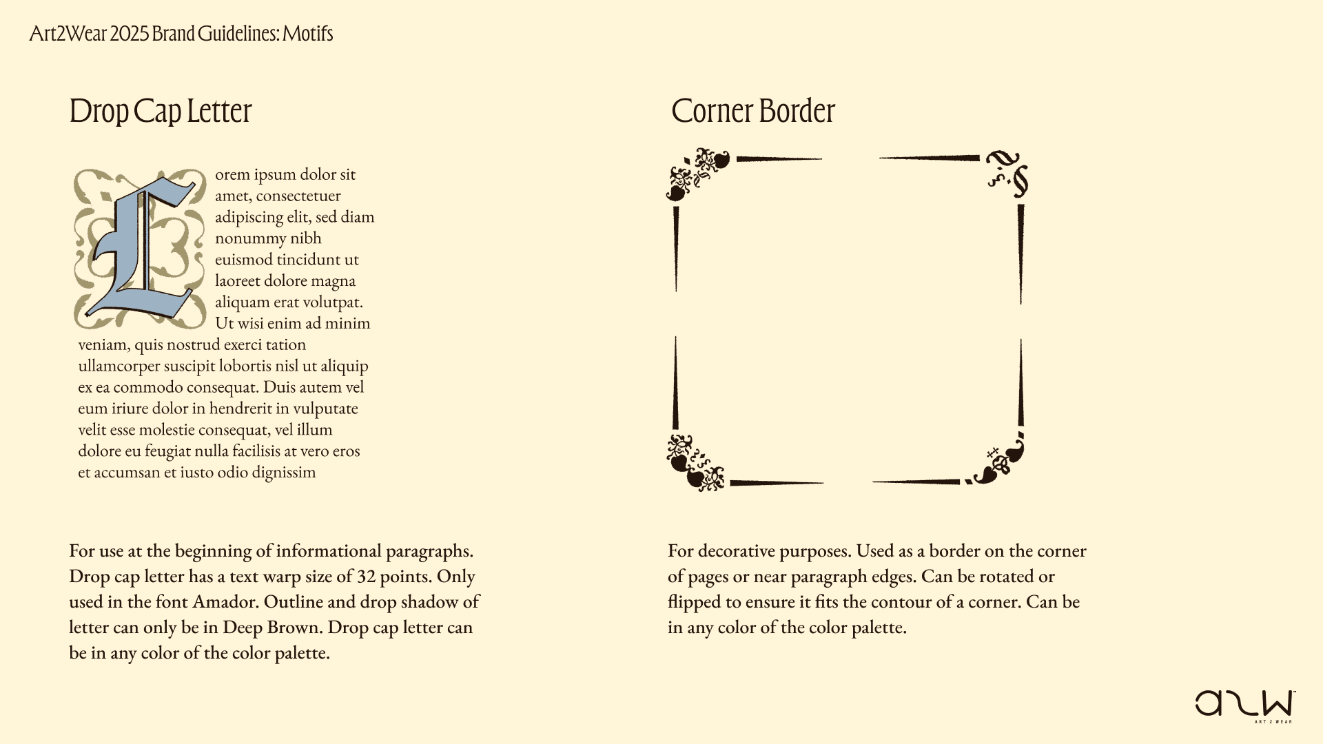
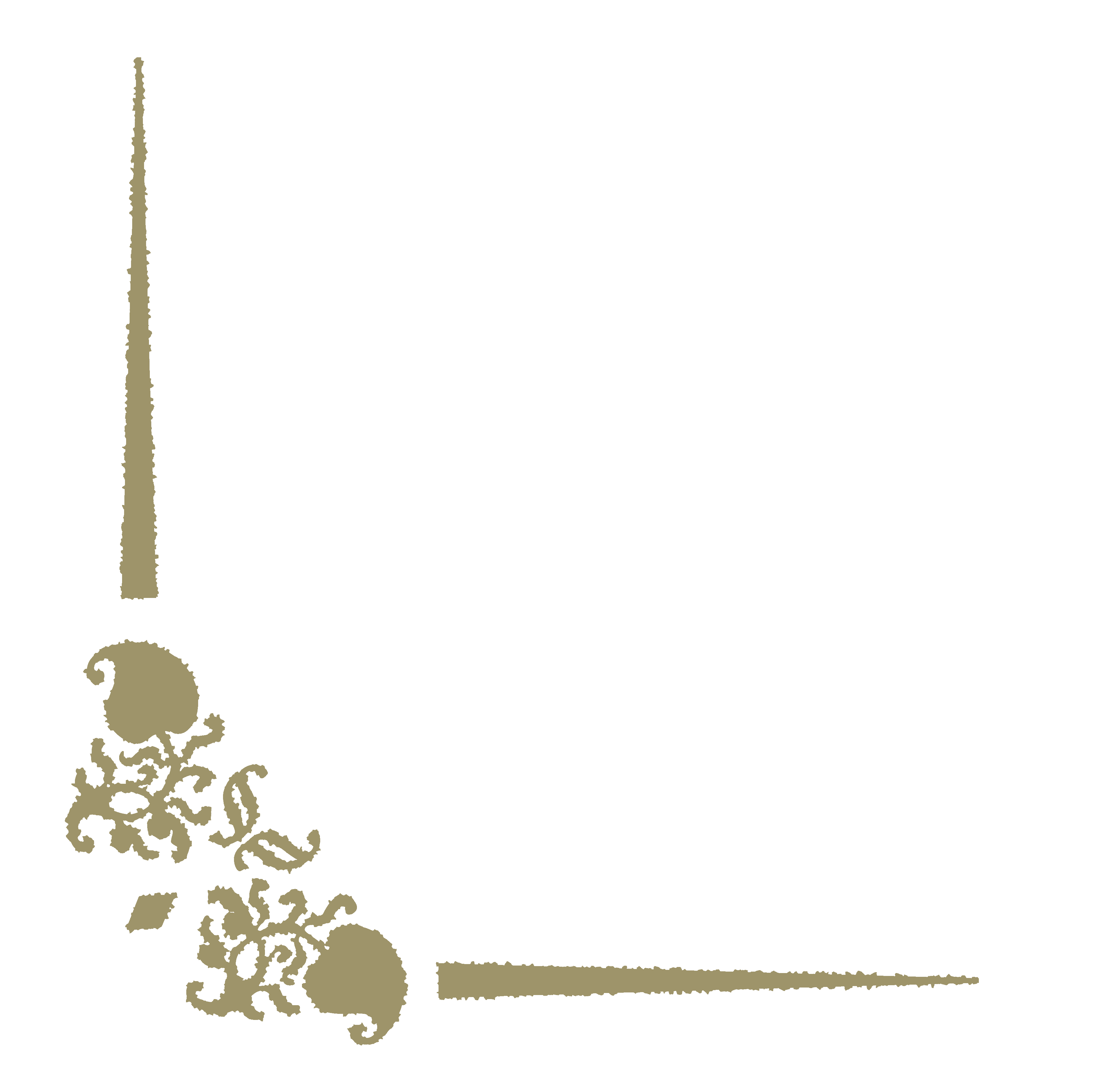
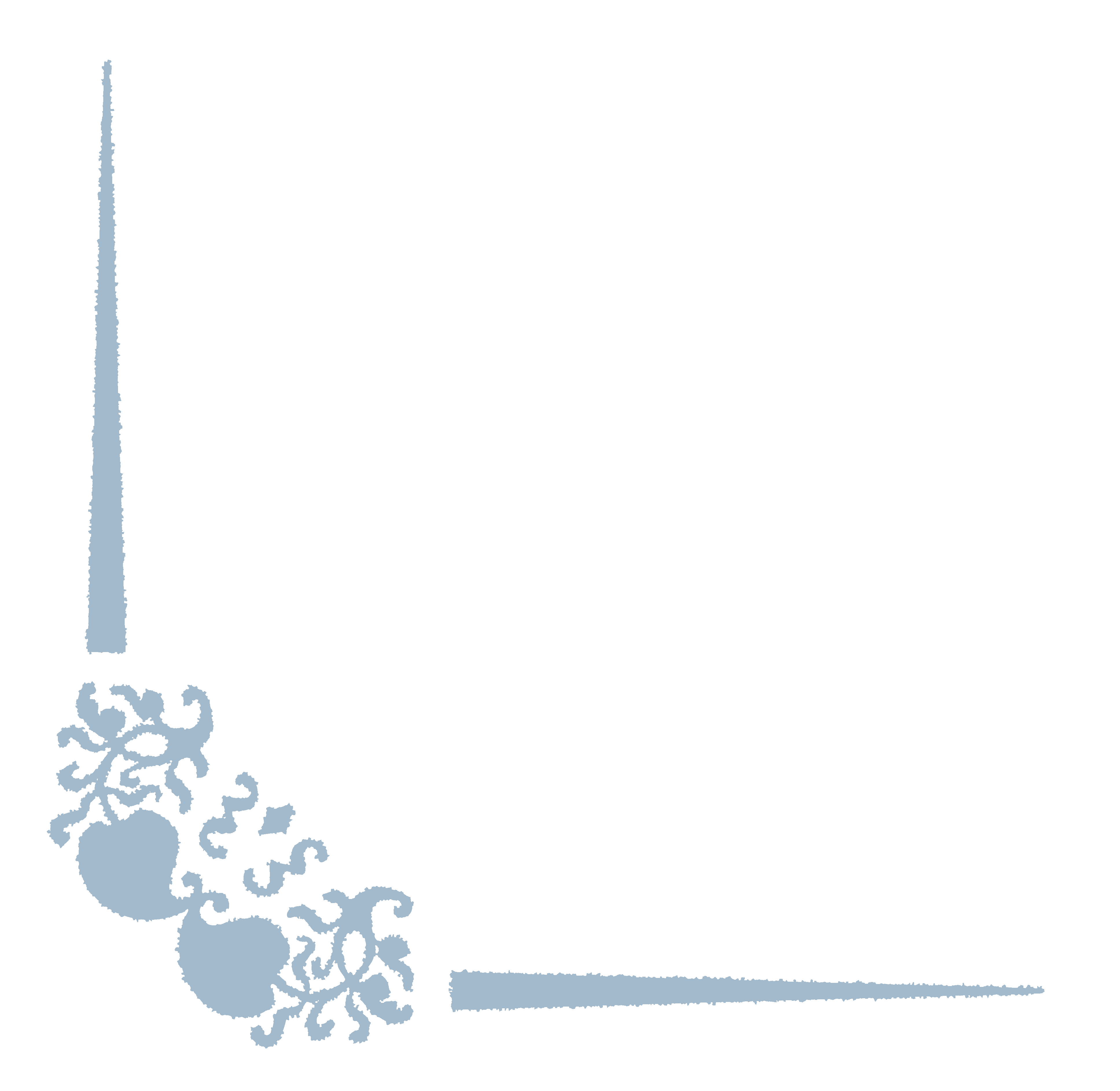
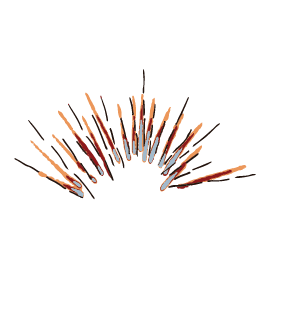
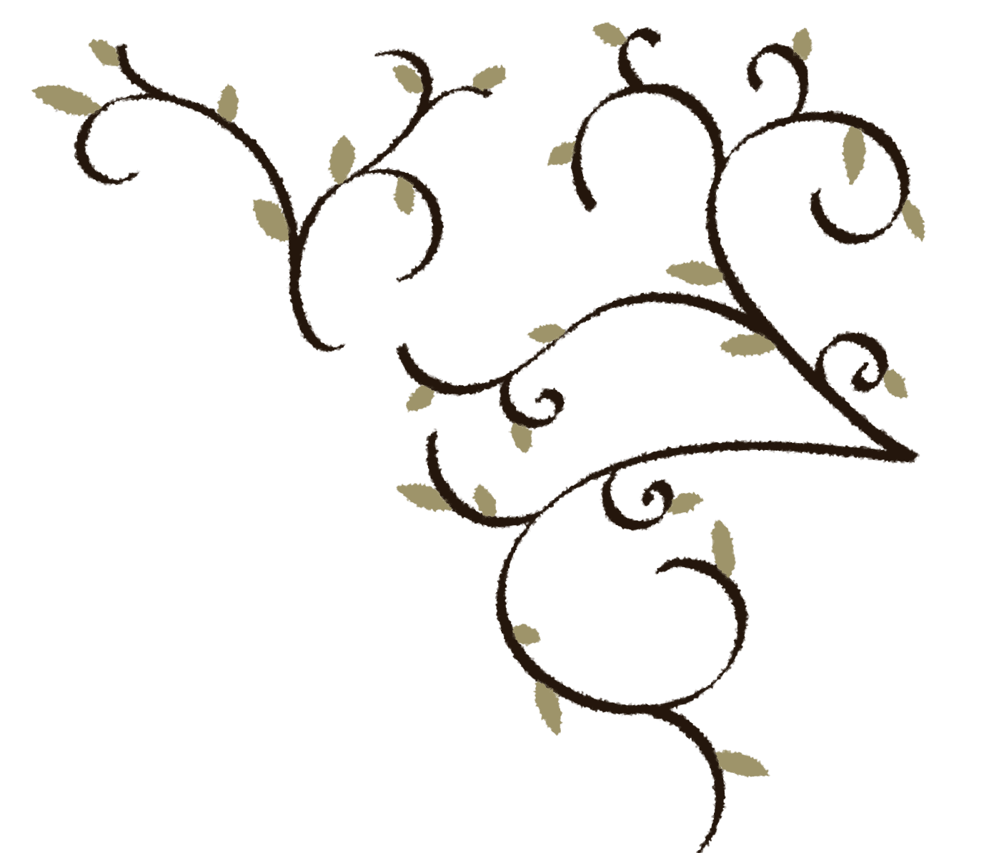
To add to our brand, we created various motifs that could be used when designing materials used to promote the show. Our motifs are made up of hand sketched elements and border corners that could be arranged in ways to would add interest to flyers or social media posts.
The border corners were made up of glyphs found in the EB Garamond font family. I took the glyphs and arranged them to be used like borders for flyers and our booklet in all the colors in our palette.


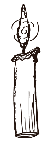
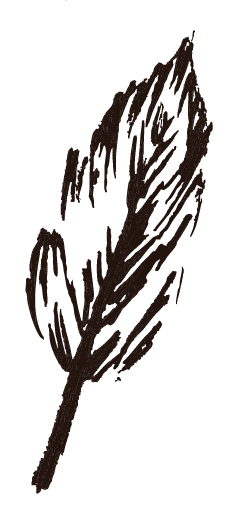
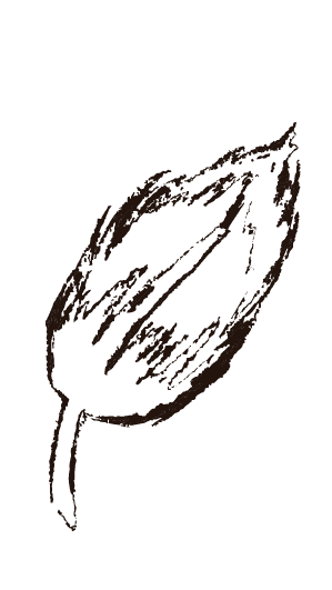
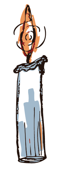
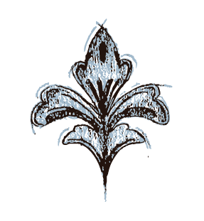
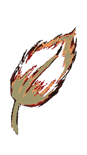
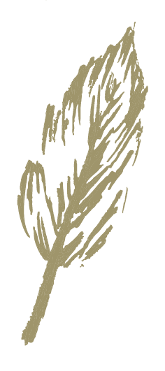
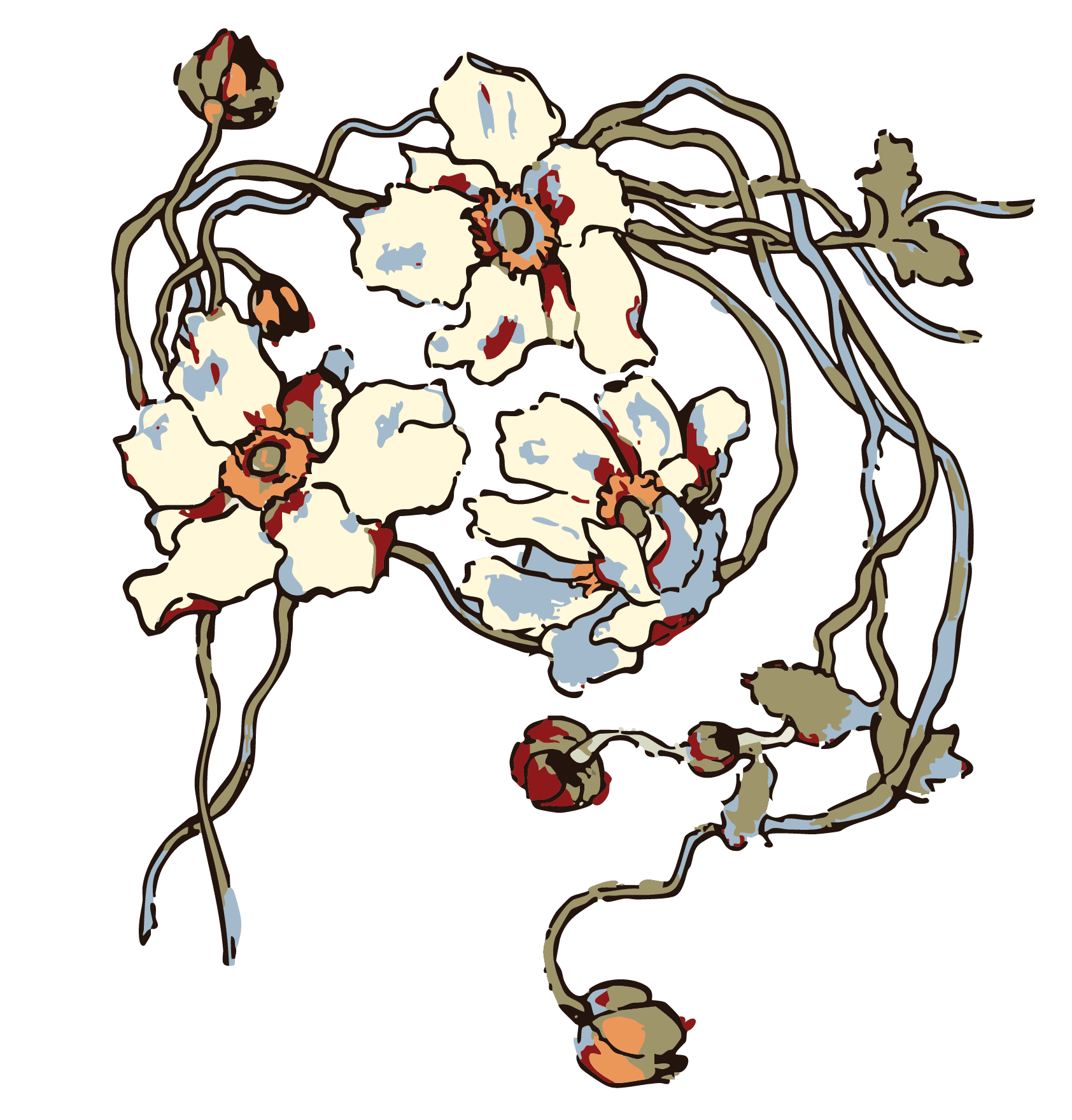
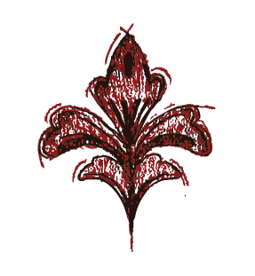
We continued the look of old books through developing sketches to use in our brand. We asked members of the committee to sketch things that aligned with our brand like things found in nature. When we got all the sketches, I digitized them through scanning them and image tracing them. I also added color to the sketches, so as we were designing we had many options from line sketches to colored sketches to use.
We continued the look of old books through developing sketches to use in our brand. We asked members of the committee to sketch things that aligned with our brand like things found in nature. When we got all the sketches, I digitized them through scanning them and image tracing them. I also added color to the sketches, so as we were designing we had many options from line sketches to colored sketches to use.
We continued the look of old books through developing sketches to use in our brand. We asked members of the committee to sketch things that aligned with our brand like things found in nature. When we got all the sketches, I digitized them through scanning them and image tracing them. I also added color to the sketches, so as we were designing we had many options from line sketches to colored sketches to use.


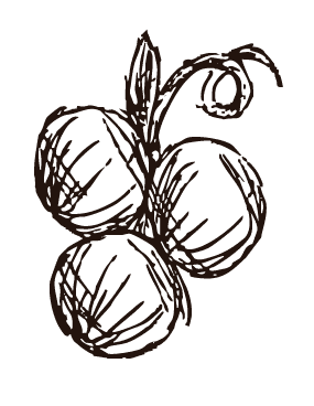

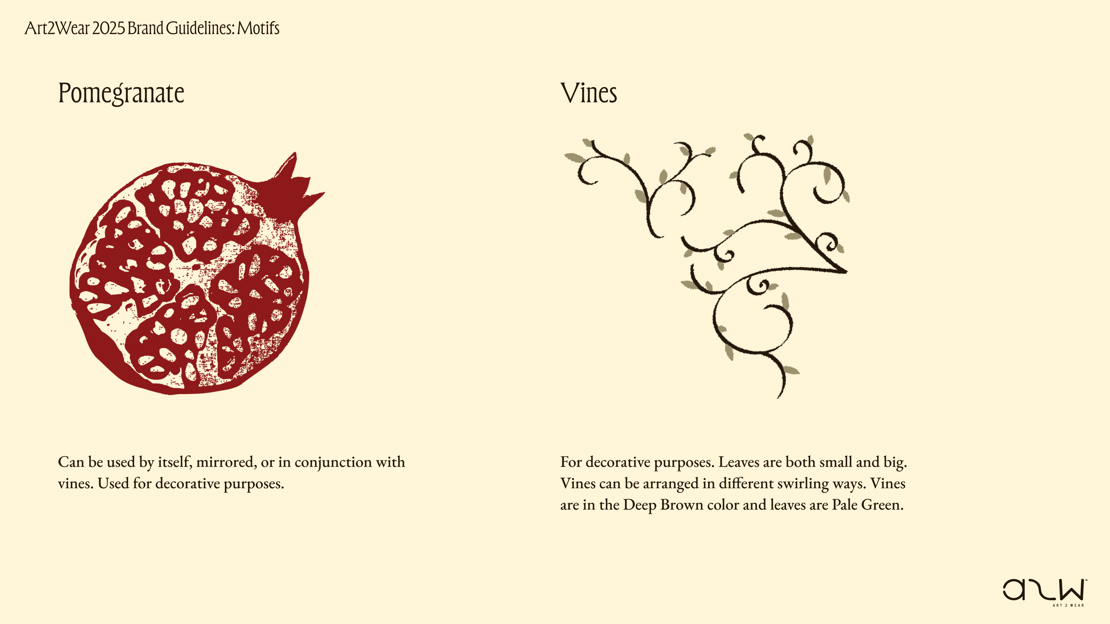
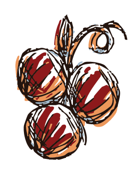
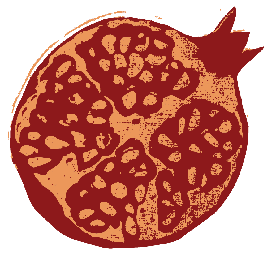
The leadership group had the idea to incorporate screen printing into the brand, so we created a pomegranate screen print and digitized it to be used as a part of our brand.
As part of promotion for the show we also screen printed it on various fabrics and posted them around campus.
The leadership group had the idea to incorporate screen printing into the brand, so we created a pomegranate screen print and digitized it to be used as a part of our brand.
As part of promotion for the show we also screen printed it on various fabrics and posted them around campus.
The leadership group had the idea to incorporate screen printing into the brand, so we created a pomegranate screen print and digitized it to be used as a part of our brand.
As part of promotion for the show we also screen printed it on various fabrics and posted them around campus.


Promotional Design
Promotional Design
Promotional Design
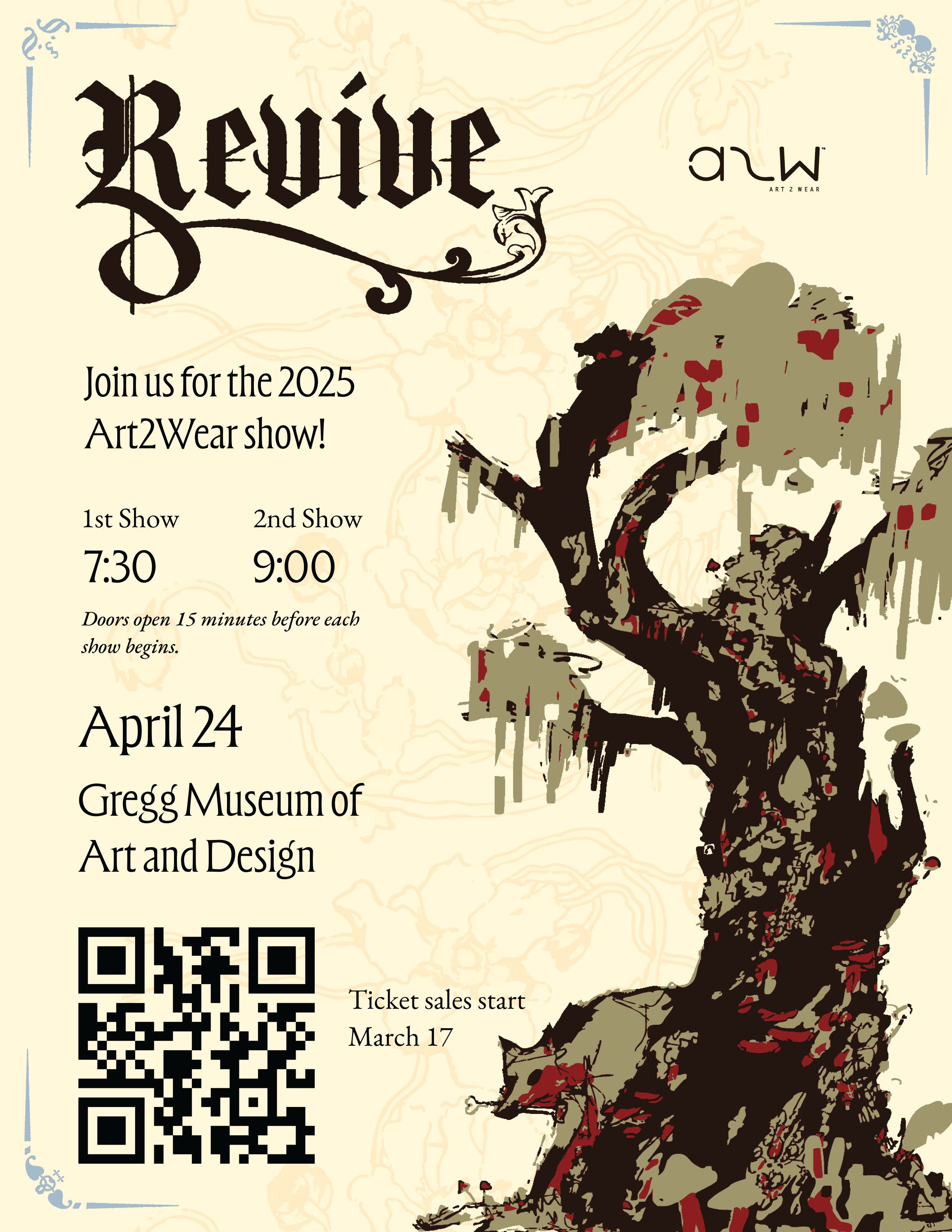
I was assigned with creating the title design for the gallery exhibit as one of the heads of the communications committee. They wanted the exhibit title to align with the brand that would be seen in the booklet, so I incorporated stylized drop cap letters that we would later use in the booklet. I designed a vertical and horizontal version for the leadership team to decide on, and they printed the horizontal version.
I was assigned with creating the title design for the gallery exhibit as one of the heads of the communications committee. They wanted the exhibit title to align with the brand that would be seen in the booklet, so I incorporated stylized drop cap letters that we would later use in the booklet. I designed a vertical and horizontal version for the leadership team to decide on, and they printed the horizontal version.
I was assigned with creating the title design for the gallery exhibit as one of the heads of the communications committee. They wanted the exhibit title to align with the brand that would be seen in the booklet, so I incorporated stylized drop cap letters that we would later use in the booklet. I designed a vertical and horizontal version for the leadership team to decide on, and they printed the horizontal version.


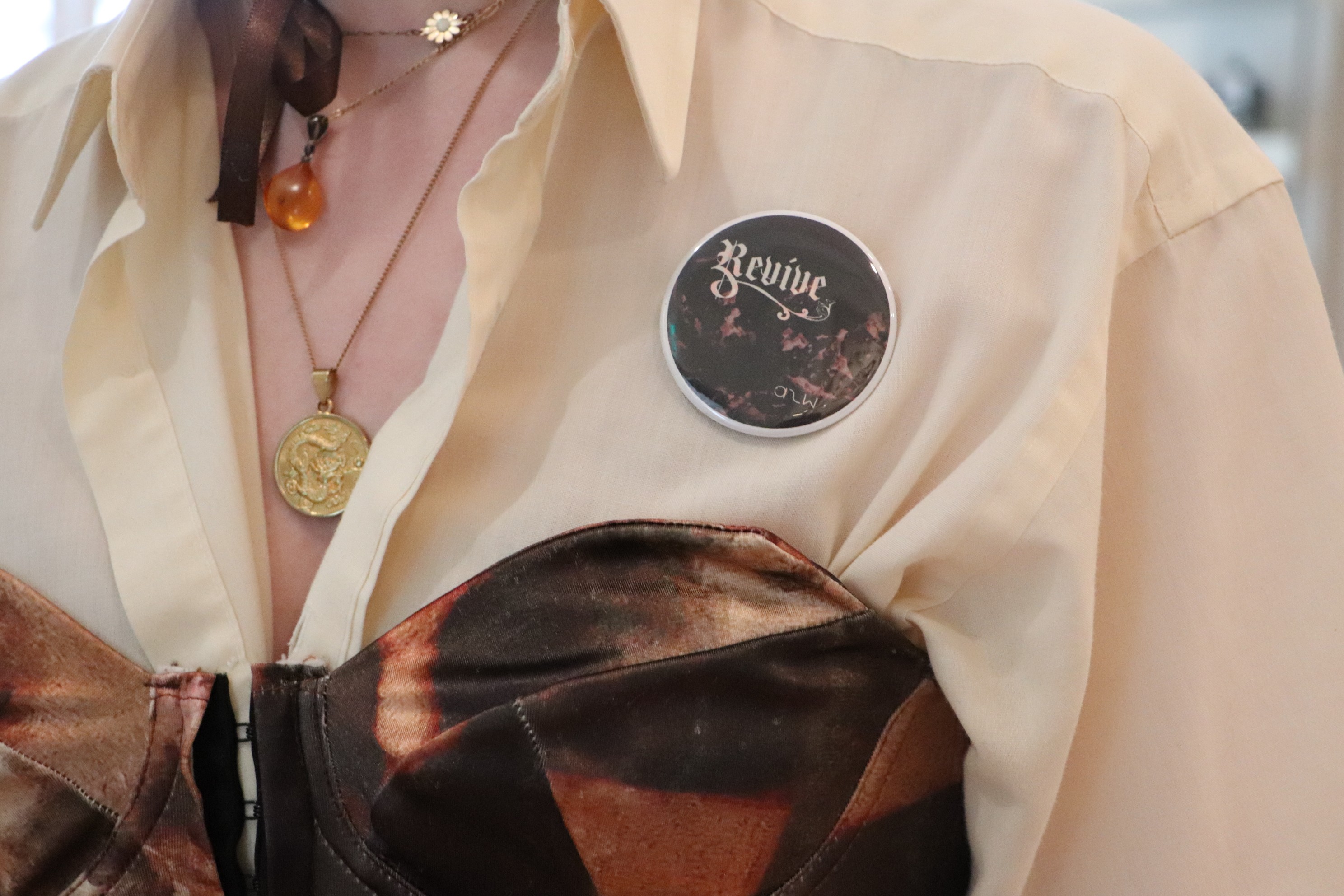
Throughout the stages of developing the show, I also created posters and a sticker design that were printed and used for promotion.
Throughout the stages of developing the show, I also created posters and a sticker design that were printed and used for promotion.
Throughout the stages of developing the show, I also created posters and a sticker design that were printed and used for promotion.
Posters:
Posters:
Posters:
Sticker:
Sticker:

Sticker:
Layout Design
Layout Design
Layout Design
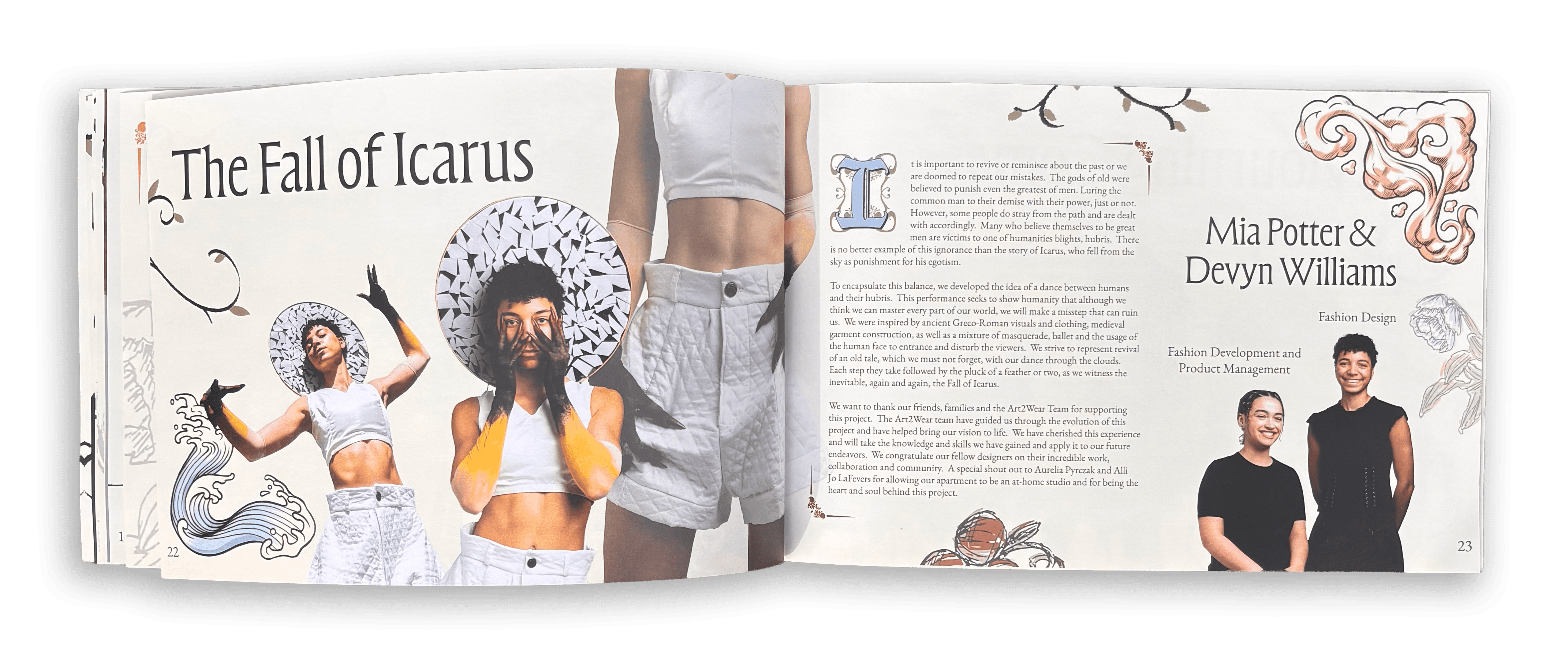
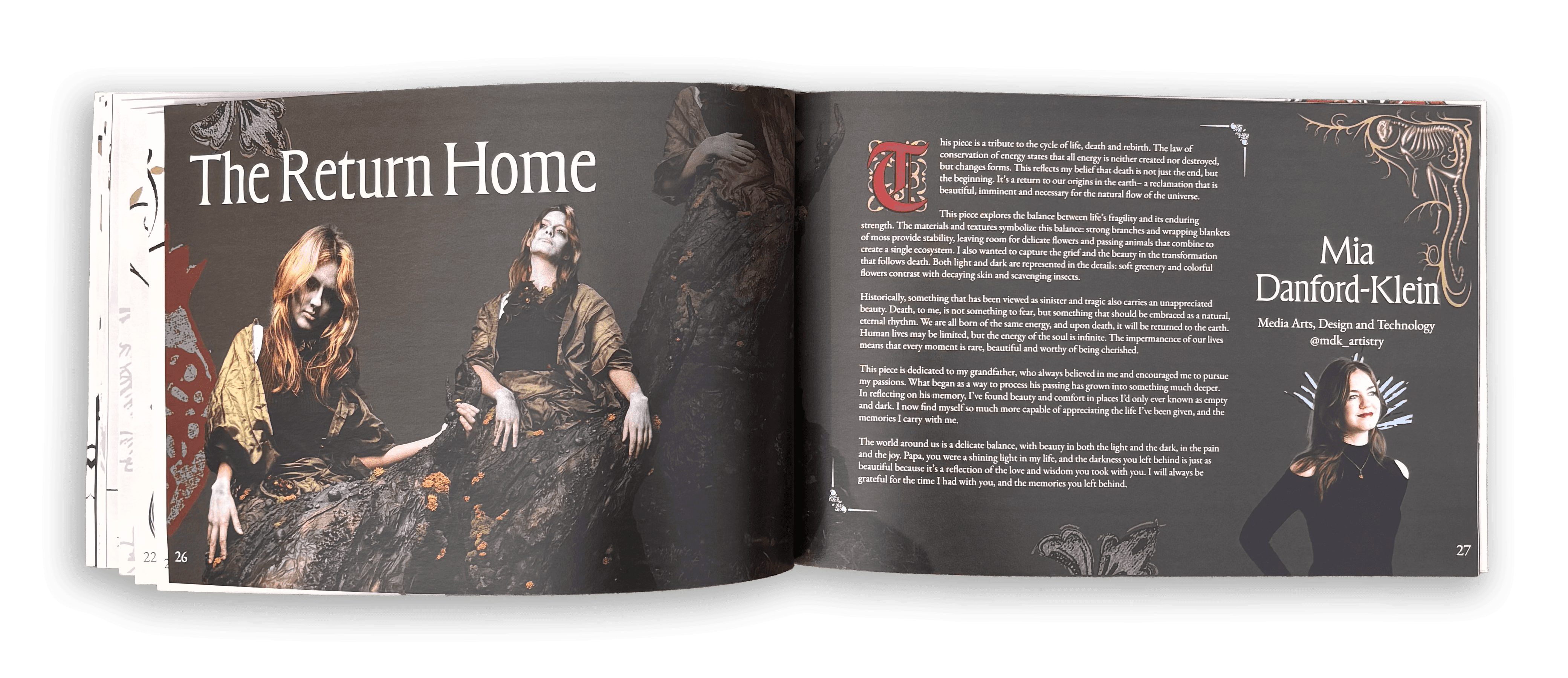
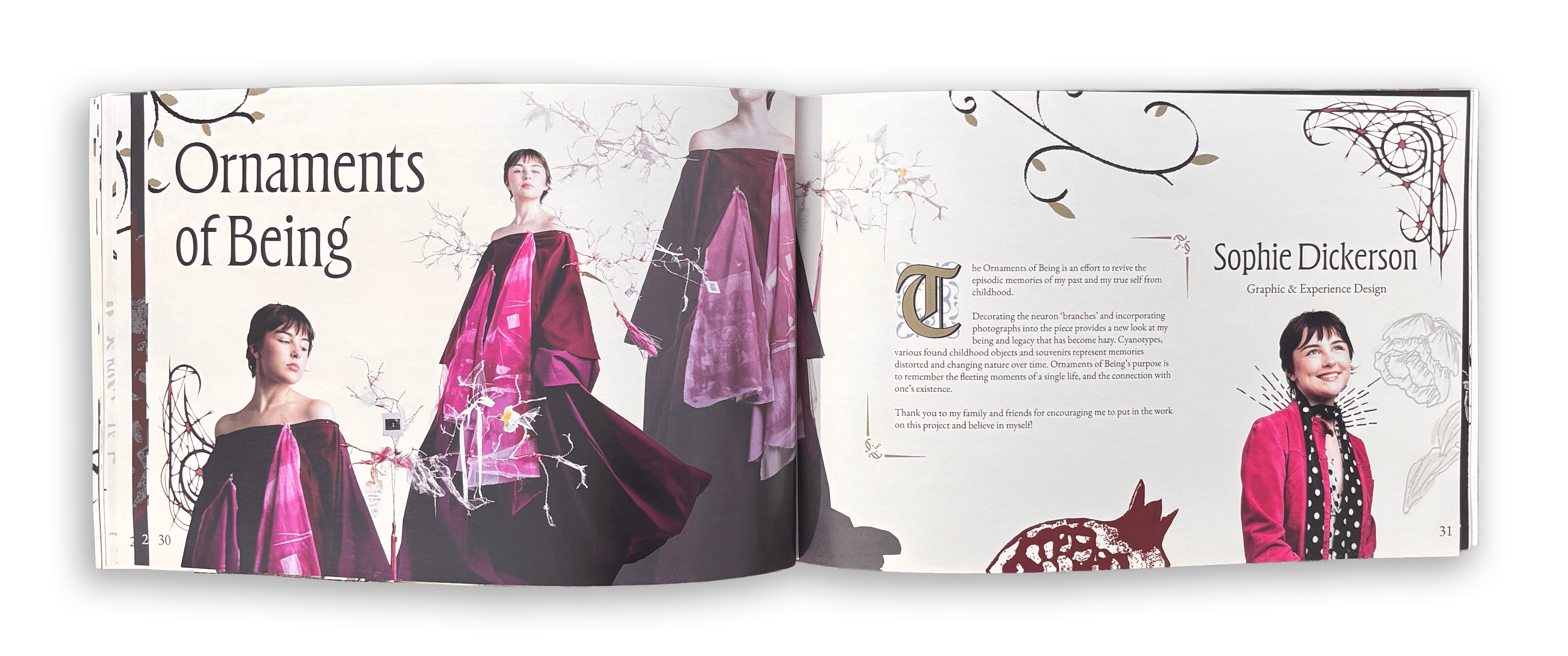
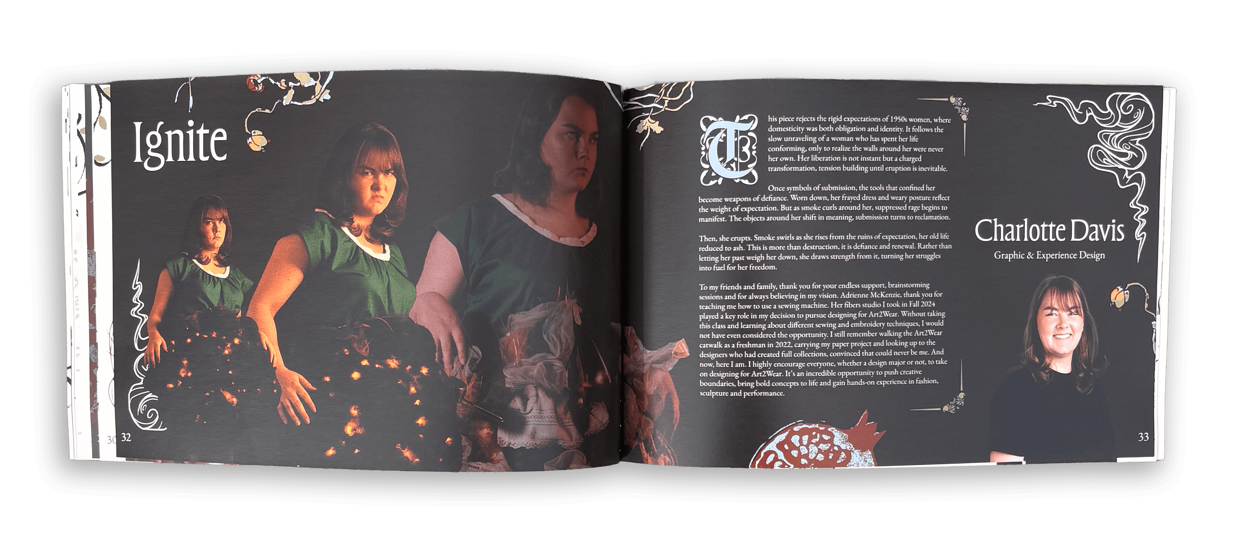
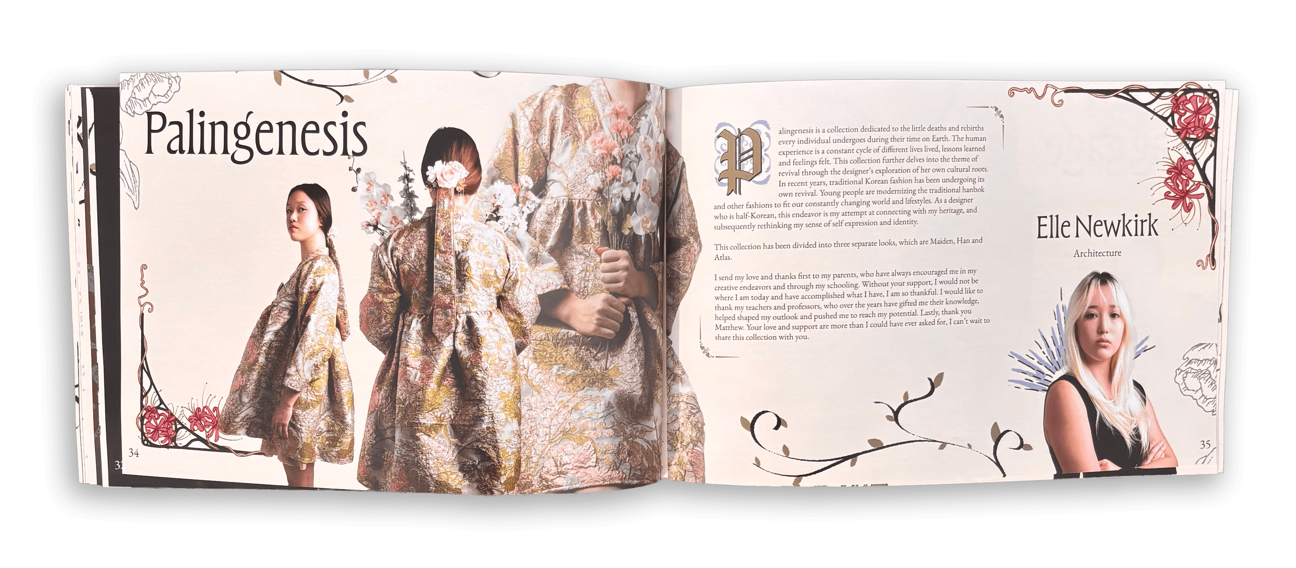
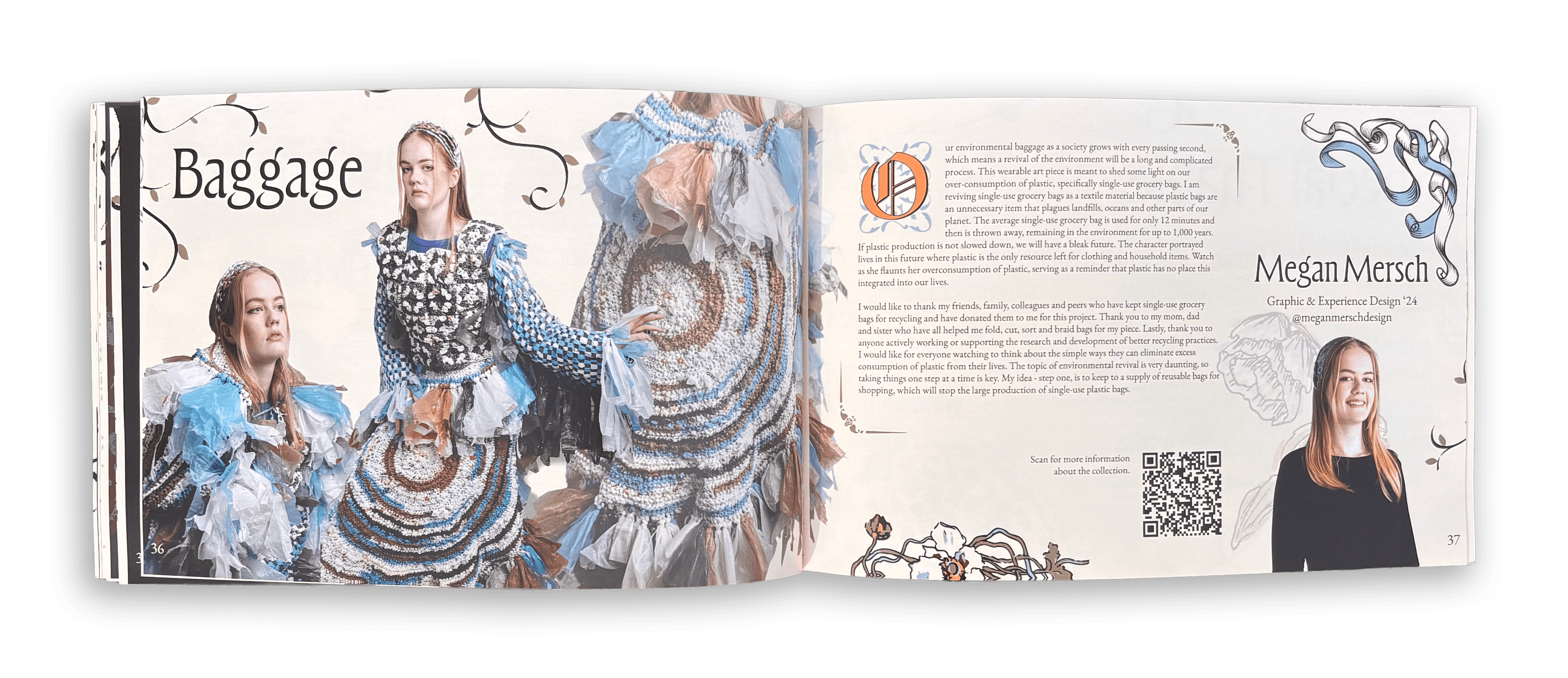
For the development of the booklet, my co-head and I organized an exercise where each member would come up with a way to layout the booklet and we would combine the elements we liked from each one into one layout format. Together, we decided on a layout that would include one large photo of the look nad two smaller ones, and the title and photos would be on the first page of the spread and the text and headshot of the designer would be on the second page of the spread.
When we received the photos of the looks and began designing the booklet, my co-head and I would leave comments on the layout of the photos, text, or motifs with suggestions on how to arrange them so the booklet could remain consistent despite being designed by different people.
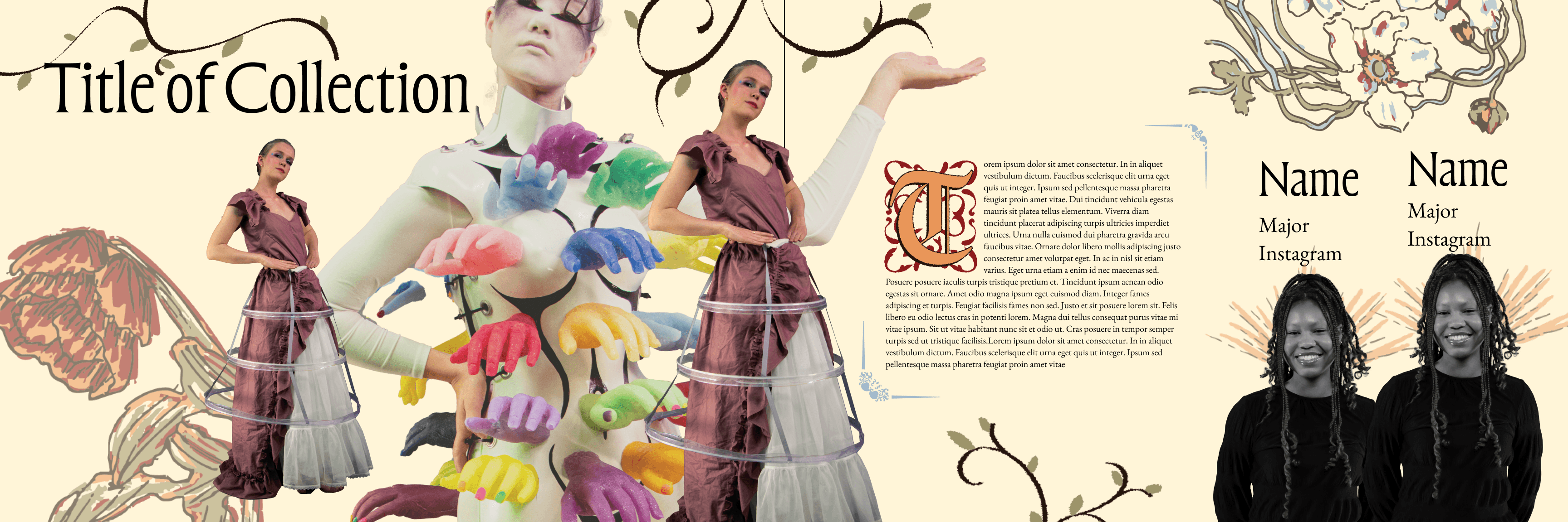
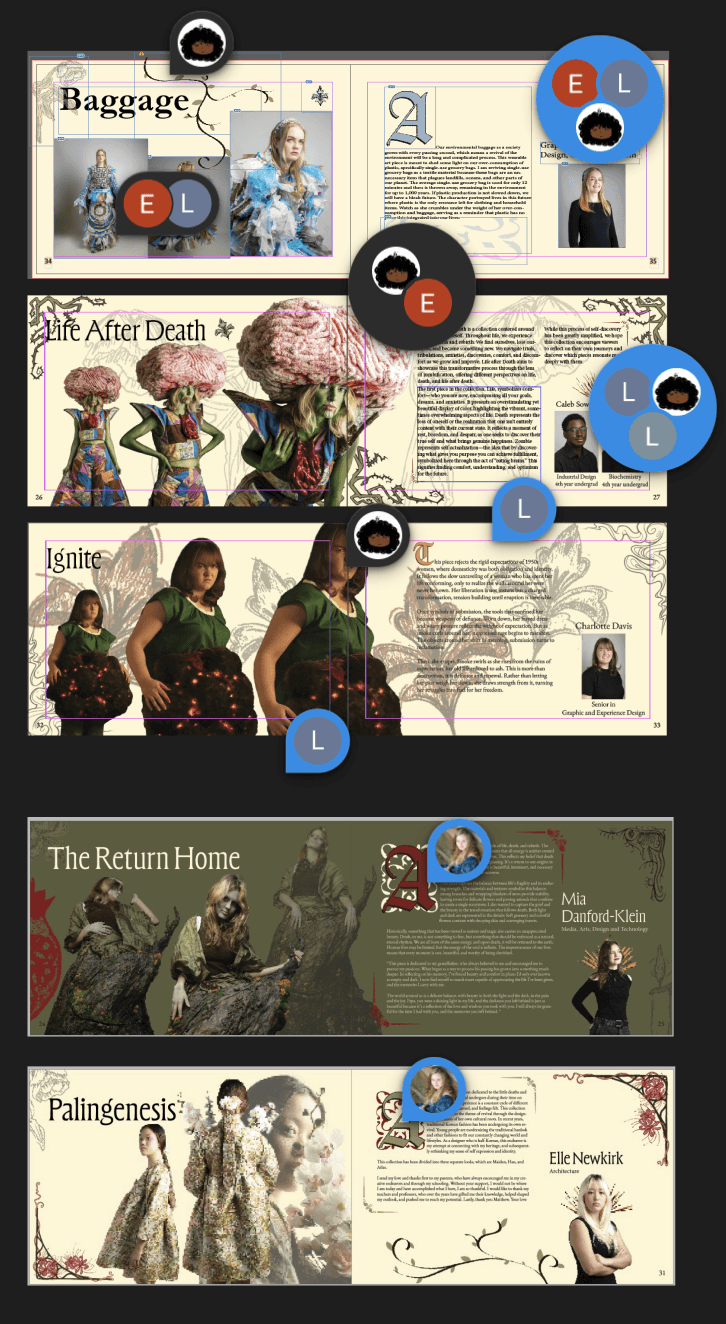
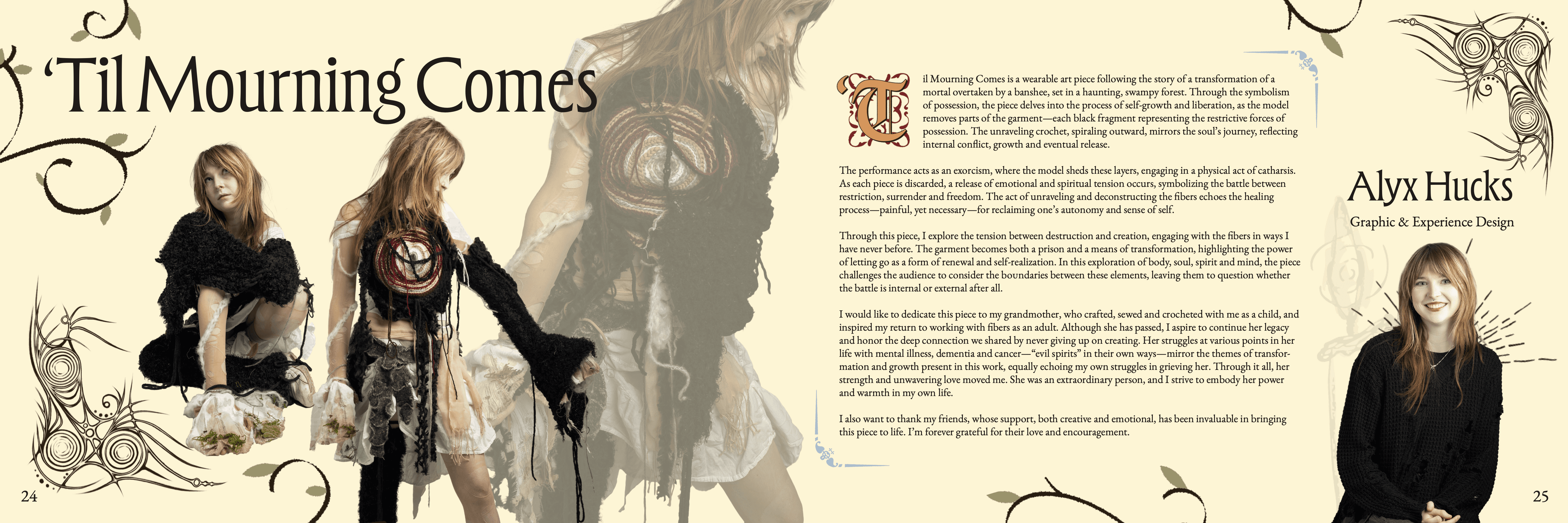
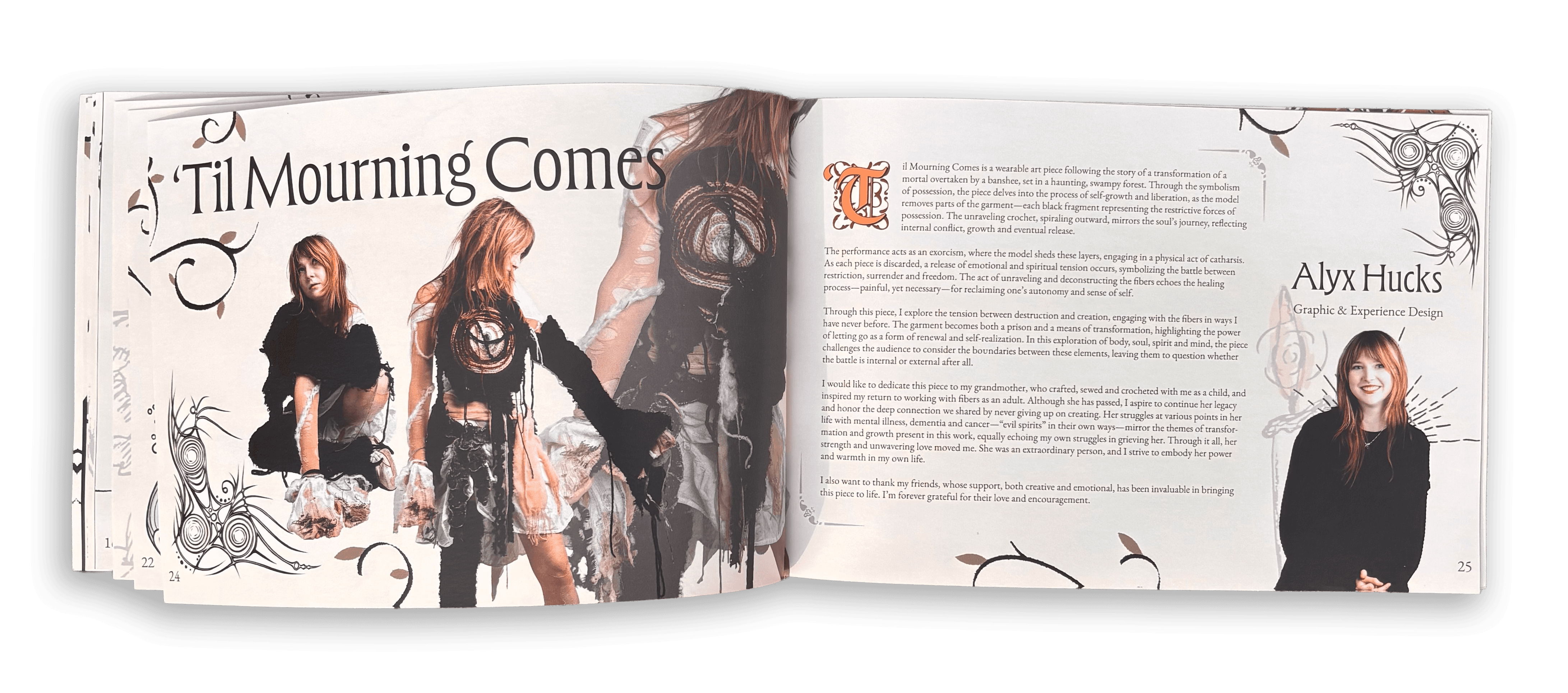
I designed the spread for the collection titled "'Til Mourning Comes." One of the student directors drew border corners unique to each collection, so we incorporated those into each final spread. With being a co-head, I helped committee members in the design process by using photoshop to remove the background on the photos and sitting down with them and doing a step-by-step tutorial of how to design using InDesign.
I designed the spread for the collection titled "'Til Mourning Comes." One of the student directors drew border corners unique to each collection, so we incorporated those into each final spread. With being a co-head, I helped committee members in the design process by using photoshop to remove the background on the photos and sitting down with them and doing a step-by-step tutorial of how to design using InDesign.
I designed the spread for the collection titled "'Til Mourning Comes." One of the student directors drew border corners unique to each collection, so we incorporated those into each final spread. With being a co-head, I helped committee members in the design process by using photoshop to remove the background on the photos and sitting down with them and doing a step-by-step tutorial of how to design using InDesign.