

Branding
Branding
Branding
Print Design
Print Design
Print Design
NCSU College of Engineering Branded Materials
NCSU College of Engineering Branded Materials
NCSU College of Engineering Branded Materials
Click to Navitage
Click to Navitage
Click to Navitage
Overview
Overview
Overview
I created various print and digital designs for the NCSU College of Engineering as the Graphic Design intern and the Lead Junior Designer for the Communications office. I designed these materials utalizing NCSU's brand identity.
I created various print and digital designs for the NCSU College of Engineering as the Graphic Design intern and the Lead Junior Designer for the Communications office. I designed these materials utalizing NCSU's brand identity.
I created various print and digital designs for the NCSU College of Engineering as the Graphic Design intern and the Lead Junior Designer for the Communications office. I designed these materials utalizing NCSU's brand identity.
Dean's Circle 2024
Dean's Circle 2024
Dean's Circle 2024
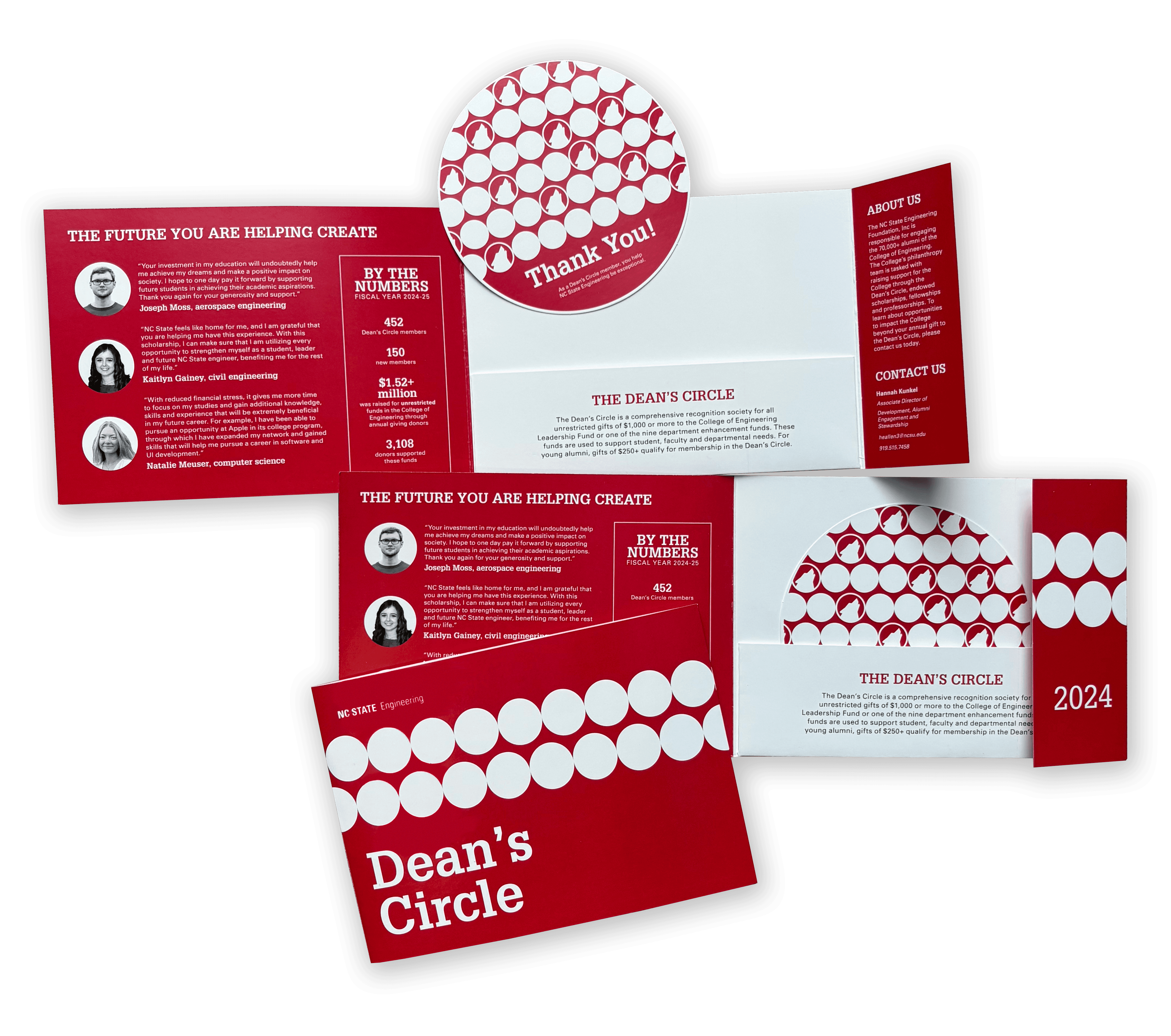
The Dean's Circle is a pamphlet sent out to donors of the College of Engineering as a thank you for their support to the students of the college. With a fun circular design and removable insert, this was designed as a keepsake for donors to hang on their fridge or display on their desks.
Given the copy text and photos, I developed a layout that highlighted the insert because I wanted it to be the first thing the person looked at when opening the pamphlet. I used a simple circle design that incorporated NC State's wolf icon to tie it into the branding.

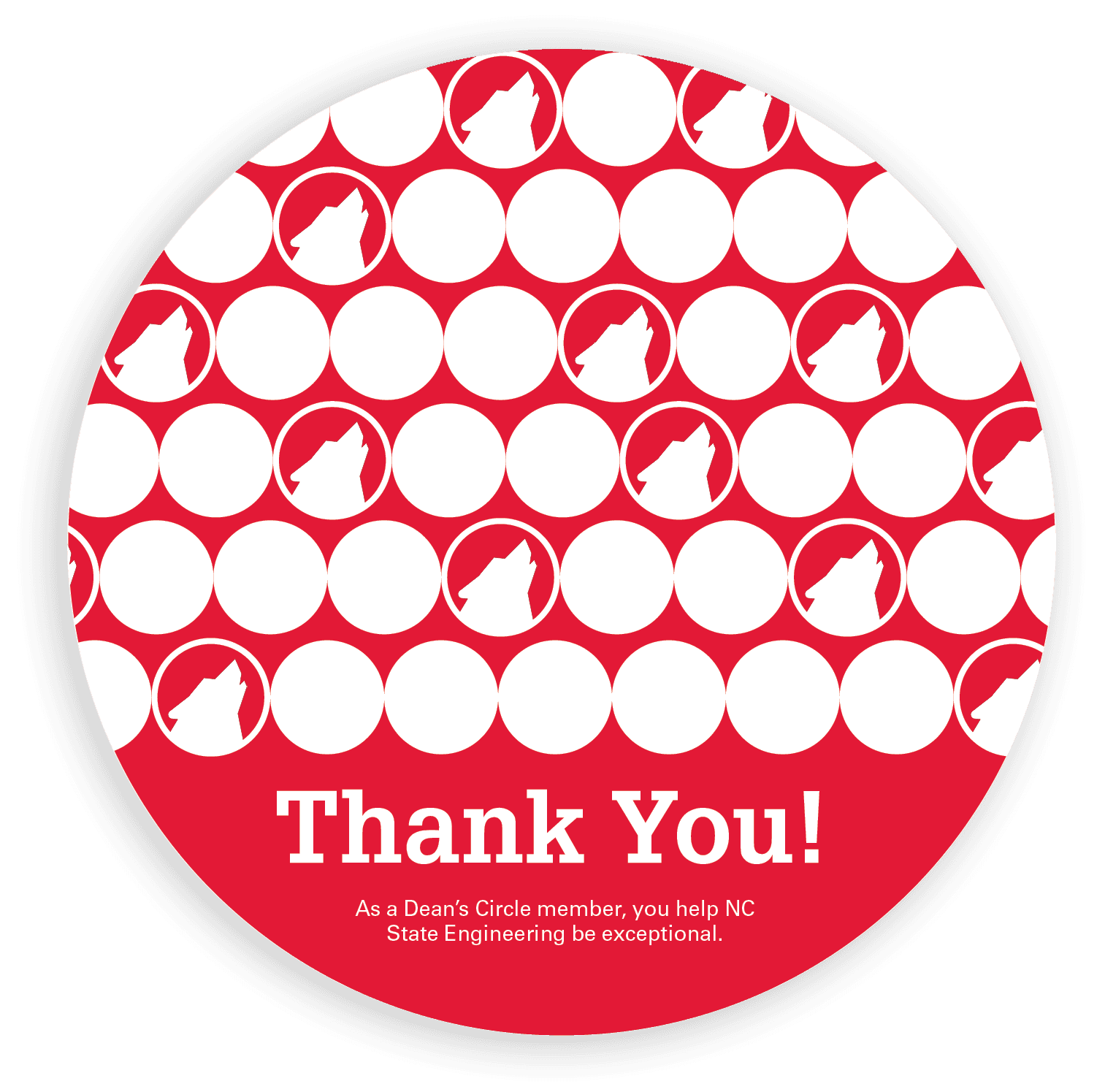

I created a variety of designs, all using circular motifs and NC State's Wolfpack Red for bold brand recognition and a fun, playful design. Using a circle motif in various ways, I wanted the design to be fun and eye-catching so those receiving it would recognize it as not only a source of information, but also as a keepsake.
Given the name "Dean's Circle," I went with the most obvious choice of circles and half circles arrange in various ways. By just using a circle, it was a challenge to find different and fun ways to arrange them while also adhering to NC State's brand guidelines.
I submitted all the designs to the dean of the college of engineering as well as the other designers at the communications office to decide which one to print and mail to donors.
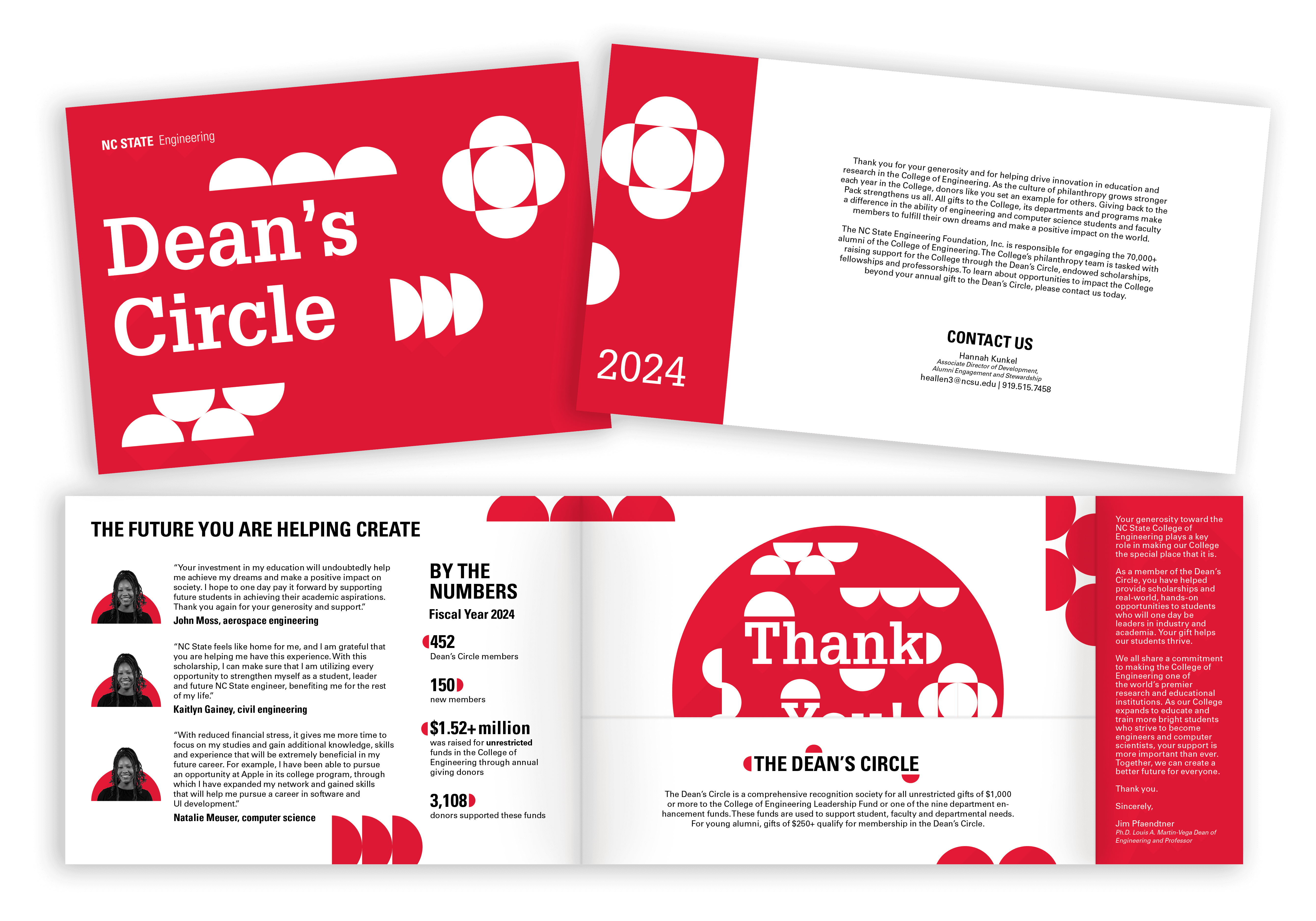


Engineering Magazine Page Layout 2025
Engineering Magazine Page Layout 2025
Engineering Magazine Page Layout 2025
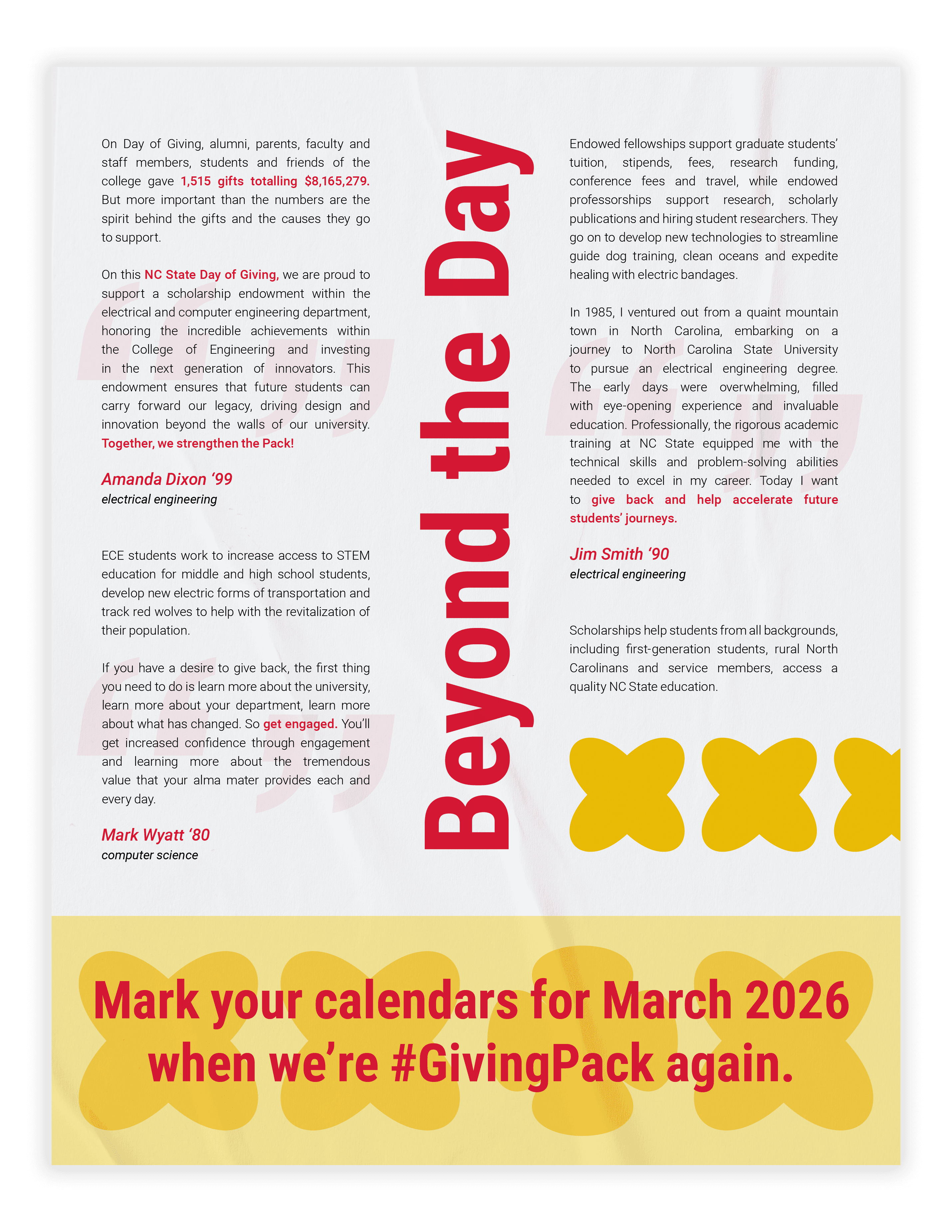
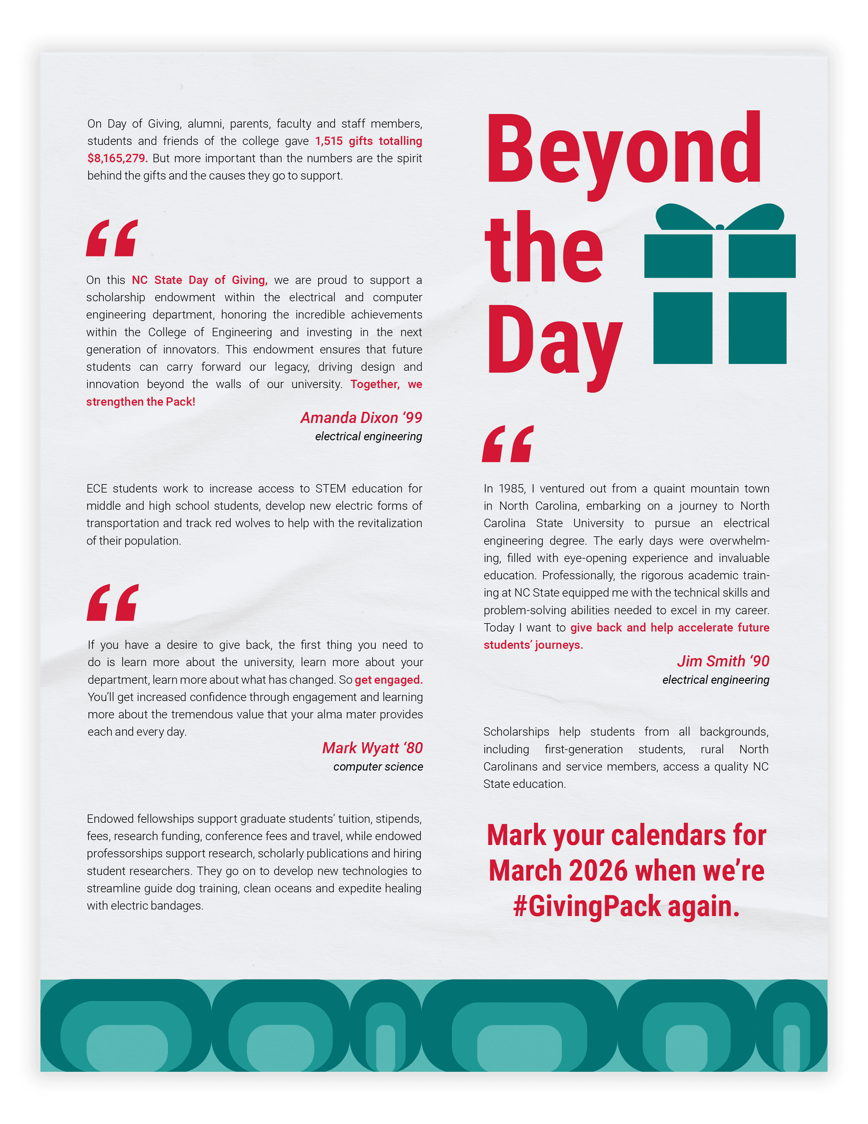
I designed a one page layout for the Engineering magazine's Fall 2025 issue to promote NC State's Day of Giving for the College of Engineering. I was given the body text that included quotes from alumni to include in the layout, as well as the requirement to include some sort of icon. Since this page was highlighting the impact that donors have on research and student's success, I wanted to make the visuals were eye-catching and interesting to draw the reader in and spark interest in donating to the college. The layout I designed was paired with another article to create the full spread.
I designed a one page layout for the Engineering magazine's Fall 2025 issue to promote NC State's Day of Giving for the College of Engineering. I was given the body text that included quotes from alumni to include in the layout, as well as the requirement to include some sort of icon. Since this page was highlighting the impact that donors have on research and student's success, I wanted to make the visuals were eye-catching and interesting to draw the reader in and spark interest in donating to the college. The layout I designed was paired with another article to create the full spread.
I designed a one page layout for the Engineering magazine's Fall 2025 issue to promote NC State's Day of Giving for the College of Engineering. I was given the body text that included quotes from alumni to include in the layout, as well as the requirement to include some sort of icon. Since this page was highlighting the impact that donors have on research and student's success, I wanted to make the visuals were eye-catching and interesting to draw the reader in and spark interest in donating to the college. The layout I designed was paired with another article to create the full spread.

Using NC State's extended color palette, I created various layouts and patterns for the single page layout. I wanted each idea to be different when it came to the positioning of the paragraphs, so I experimented with the title and quotation mark placements. I also experimented with the pattern I used for the layout, which took some time because I wanted it to be interesting, but not too distracting from the article.
I got a lot of my inspiration for the layout from pintrest by looking at other creative layouts and adapting them to ensure the information was still highlighted as the most important thing on the page despite having icons and patterns.
I submitted all the designs to the other designers at the communications office, and we decided to go with the quote bubble design. I was given more specific critiques for that design to get to the final design.


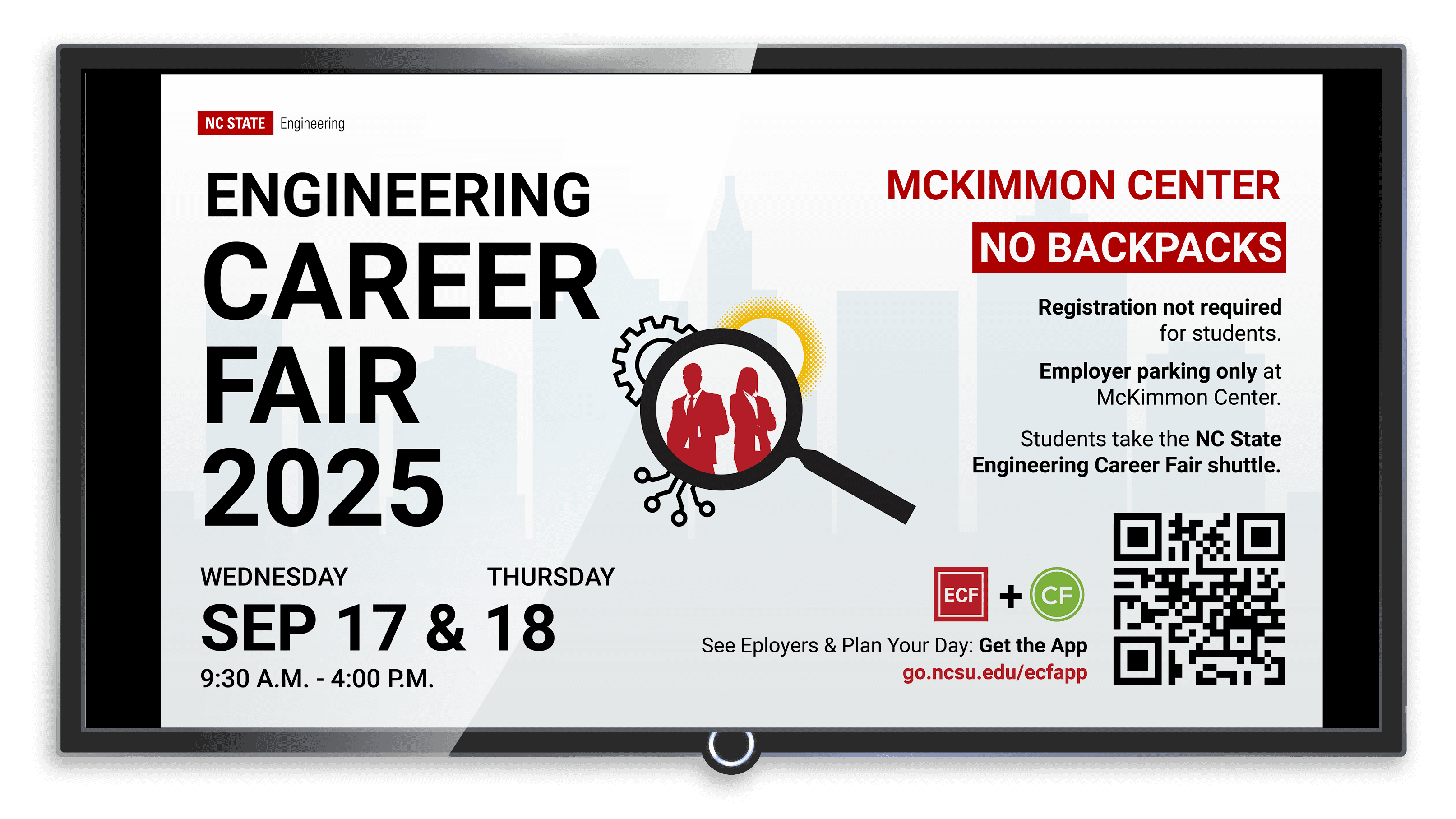
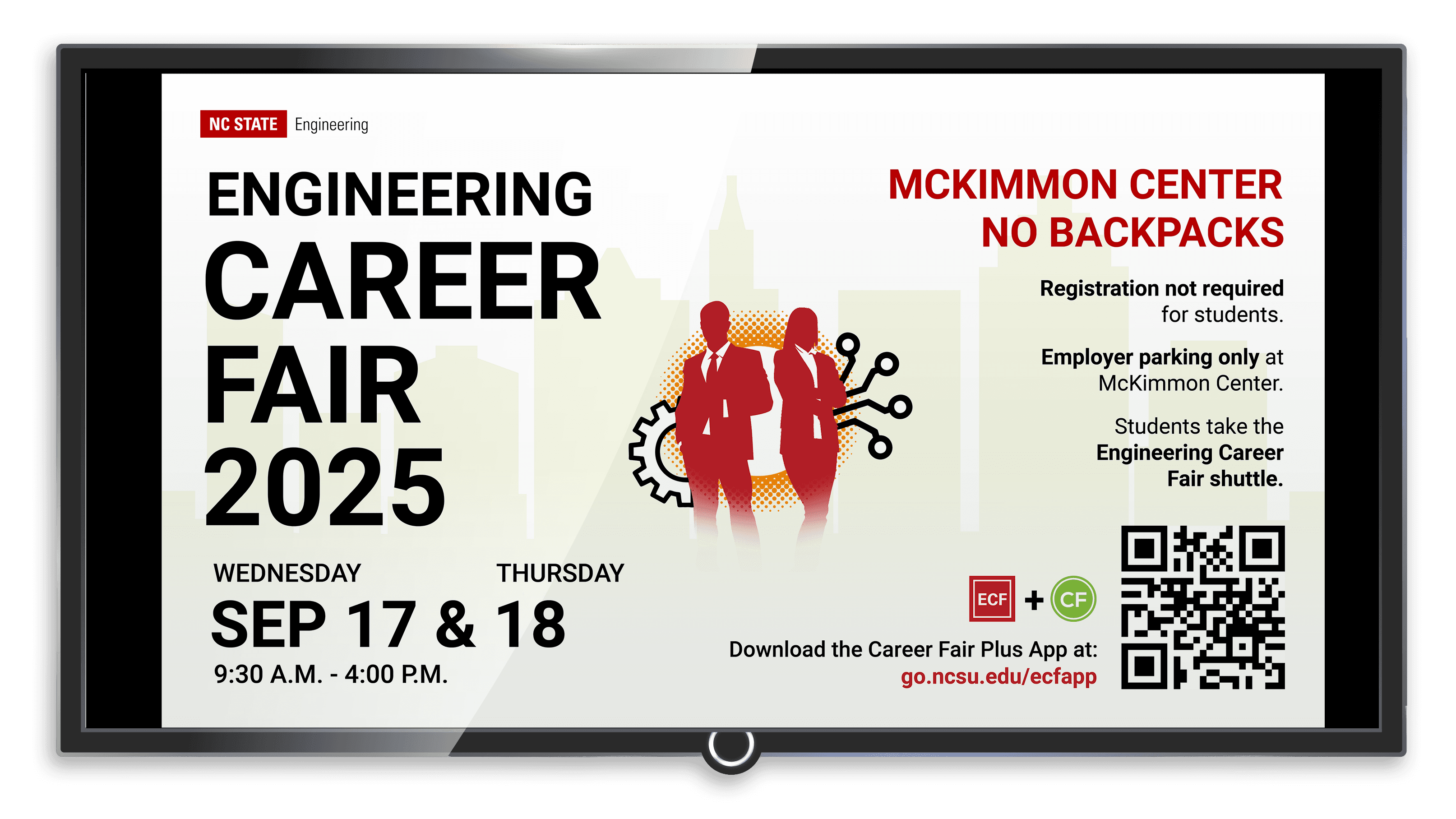
Engineering Career Fair 2025
Engineering Career Fair 2025
Engineering Career Fair 2025
I designed two flyers and a digital slide for the 2025 Engineering Career Fair. I was given the text and QR code to include in the layout. The flyers were put on large stands across campus, so I made sure to have a large title that can be seen from far distances to draw students in to get more information about the career fair.
I used NC State's extended color palette because I wanted to highlight the important info in red, so I used their Innovation Blue for the background to avoid having a blank white background. I used the cityscape graphic to add a design element that would draw students to the poster, while also being relevant to subject due to the idea of a career being in an office in the city.
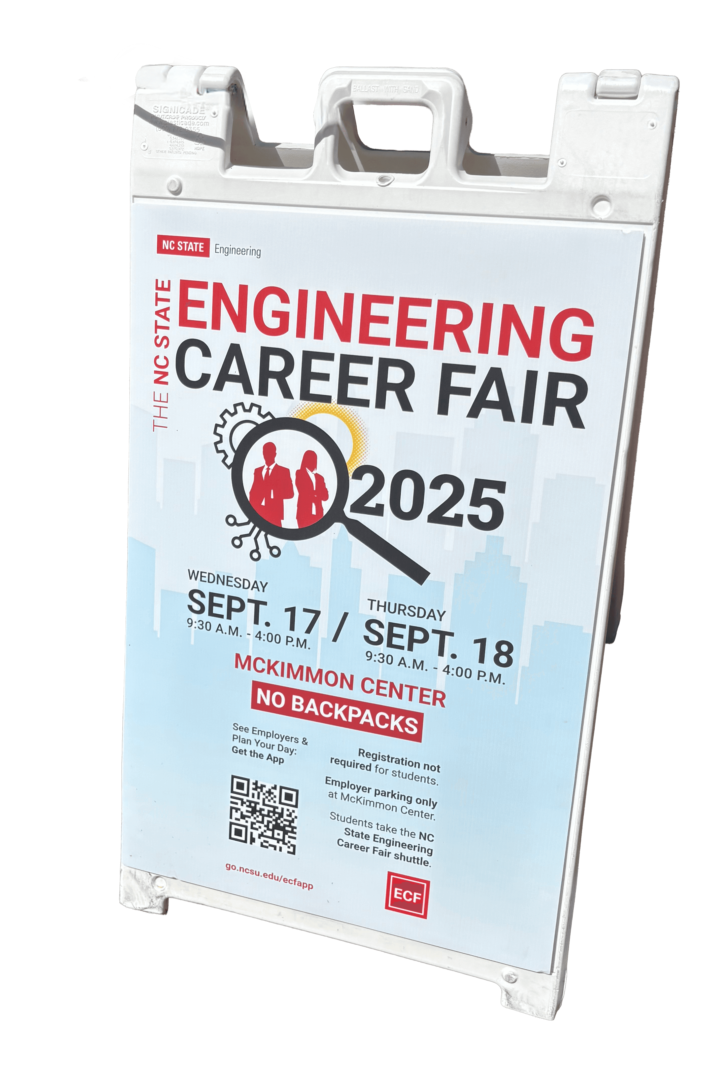


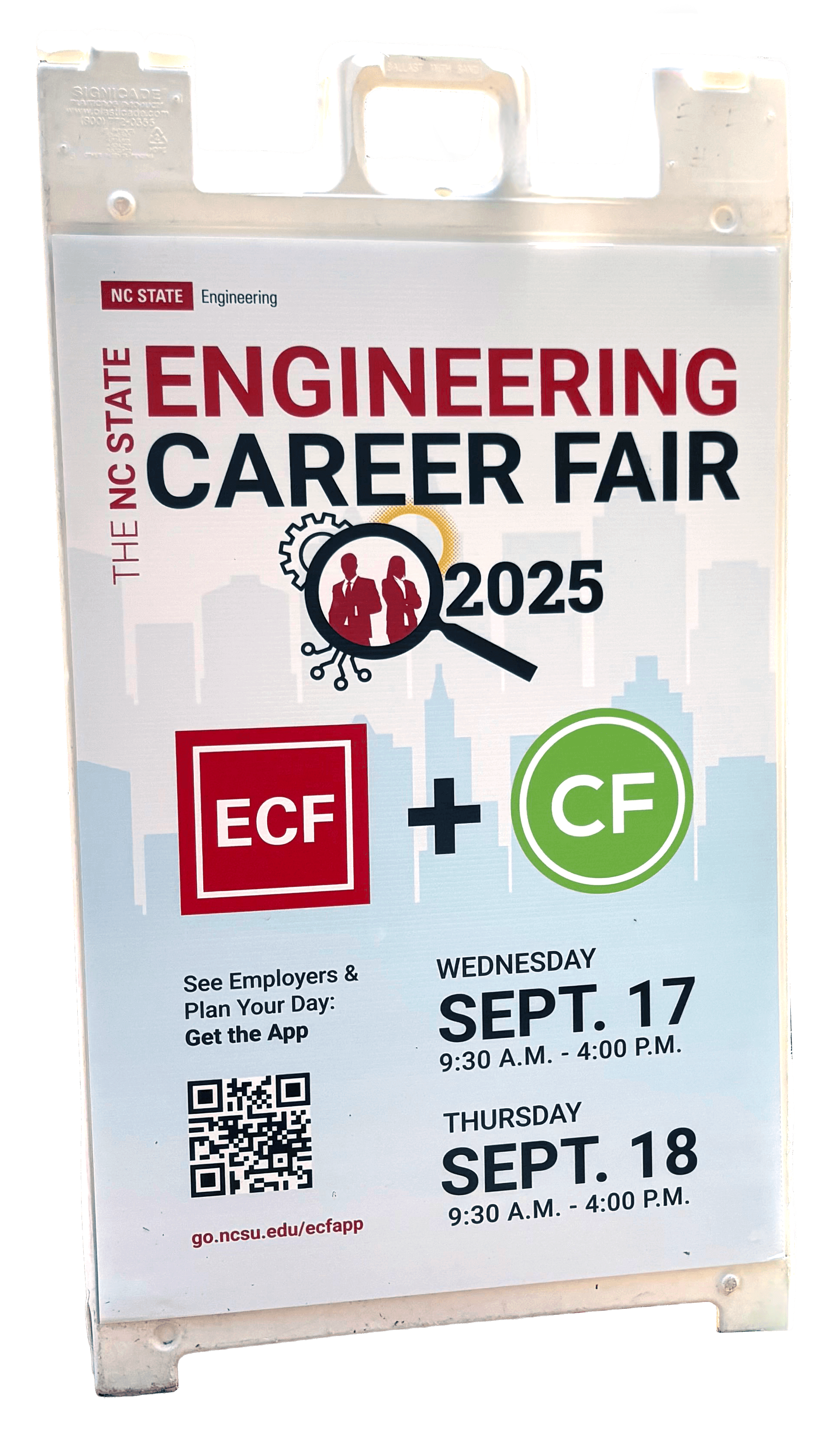
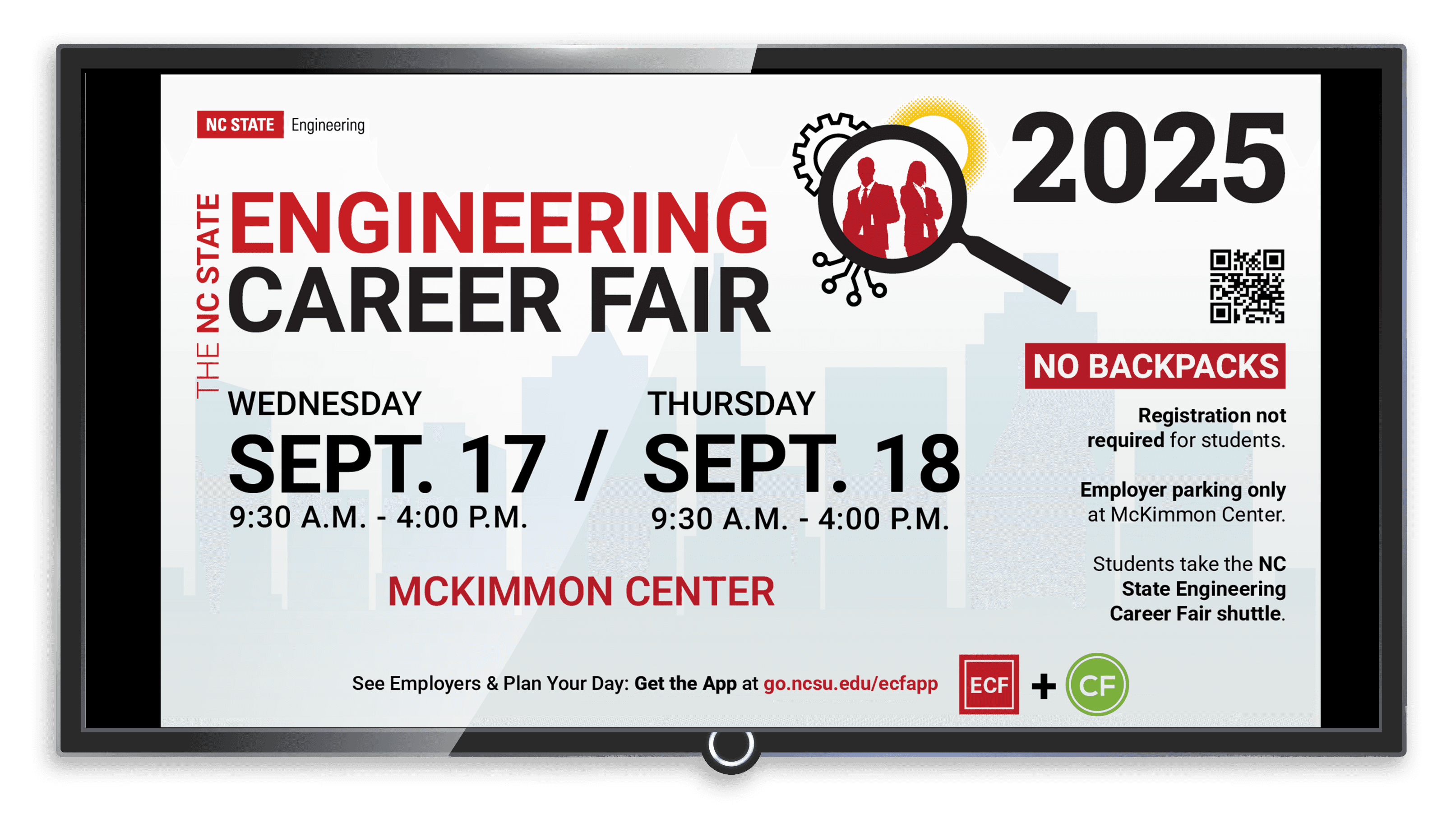
The department that wanted the poster and digital slide requested that I use icons of people, a magnifying glass, and something related to engineering. Given that request, I designed this graphic with the idea that students are being found by engineering employers.
The department that wanted the poster and digital slide requested that I use icons of people, a magnifying glass, and something related to engineering. Given that request, I designed this graphic with the idea that students are being found by engineering employers.
The department that wanted the poster and digital slide requested that I use icons of people, a magnifying glass, and something related to engineering. Given that request, I designed this graphic with the idea that students are being found by engineering employers.

I started desging the poster by finding a place for all the information I was given that was balanced while still having hierarchy in the information. I experimented with different colors within the extended color palette as well. After I sent various layouts to the other designers on the communications team, I was given the feedback of centering the information and moving the dates higher so students would get the most important details in a quicker glance.
I started desging the poster by finding a place for all the information I was given that was balanced while still having hierarchy in the information. I experimented with different colors within the extended color palette as well. After I sent various layouts to the other designers on the communications team, I was given the feedback of centering the information and moving the dates higher so students would get the most important details in a quicker glance.
I started desging the poster by finding a place for all the information I was given that was balanced while still having hierarchy in the information. I experimented with different colors within the extended color palette as well. After I sent various layouts to the other designers on the communications team, I was given the feedback of centering the information and moving the dates higher so students would get the most important details in a quicker glance.


Engineering Modular Display Booth
Engineering Modular Display Booth
Engineering Modular Display Booth
I designed a display booth for The College of Engineering, who wanted a booth that could be resized for different events and shows while also being general enough for all departments within the college to use. I was new to this task, so I started by looking at different brands that sold display booths and different examples of display booths at trade shows. Once the booth format was selected by the communications office, I was tasked to design what would go on the booth.
I decided to use NC State's icons for the design since they could be general to the whole university, but also be specific to engineering and technology. I choose 9 icons and arranged them in a checker board design using NC State's Wolfpack Red color for a design that wasn't too overwhelming while also having strong branding for the college. I was told that the bold use of red and icons attracted a lot of foot traffic to the booth, which meant the goal of my design was reached!


The outside panels include general NC State icons like the belltower, wolf circle, and wolf hand. The rest can be applied to engineering as things they use or make in their career. To add variety I alternated the icons for the right and left panels.
The outside panels include general NC State icons like the belltower, wolf circle, and wolf hand. The rest can be applied to engineering as things they use or make in their career. To add variety I alternated the icons for the right and left panels.
The outside panels include general NC State icons like the belltower, wolf circle, and wolf hand. The rest can be applied to engineering as things they use or make in their career. To add variety I alternated the icons for the right and left panels.
To design the booth panels, I was given the dimensions and created a mockup to show the communications office different design variations put together. This also allowed me to see what the potential design would look like with the TV screens included in the booth. This way of making mockup allowed for me to make many variations and send them to other designers on the team to find a combination that everyone liked.
To design the booth panels, I was given the dimensions and created a mockup to show the communications office different design variations put together. This also allowed me to see what the potential design would look like with the TV screens included in the booth. This way of making mockup allowed for me to make many variations and send them to other designers on the team to find a combination that everyone liked.
To design the booth panels, I was given the dimensions and created a mockup to show the communications office different design variations put together. This also allowed me to see what the potential design would look like with the TV screens included in the booth. This way of making mockup allowed for me to make many variations and send them to other designers on the team to find a combination that everyone liked.
When developing the design for the outside panels, I started with a circle pattern with the idea that it would be a good backdrop for pictures and attract people to the booth. While developing the circle design, I noticed that it seemed more playful than professional, so I had to think about it in a different way since the booth would be used professionally at events. The same can be said for the multi-colored design I created, so I only used Wolfpack Red for the final design.
I reduced the amount of circles and incorporated more imagery as an option for the outside panels. This option brought up the challenge of choosing imagery that was general enough to be connected to all departments in the college and also show off the college's advanced technology available. While choosing all the photos, I took into account displaying the College of Engineering as a high tech and diverse in both gender and race to make sure potential students who may see the booth can see themselves in the college through the imagery.


