

Layout
Layout
Layout
Platform Magazine Article and Photoshoot Spreads
Platform Magazine Article and Photoshoot Spreads
Platform Magazine Article and Photoshoot Spreads
Click to Navitage
Click to Navitage
Click to Navitage
Retro Futurism
Retro Futurism
Let Them Eat Cake
Let Them
Eat Cake
Promenade
Promenade
Promenade
Psychedelic Bloom
Psychedelic Bloom
Overview
Overview
Overview
Platform magazine is a student-led fashion and culture magazine at NC State University that aims to uplift its member's voices on fashion, culture, lifestyle, technology, and more. I was a layout designer for the magazine from 2022-2025 and worked within groups of 6-10 designers. I designed layouts for articles, photoshoots, and drew graphics for the magazine as well.
Each spread I designed began with a conversation between the writing team or a director to understand their idea. Then I created a moodboard of visual imagery and layout ideas for the spreads that were reviewed by the graphic design team and those who provided me the idea. My mood boards were critiqued to ensure my ideas stayed consistent with the initial idea.
While some spreads were updated in final edits for print, the updates were made based on my original designs and ideas. To view full digital magazines visit Platform Magazine's Website.

Retro Futurism
Retro Futurism
Retro Futurism
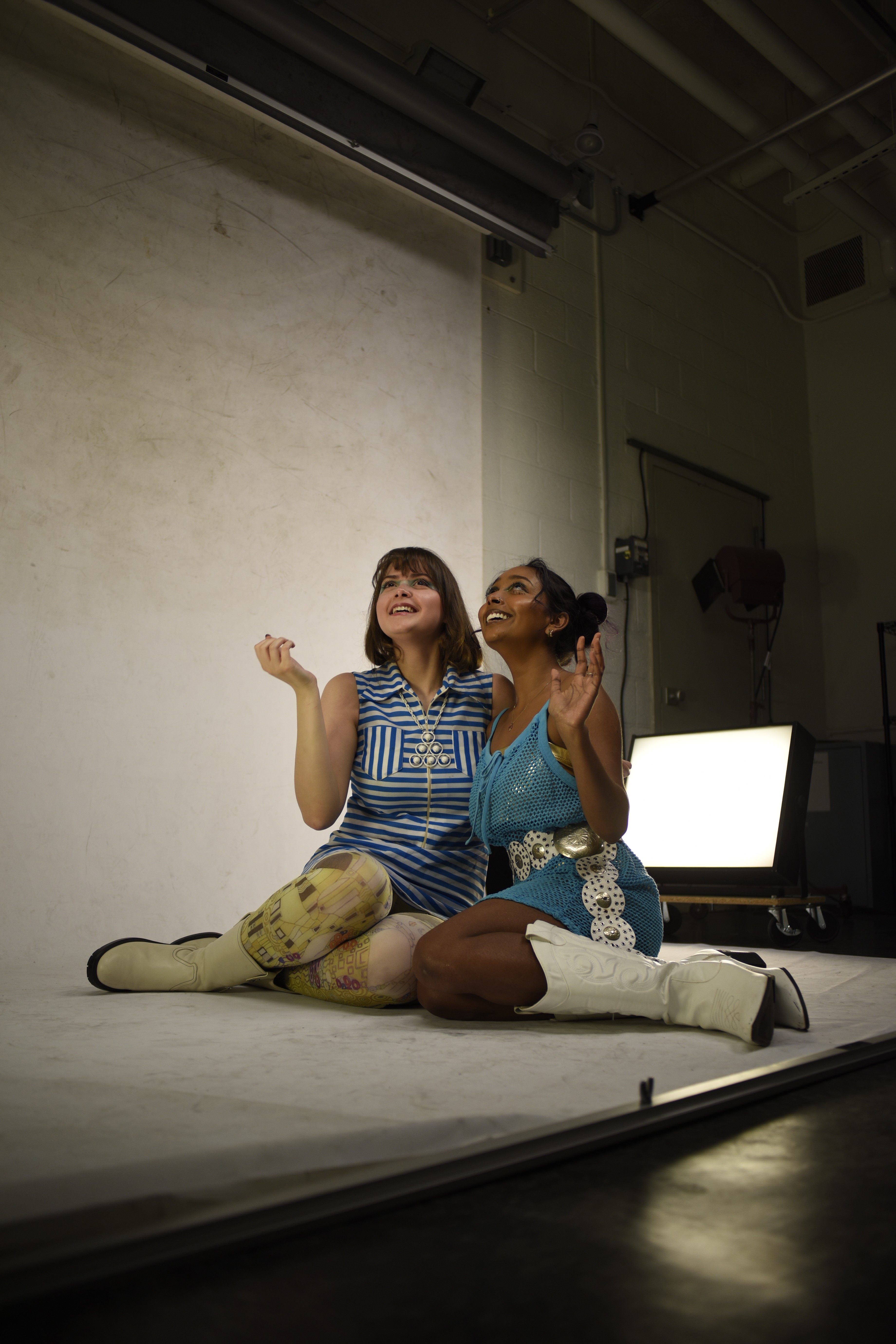
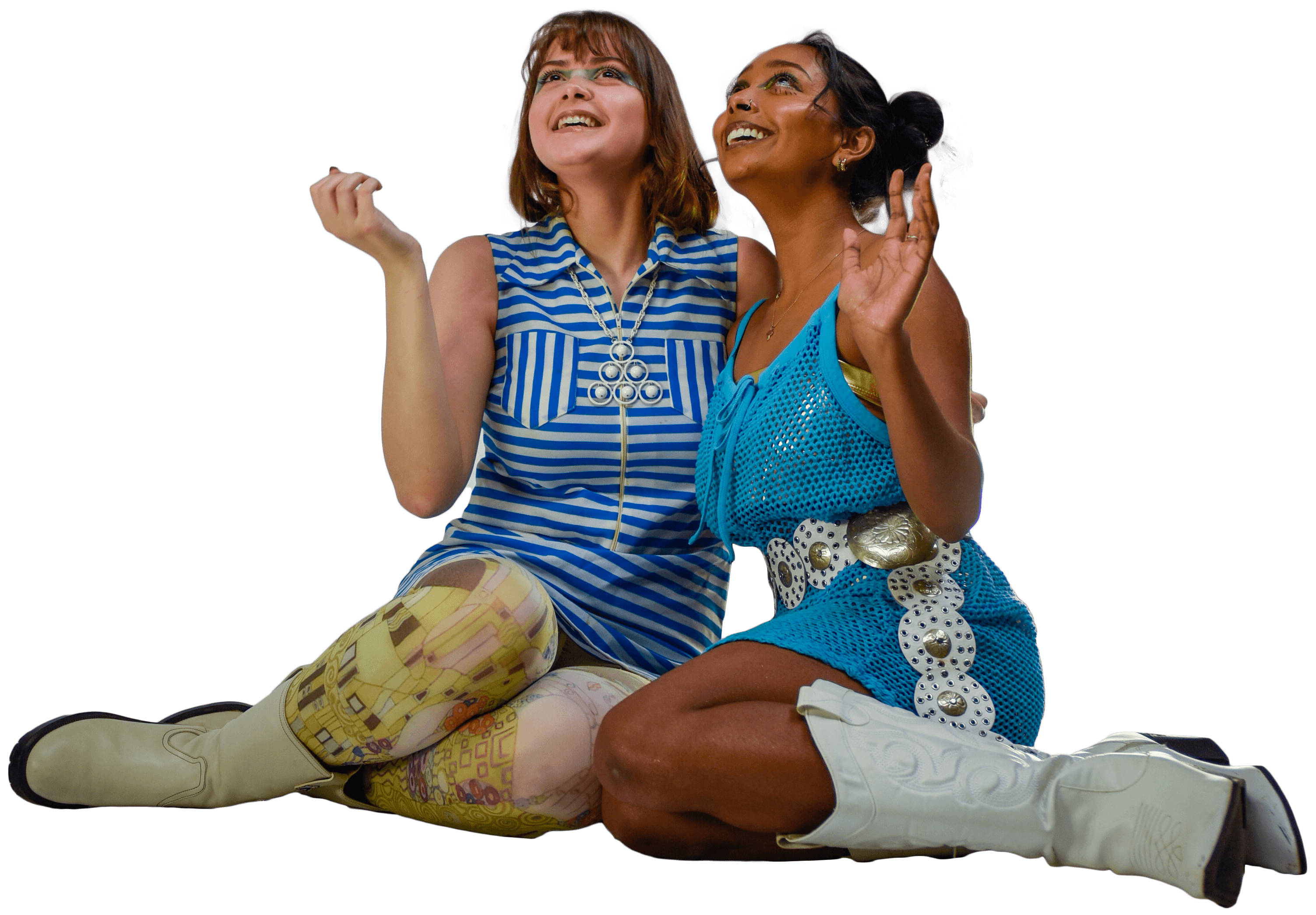
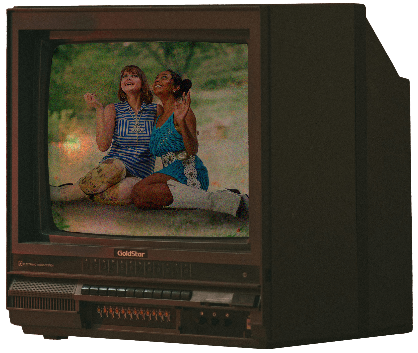
These spreads were created for NC State's Platform Magazine Volume XIII. The theme for this photoshoot was retro fashion paired with a hyper-realistic imagery to create a retro-futuristic environment.
These spreads were created for NC State's Platform Magazine Volume XIII. The theme for this photoshoot was retro fashion paired with a hyper-realistic imagery to create a retro-futuristic environment.
These spreads were created for NC State's Platform Magazine Volume XIII. The theme for this photoshoot was retro fashion paired with a hyper-realistic imagery to create a retro-futuristic environment.


I began with compiling imagery that represented the overall visual feel that the executive team of Platform Magazine desired for this shoot. The juxtaposition of retro styles and futurism was a big point from the executive team, so I created a mood board with a lot of futuristic robots and retro comic book-style drawings.
I began with compiling imagery that represented the overall visual feel that the executive team of Platform Magazine desired for this shoot. The juxtaposition of retro styles and futurism was a big point from the executive team, so I created a mood board with a lot of futuristic robots and retro comic book-style drawings.
I began with compiling imagery that represented the overall visual feel that the executive team of Platform Magazine desired for this shoot. The juxtaposition of retro styles and futurism was a big point from the executive team, so I created a mood board with a lot of futuristic robots and retro comic book-style drawings.
Once the photos were taken, I was tasked with editing the lighting and removing the background of the photos before putting them into Photoshop to build the background. Using that process, I built up the background to create a space environment with surreal elements and a retro look to it.
Once the photos were taken, I was tasked with editing the lighting and removing the background of the photos before putting them into Photoshop to build the background. Using that process, I built up the background to create a space environment with surreal elements and a retro look to it.
Once the photos were taken, I was tasked with editing the lighting and removing the background of the photos before putting them into Photoshop to build the background. Using that process, I built up the background to create a space environment with surreal elements and a retro look to it.
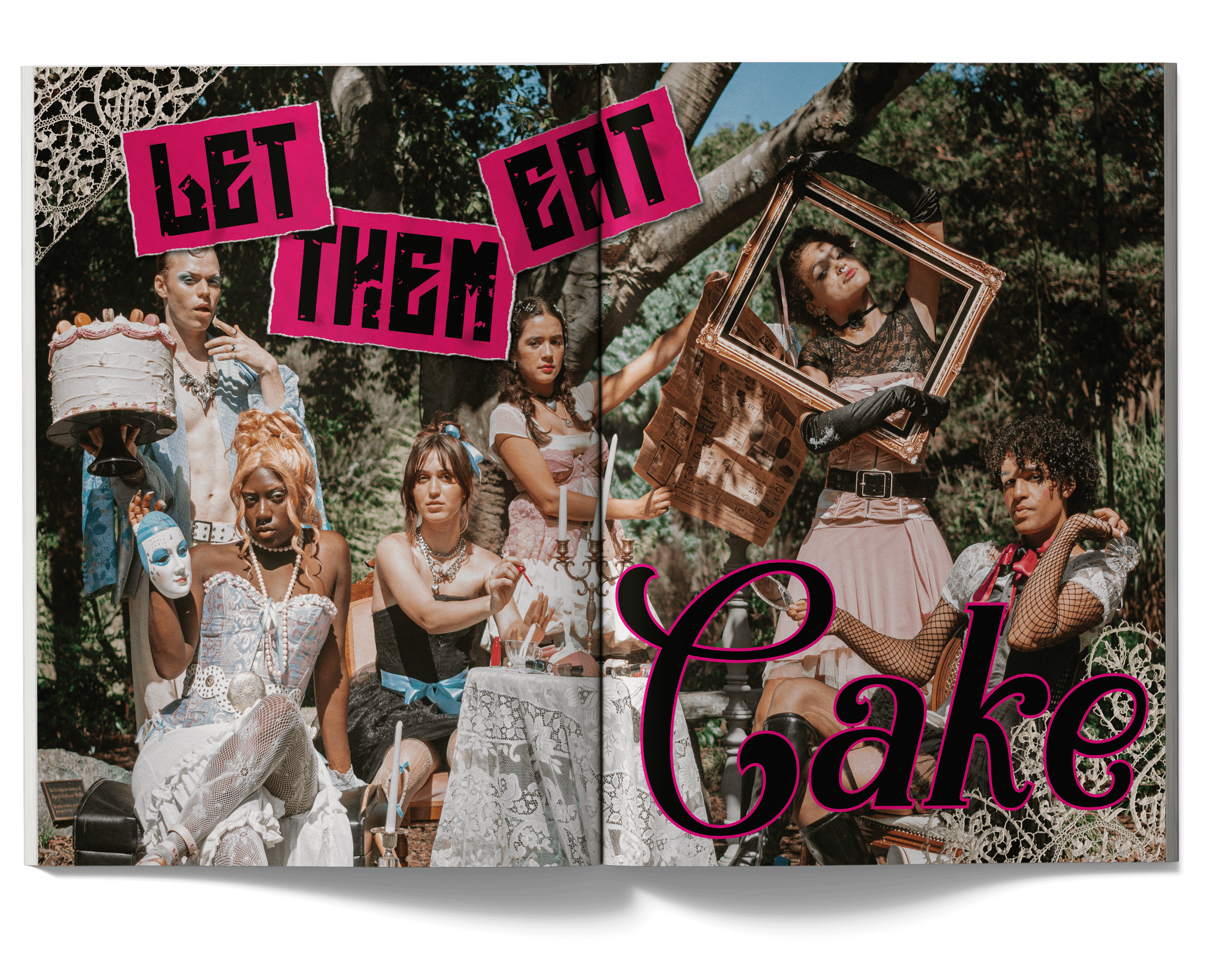
Let Them Eat Cake
Let Them Eat Cake
Let Them Eat Cake
These spreads were created for NC State's Platform Magazine Volume XIV. The theme for this photoshoot was inspired by fashion during the Rococo era and the concept of punk, rebellion, and Marie Antoinette's famous saying.
These spreads were created for NC State's Platform Magazine Volume XIV. The theme for this photoshoot was inspired by fashion during the Rococo era and the concept of punk, rebellion, and Marie Antoinette's famous saying.
These spreads were created for NC State's Platform Magazine Volume XIV. The theme for this photoshoot was inspired by fashion during the Rococo era and the concept of punk, rebellion, and Marie Antoinette's famous saying.
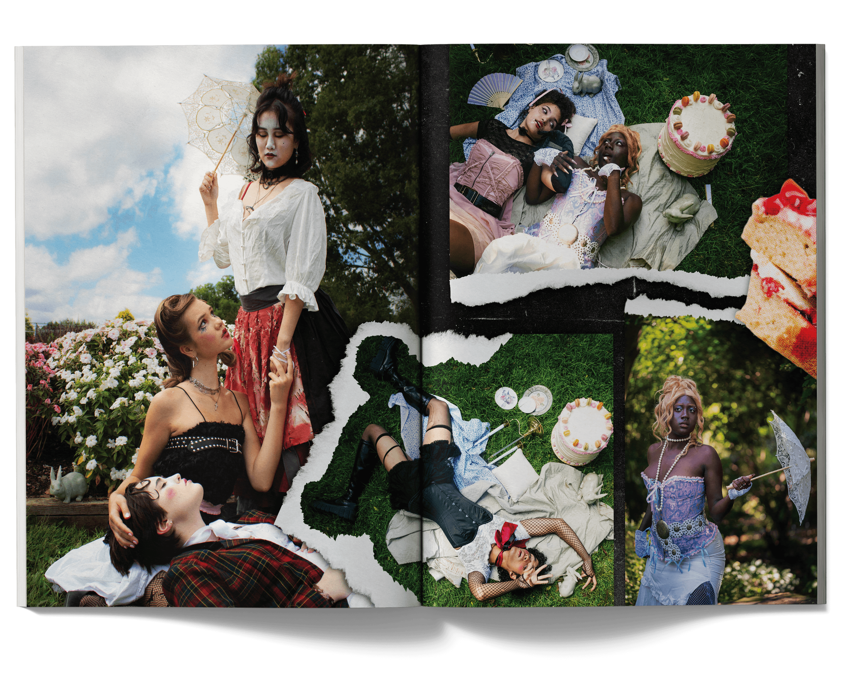
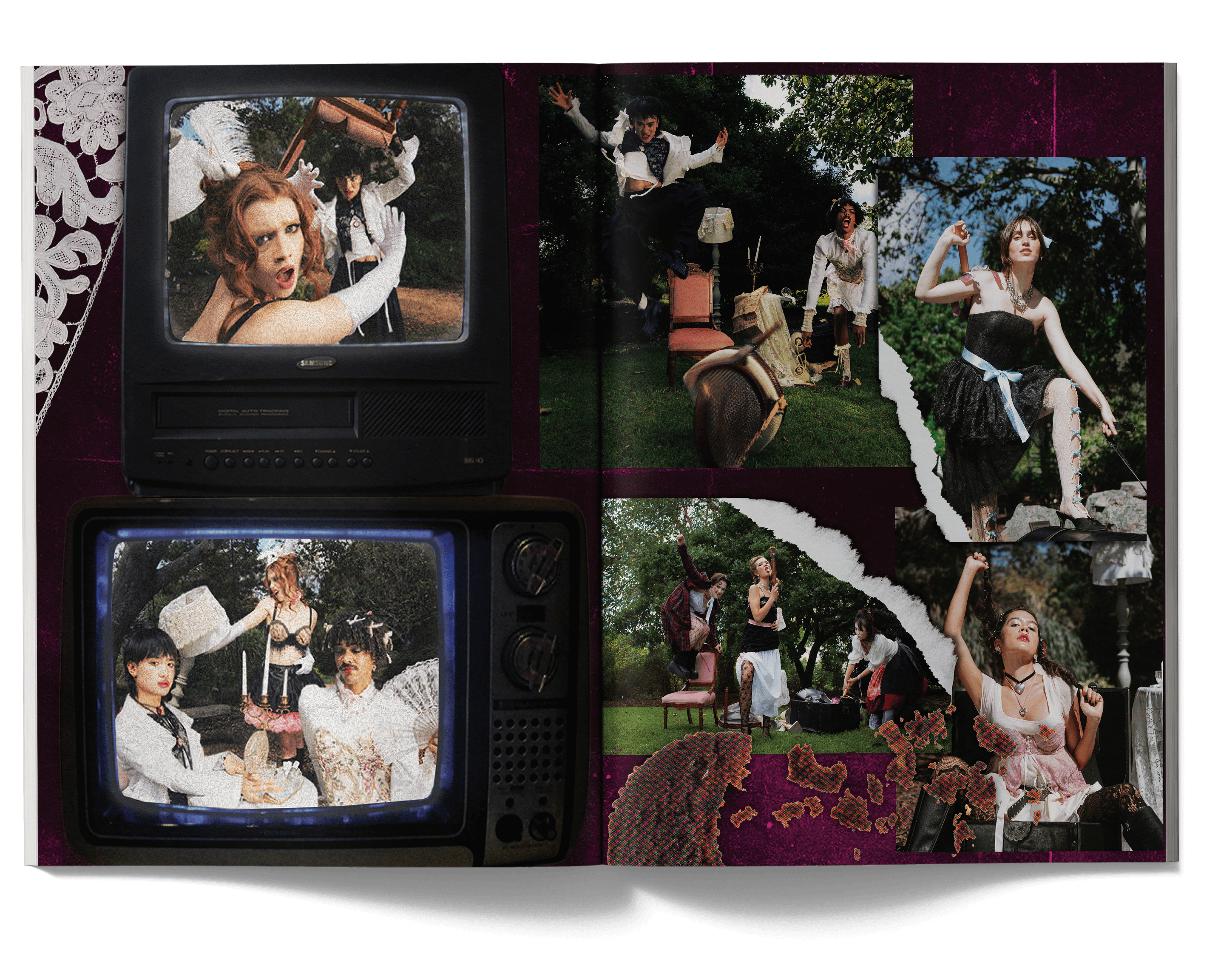
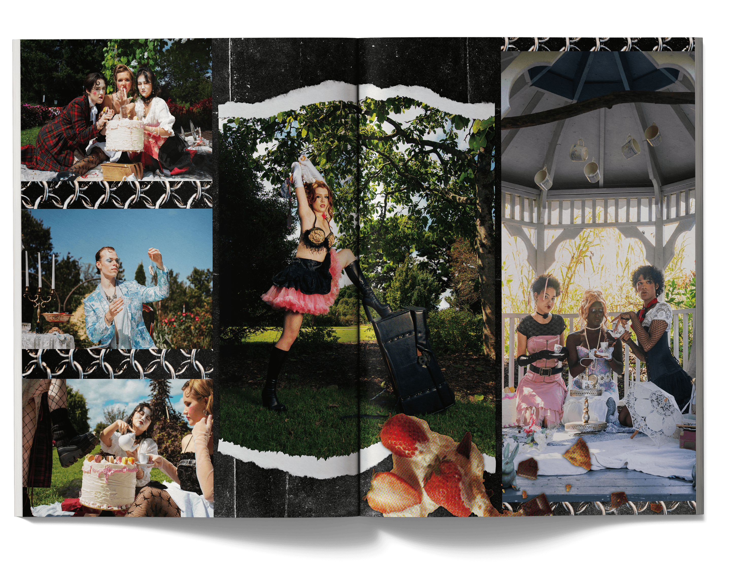
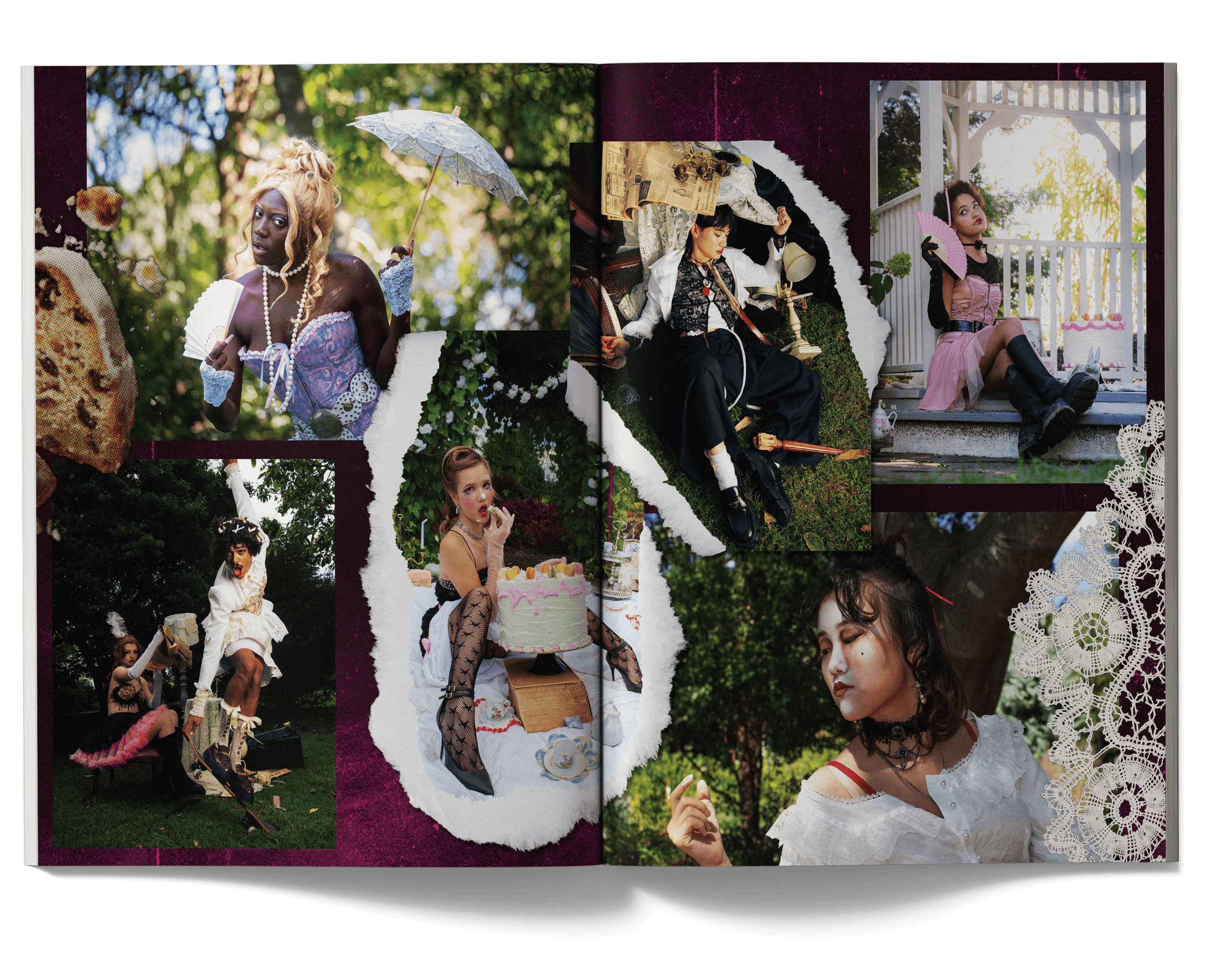
I began with a Pinterest board to find inspiration for the visuals for the shoot, focusing on interesting ways to manipulate typography that was inspired by grunge-punk posters. I also looked into the imagery of a messy cake, since the photo shoot was inspired by Marie Antionette's famous saying "let them eat cake."
I began with a Pinterest board to find inspiration for the visuals for the shoot, focusing on interesting ways to manipulate typography that was inspired by grunge-punk posters. I also looked into the imagery of a messy cake, since the photo shoot was inspired by Marie Antionette's famous saying "let them eat cake."
I began with a Pinterest board to find inspiration for the visuals for the shoot, focusing on interesting ways to manipulate typography that was inspired by grunge-punk posters. I also looked into the imagery of a messy cake, since the photo shoot was inspired by Marie Antionette's famous saying "let them eat cake."
Taking the direction of the Pinterest board and input from the graphic design team, I moved forward with the idea of bright, bold pink, and dark grunge aesthetics.
I incorporated lacy decals and cake chunks to accentuate the idea of elegance, while also incorporating ripped paper edges and chains to contrast the elegance and add a punk look to the spreads.
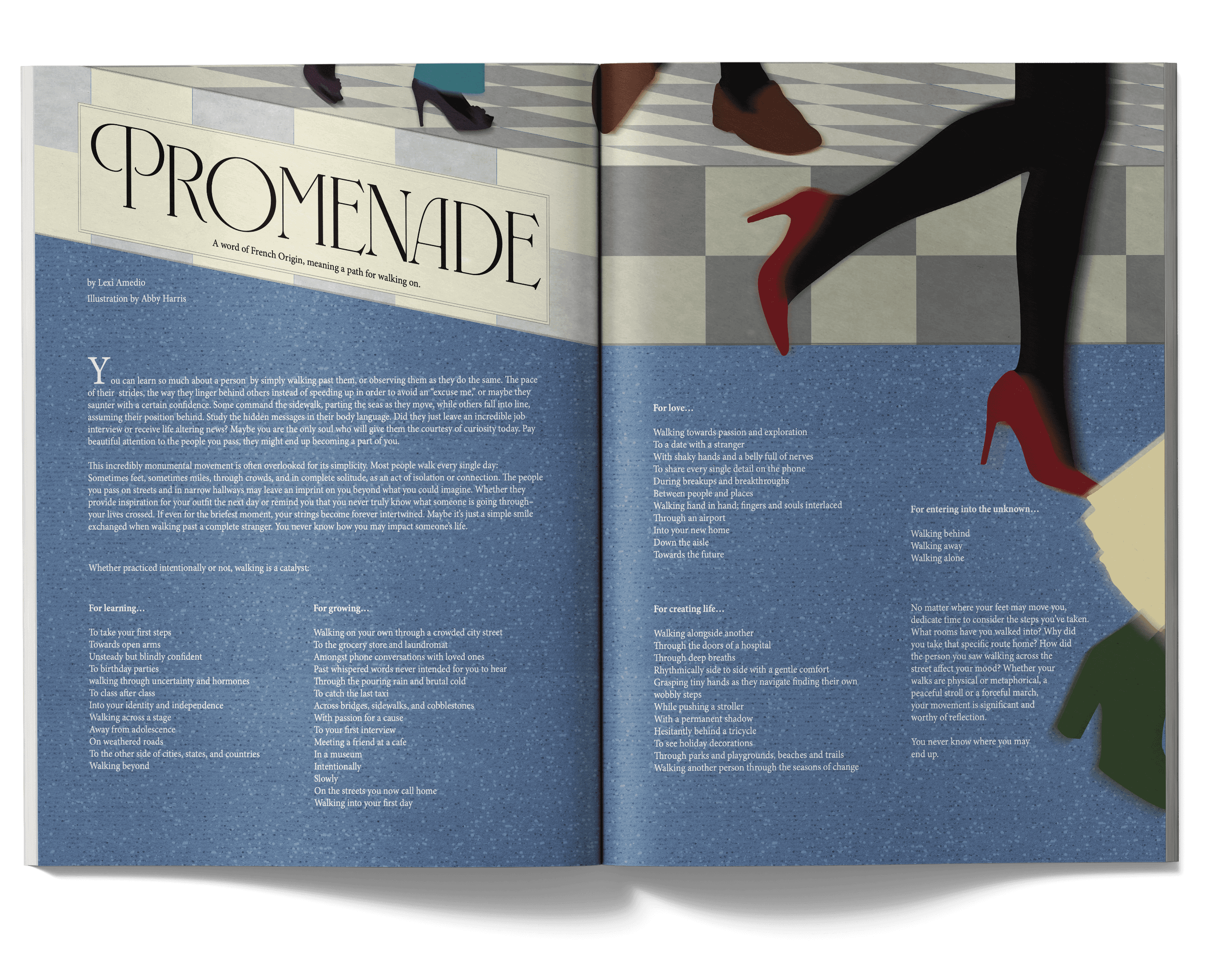
Promenade
Promenade
Promenade
This spread was created for NC State's Platform Magazine Volume XVII. The article's theme was based on the idea of walking past people who you could form unlikely connections with.
This spread was created for NC State's Platform Magazine Volume XVII. The article's theme was based on the idea of walking past people who you could form unlikely connections with.
This spread was created for NC State's Platform Magazine Volume XVII. The article's theme was based on the idea of walking past people who you could form unlikely connections with.
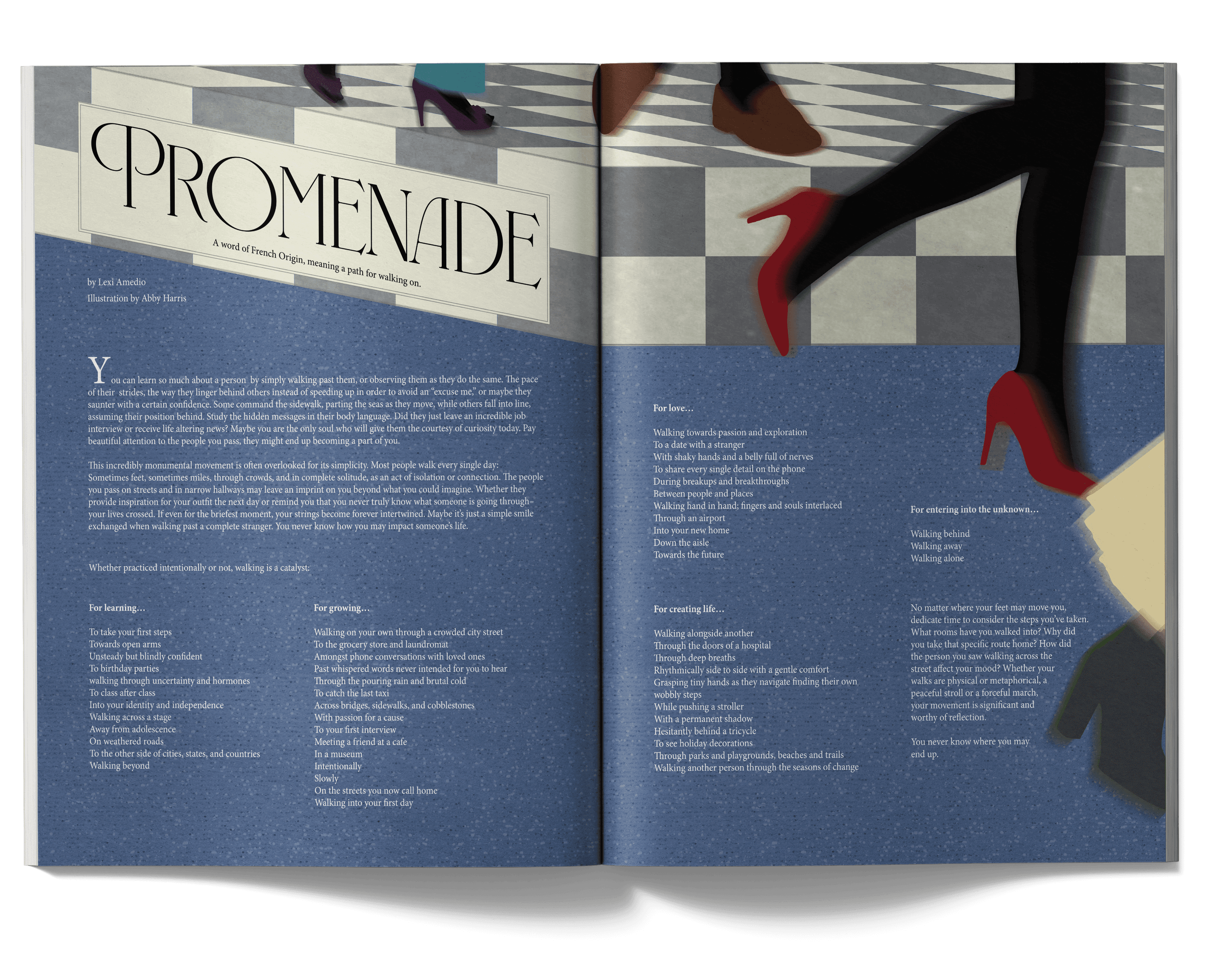
I began with talking with the writer to understand what they had in mind for the visuals for their article. They envisioned a parisian style walkway with people walking or a busy traffic intersection. They also mentioned the color scheme being monotone and gray. With that idea, I looked up photos of busy walkways and imitated the act of walking or being in a rush by creating blurred silhouettes.
I began with talking with the writer to understand what they had in mind for the visuals for their article. They envisioned a parisian style walkway with people walking or a busy traffic intersection. They also mentioned the color scheme being monotone and gray. With that idea, I looked up photos of busy walkways and imitated the act of walking or being in a rush by creating blurred silhouettes.
I began with talking with the writer to understand what they had in mind for the visuals for their article. They envisioned a parisian style walkway with people walking or a busy traffic intersection. They also mentioned the color scheme being monotone and gray. With that idea, I looked up photos of busy walkways and imitated the act of walking or being in a rush by creating blurred silhouettes.
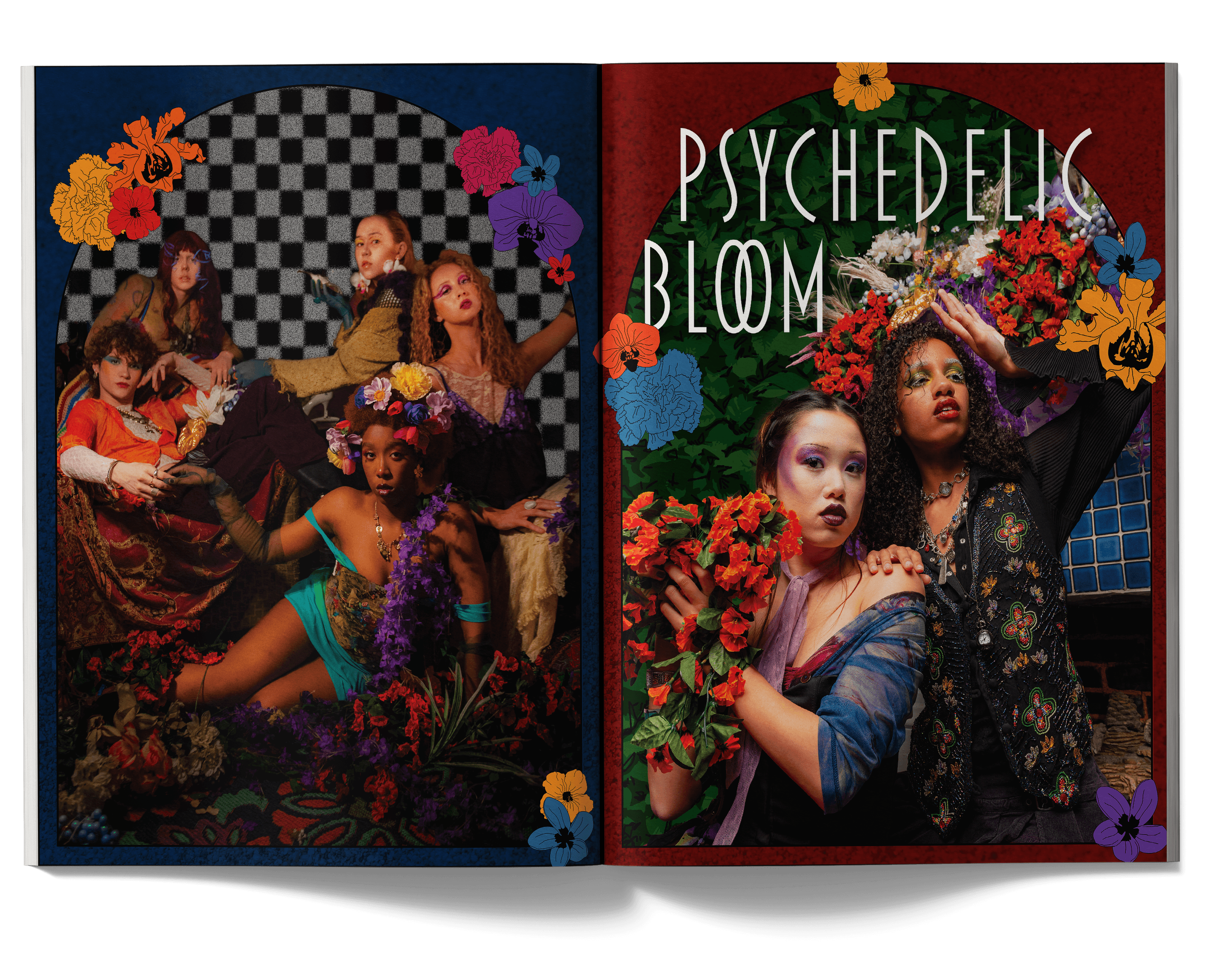
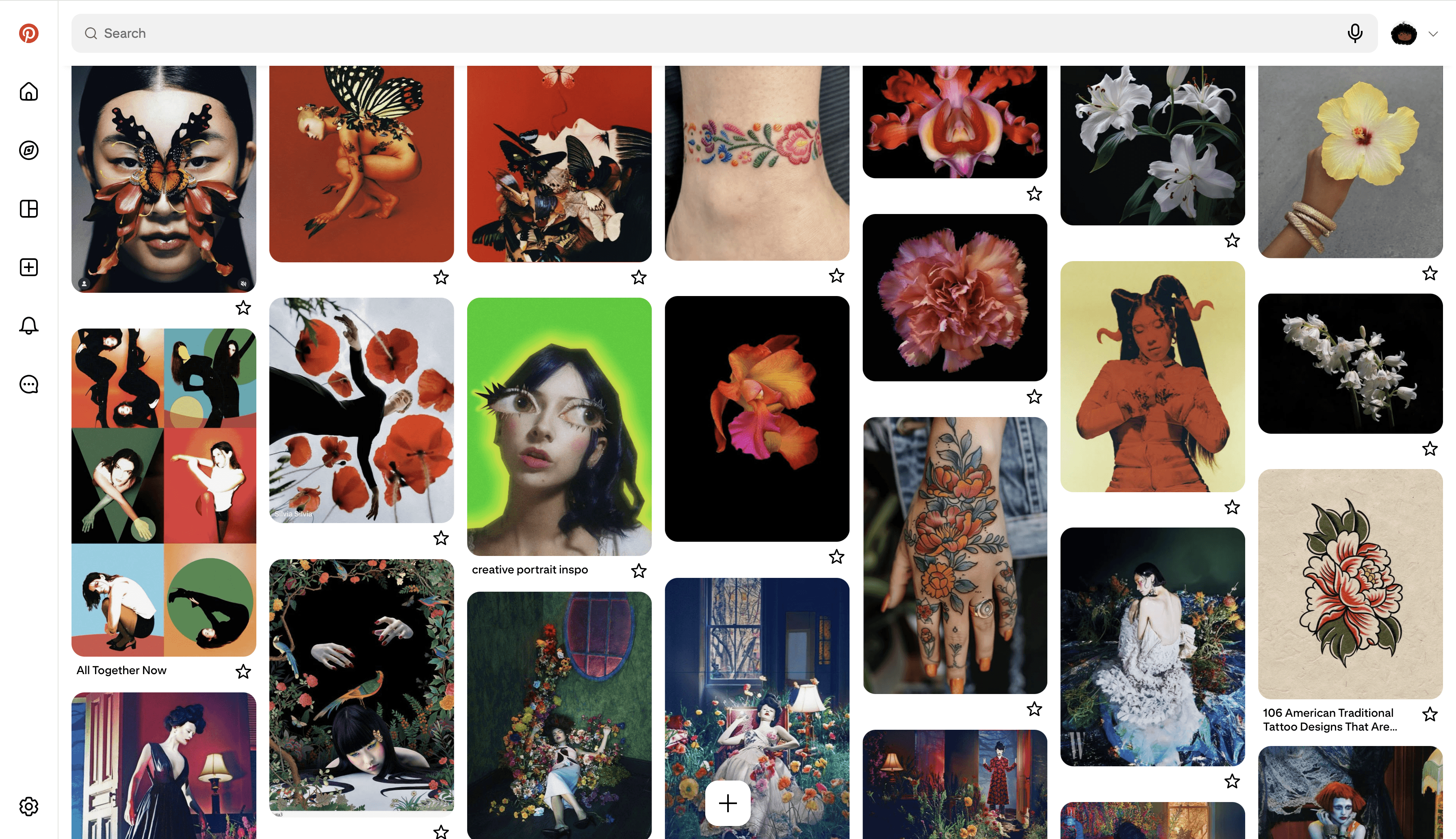
Psychedelic Bloom
Psychedelic Bloom
Psychedelic Bloom
This spread was created for NC State's Platform Magazine Volume XVII. The shoot was centered around florals and artistic surrealism. I used Photoshop to cut out photos to create surreal backgrounds and environments.
This spread was created for NC State's Platform Magazine Volume XVII. The shoot was centered around florals and artistic surrealism. I used Photoshop to cut out photos to create surreal backgrounds and environments.
This spread was created for NC State's Platform Magazine Volume XVII. The shoot was centered around florals and artistic surrealism. I used Photoshop to cut out photos to create surreal backgrounds and environments.
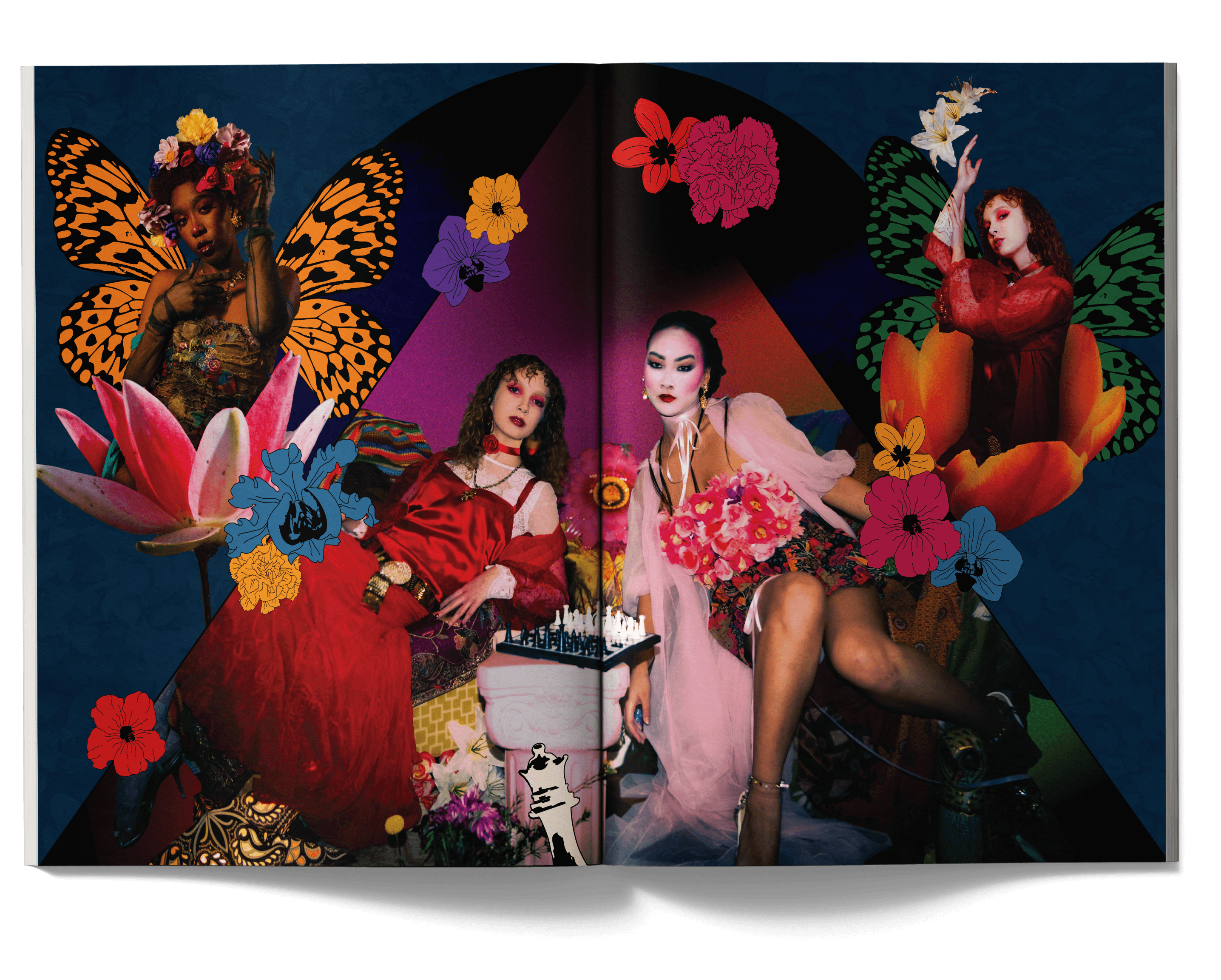
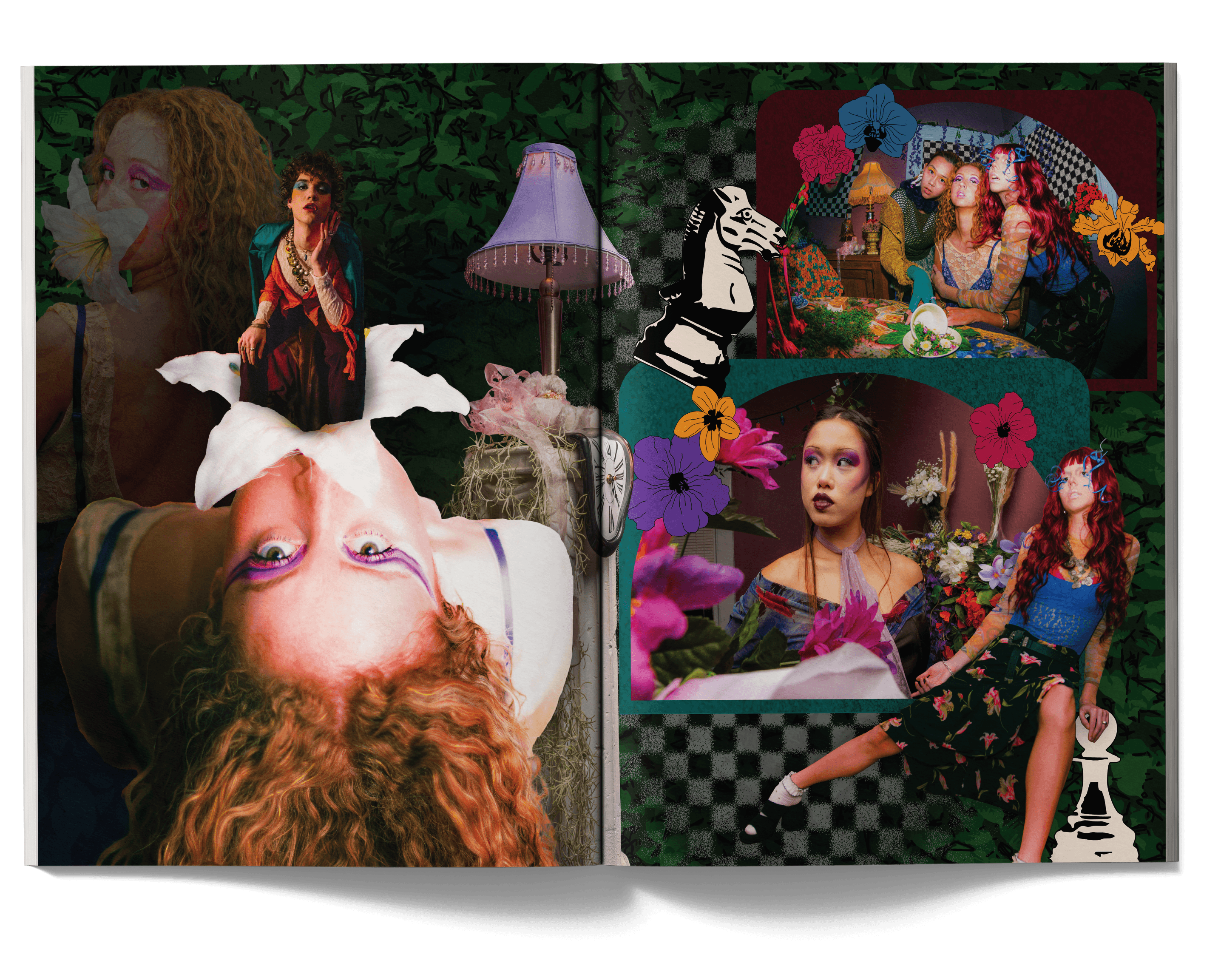
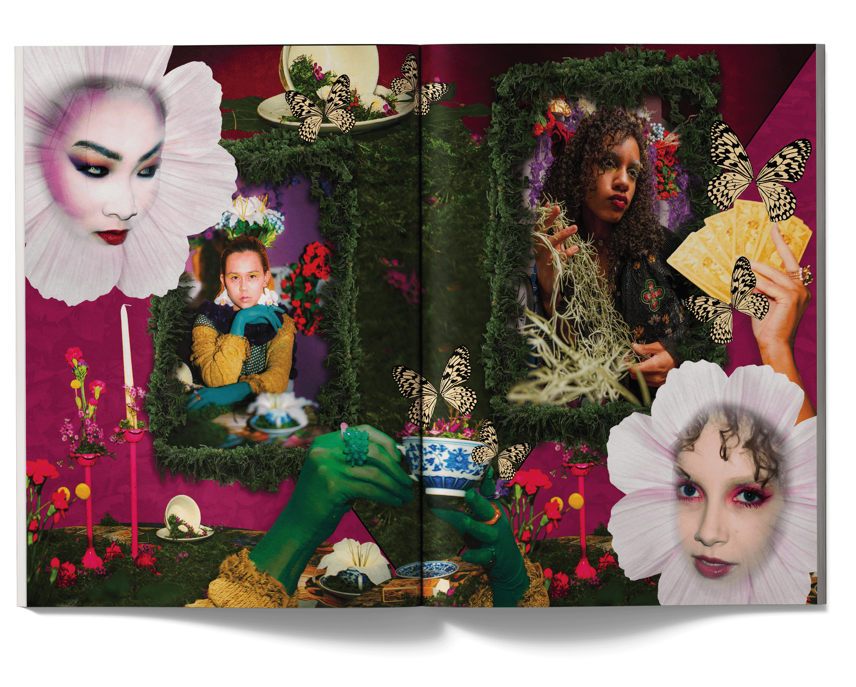
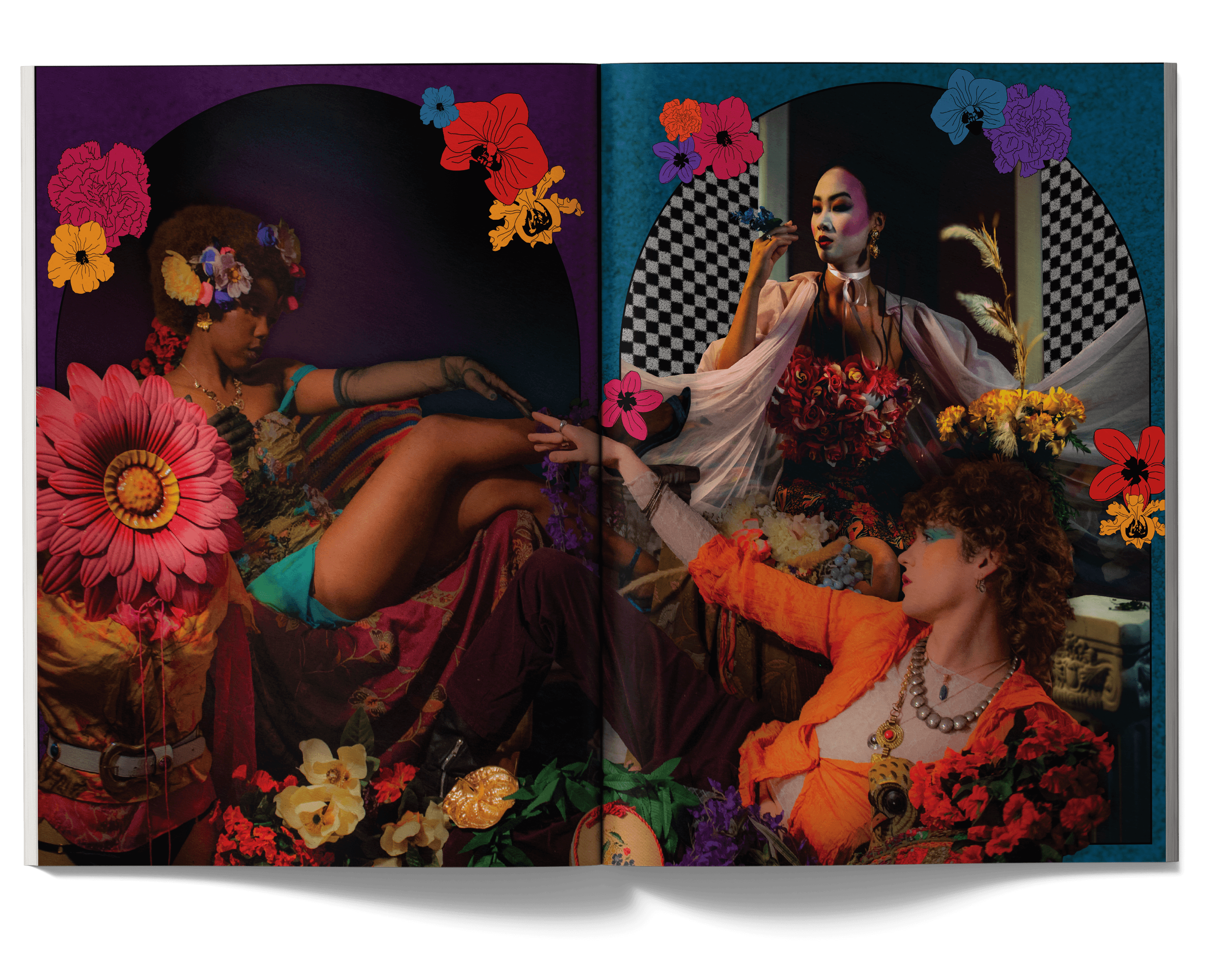
I began with a Pinterest board of what I imagined the themed to look like and any creative things I could do wit the photos from the shoot. I drew a lot of inspiration from the image with flower borders and colored shapes and incorporated them into the spreads. I used bold and bright colors for the surreal look and add more emphasis on the "psychedelic" aspect of the shoot.
I began with a Pinterest board of what I imagined the themed to look like and any creative things I could do wit the photos from the shoot. I drew a lot of inspiration from the image with flower borders and colored shapes and incorporated them into the spreads. I used bold and bright colors for the surreal look and add more emphasis on the "psychedelic" aspect of the shoot.
I began with a Pinterest board of what I imagined the themed to look like and any creative things I could do wit the photos from the shoot. I drew a lot of inspiration from the image with flower borders and colored shapes and incorporated them into the spreads. I used bold and bright colors for the surreal look and add more emphasis on the "psychedelic" aspect of the shoot.
Memory in The Air
Memory in The Air
Memory in The Air
This spread was created for NC State's Platform Magazine Volume XIII. The article was themed around love and longing.
This spread was created for NC State's Platform Magazine Volume XIII. The article was themed around love and longing.
This spread was created for NC State's Platform Magazine Volume XIII. The article was themed around love and longing.
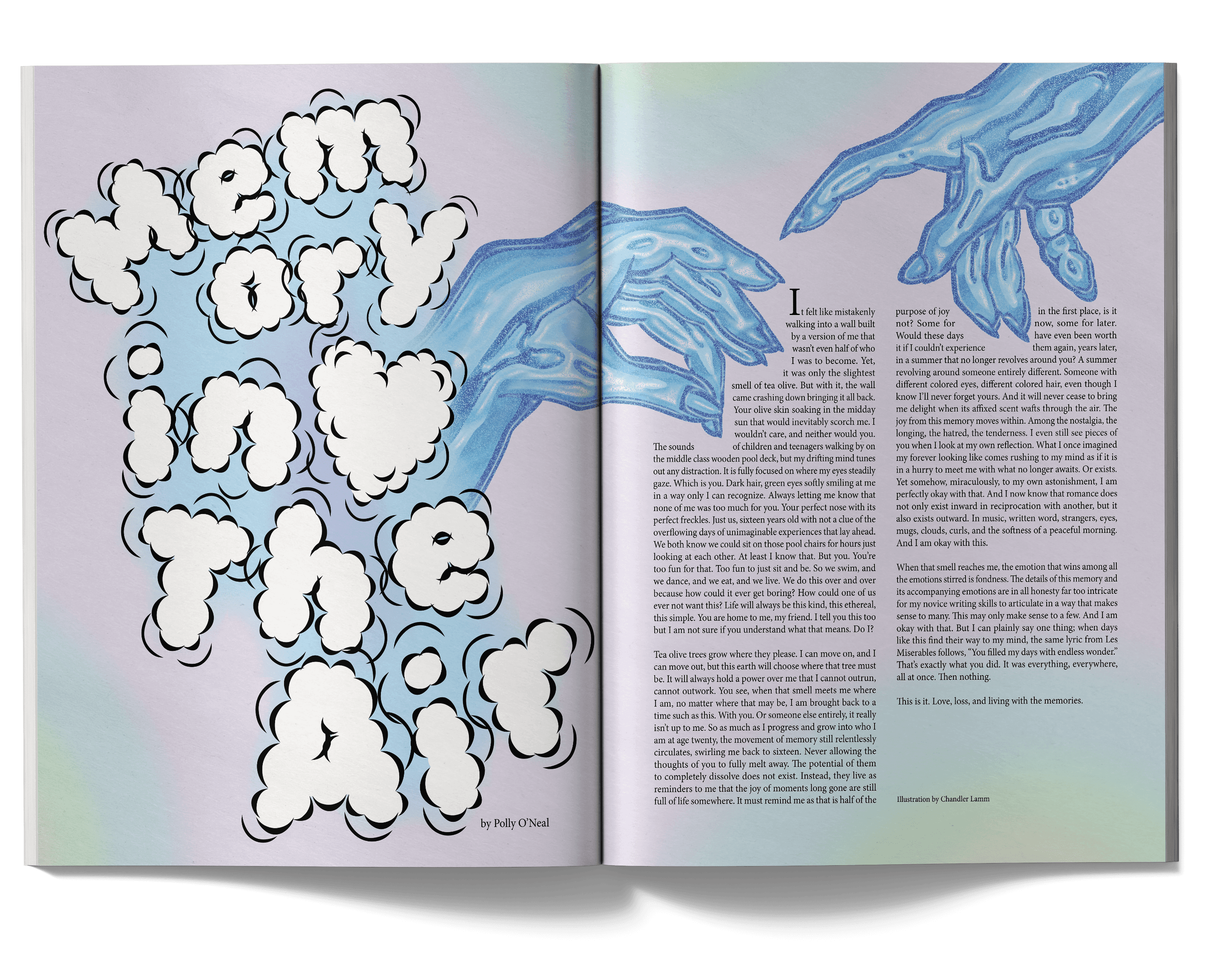
I started with a conversation with the author of the article to get a sense of how they wanted their spread to look. They told me about the overall feeling of melancholic love that their article would take a direction in. I interpreted that as the text molding with the illustration using a text warp and gathered some images that inspired me.
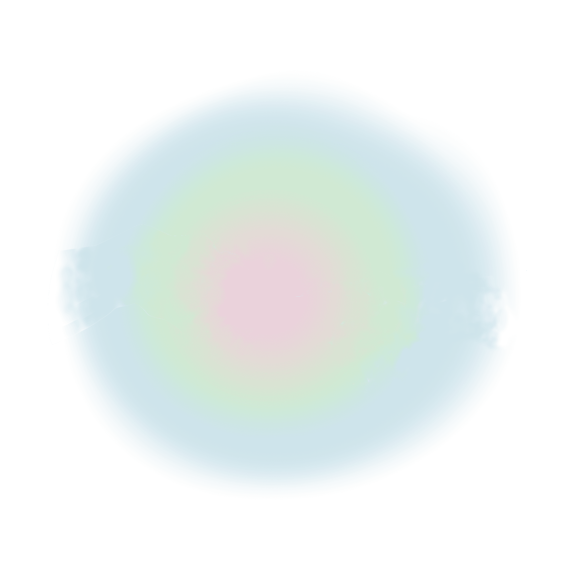
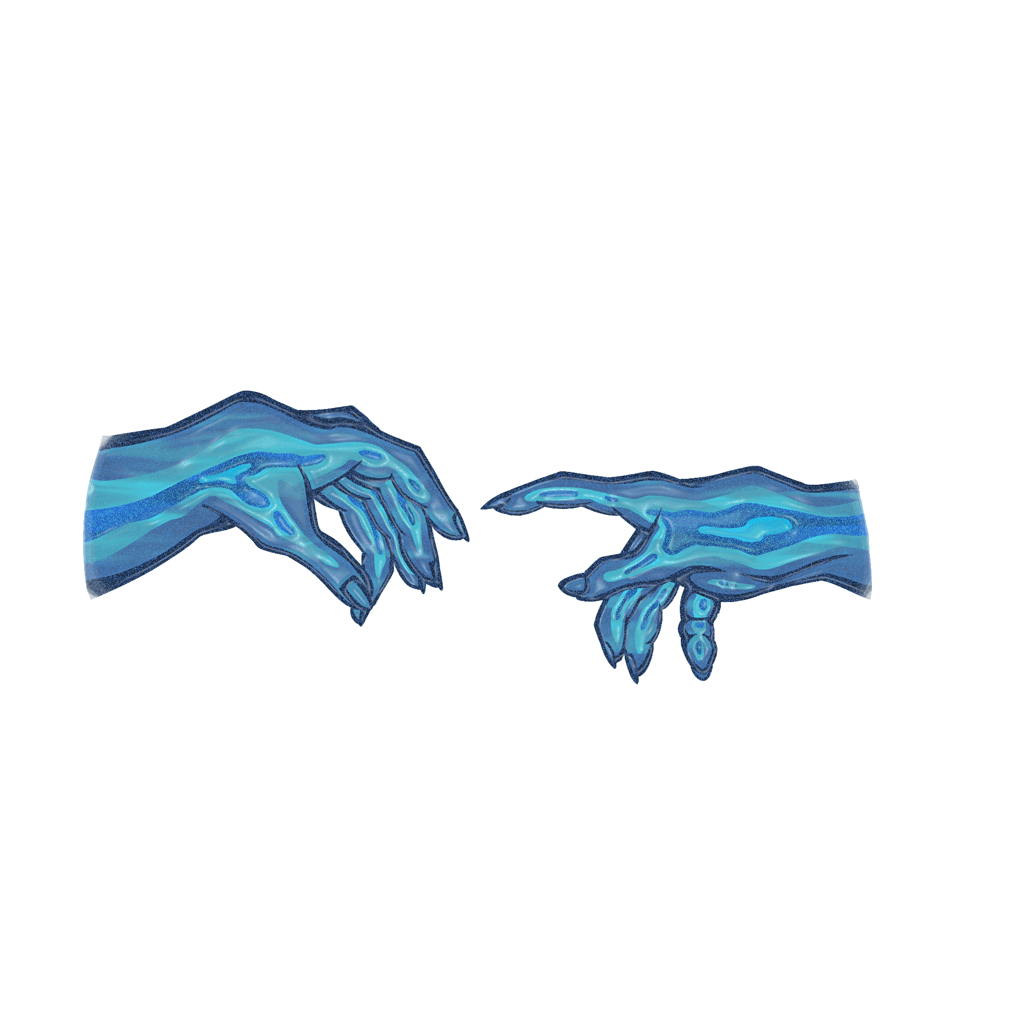
The illustrator provided me with an illustration of their interpretation of the article, a soft aura and hands reaching towards each other. I decided to break up the image from its background so I could use the hands as the place where the text would wrap around. I also edited the hands to give it a more "liquified" look.
I started with a conversation with the author of the article to get a sense of how they wanted their spread to look. They told me about the overall feeling of melancholic love that their article would take a direction in. I interpreted that as the text molding with the illustration using a text warp and gathered some images that inspired me.
The illustrator provided me with an illustration of their interpretation of the article, a soft aura and hands reaching towards each other. I decided to break up the image from its background so I could use the hands as the place where the text would wrap around. I also edited the hands to give it a more "liquified" look.
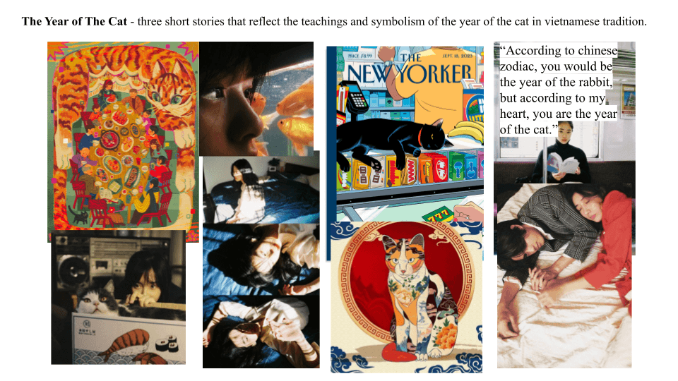
the year of the cat
the year of the cat
the year of the cat
This spread were created for NC State's Platform Magazine Volume XIV. The idea for the articles was a 3 part story based on Vietnamese culture and the importance of the cat in it.
This spread were created for NC State's Platform Magazine Volume XIV. The idea for the articles was a 3 part story based on Vietnamese culture and the importance of the cat in it.
This spread were created for NC State's Platform Magazine Volume XIV. The idea for the articles was a 3 part story based on Vietnamese culture and the importance of the cat in it.
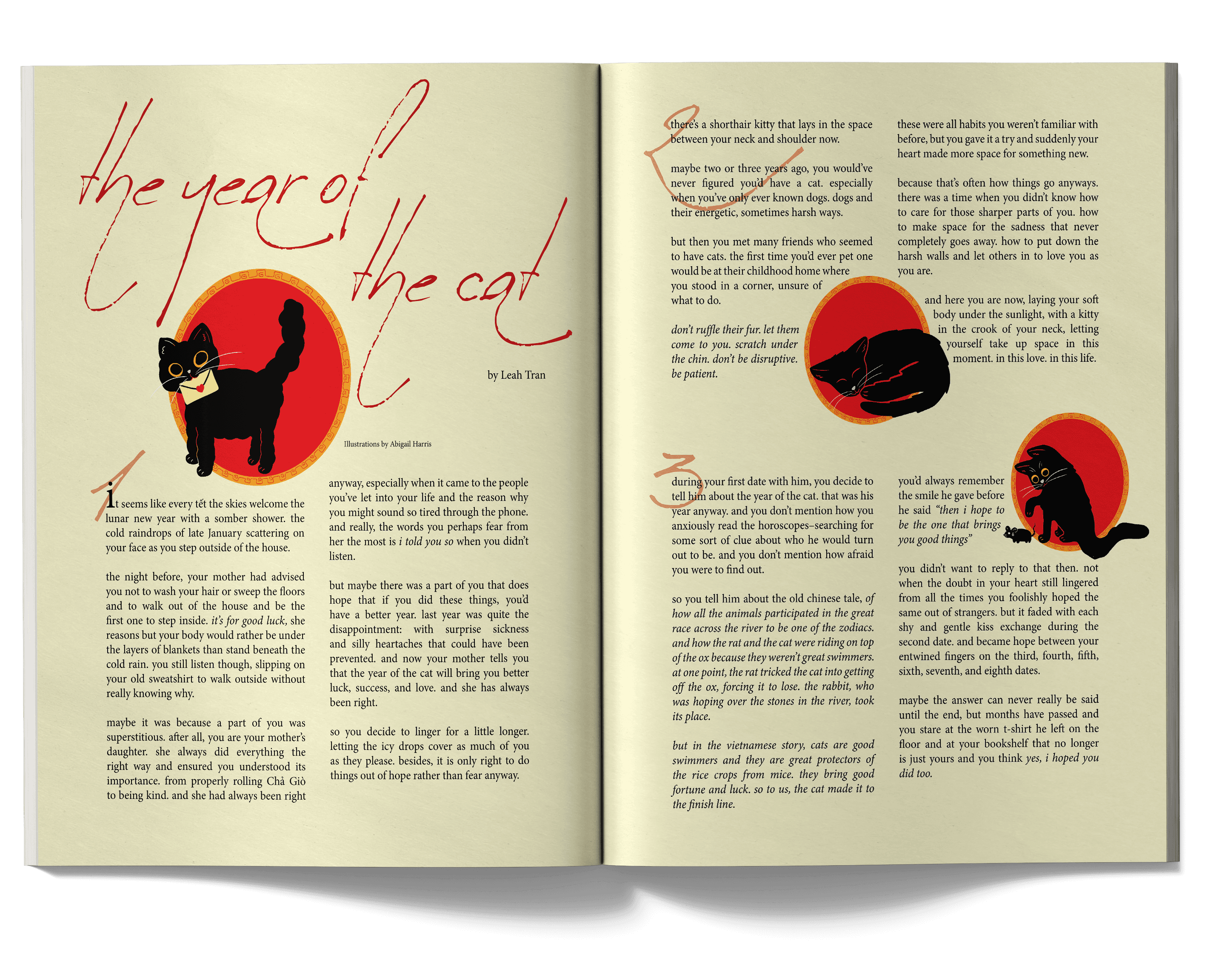
I started by talking with the author of the article and she told me about her idea for her article. She shared a mood board she created and I used it to guide my design process. I was also responsible to drawing the illustration for the article, which involved 3 black cats that corespond to each part of the article.
I started by talking with the author of the article and she told me about her idea for her article. She shared a mood board she created and I used it to guide my design process. I was also responsible to drawing the illustration for the article, which involved 3 black cats that corespond to each part of the article.
I started by talking with the author of the article and she told me about her idea for her article. She shared a mood board she created and I used it to guide my design process. I was also responsible to drawing the illustration for the article, which involved 3 black cats that corespond to each part of the article.
Editorial Drag
Editorial Drag
Editorial Drag
These spreads were created for NC State's Platform Magazine Volume XIII. The article highlighted the bold and colorful makeup looks in drag culture.
These spreads were created for NC State's Platform Magazine Volume XIII. The article highlighted the bold and colorful makeup looks in drag culture.
These spreads were created for NC State's Platform Magazine Volume XIII. The article highlighted the bold and colorful makeup looks in drag culture.
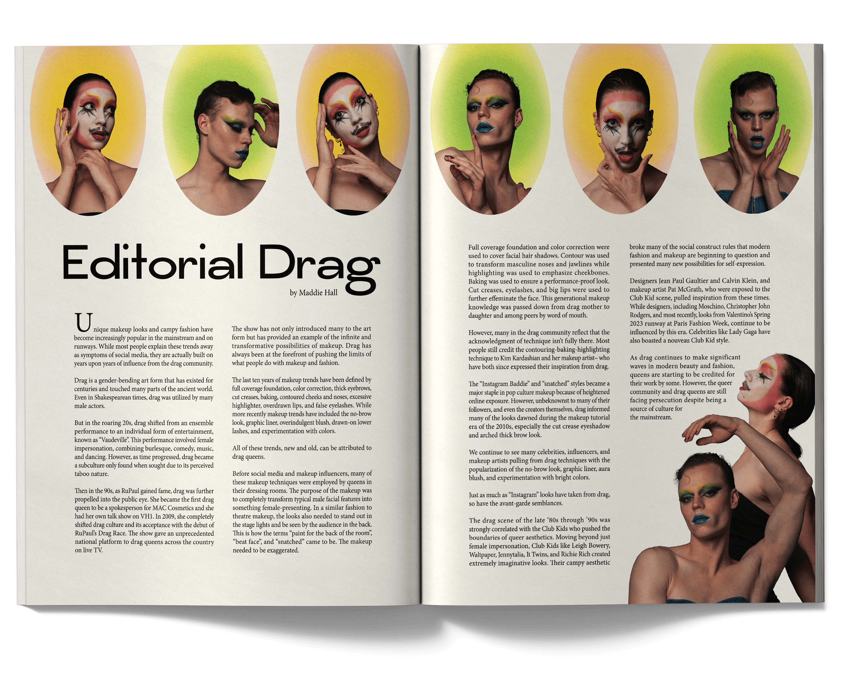
I started with a conversation with the author of the article to get a sense of how they wanted their spread to look. They wanted the visuals to be emphasized in the layout since their article focused on makeup. I gathered photos that emphasized faces for inspiration in a mood board. Because of the bold nature of drag, I wanted to highlight the makeup looks they did for the article by having multiple dynamic poses shown in the article.
I started with a conversation with the author of the article to get a sense of how they wanted their spread to look. They wanted the visuals to be emphasized in the layout since their article focused on makeup. I gathered photos that emphasized faces for inspiration in a mood board. Because of the bold nature of drag, I wanted to highlight the makeup looks they did for the article by having multiple dynamic poses shown in the article.
I started with a conversation with the author of the article to get a sense of how they wanted their spread to look. They wanted the visuals to be emphasized in the layout since their article focused on makeup. I gathered photos that emphasized faces for inspiration in a mood board. Because of the bold nature of drag, I wanted to highlight the makeup looks they did for the article by having multiple dynamic poses shown in the article.
Let's Go to the Mall
Let's Go to the Mall
Let's Go to the Mall
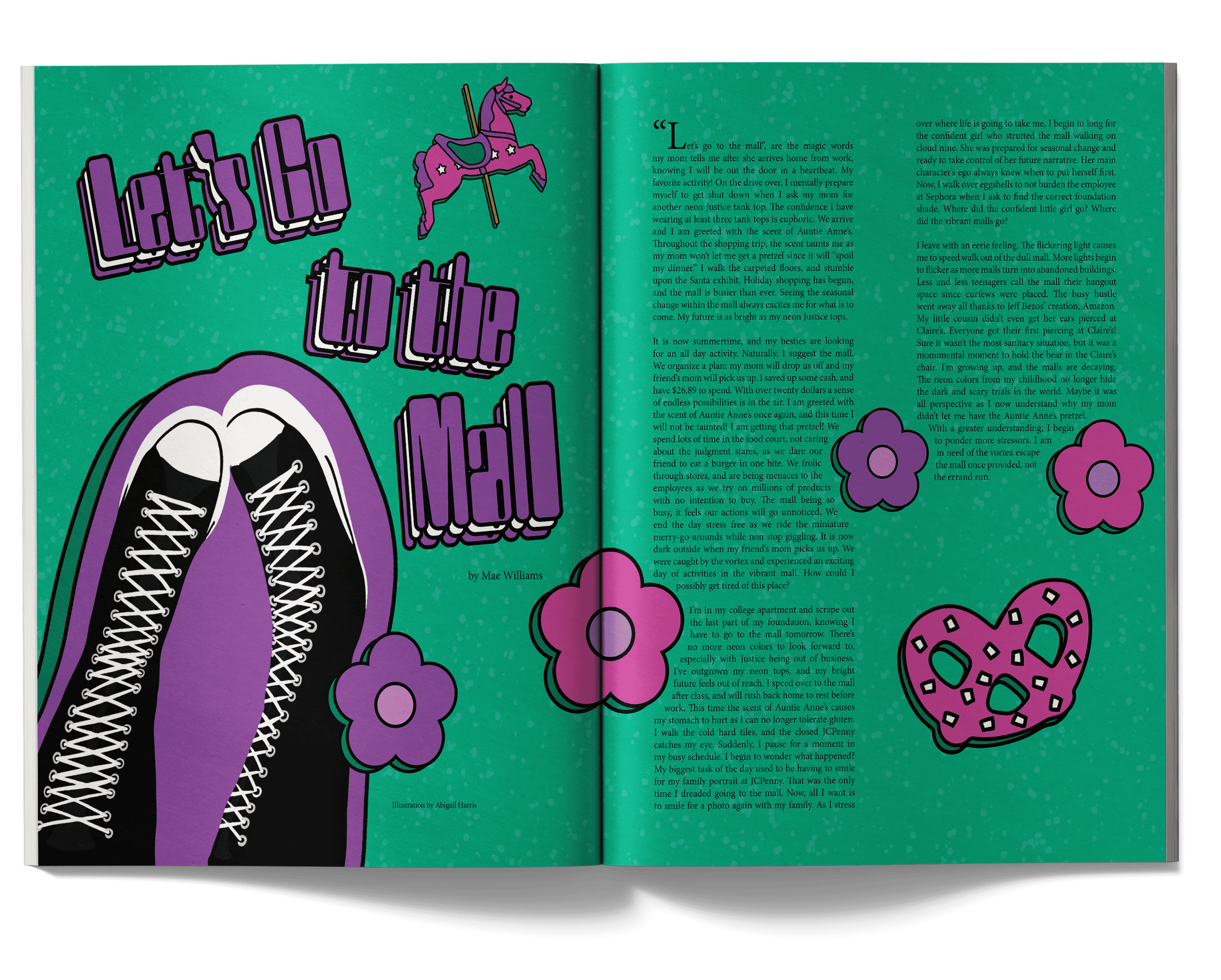
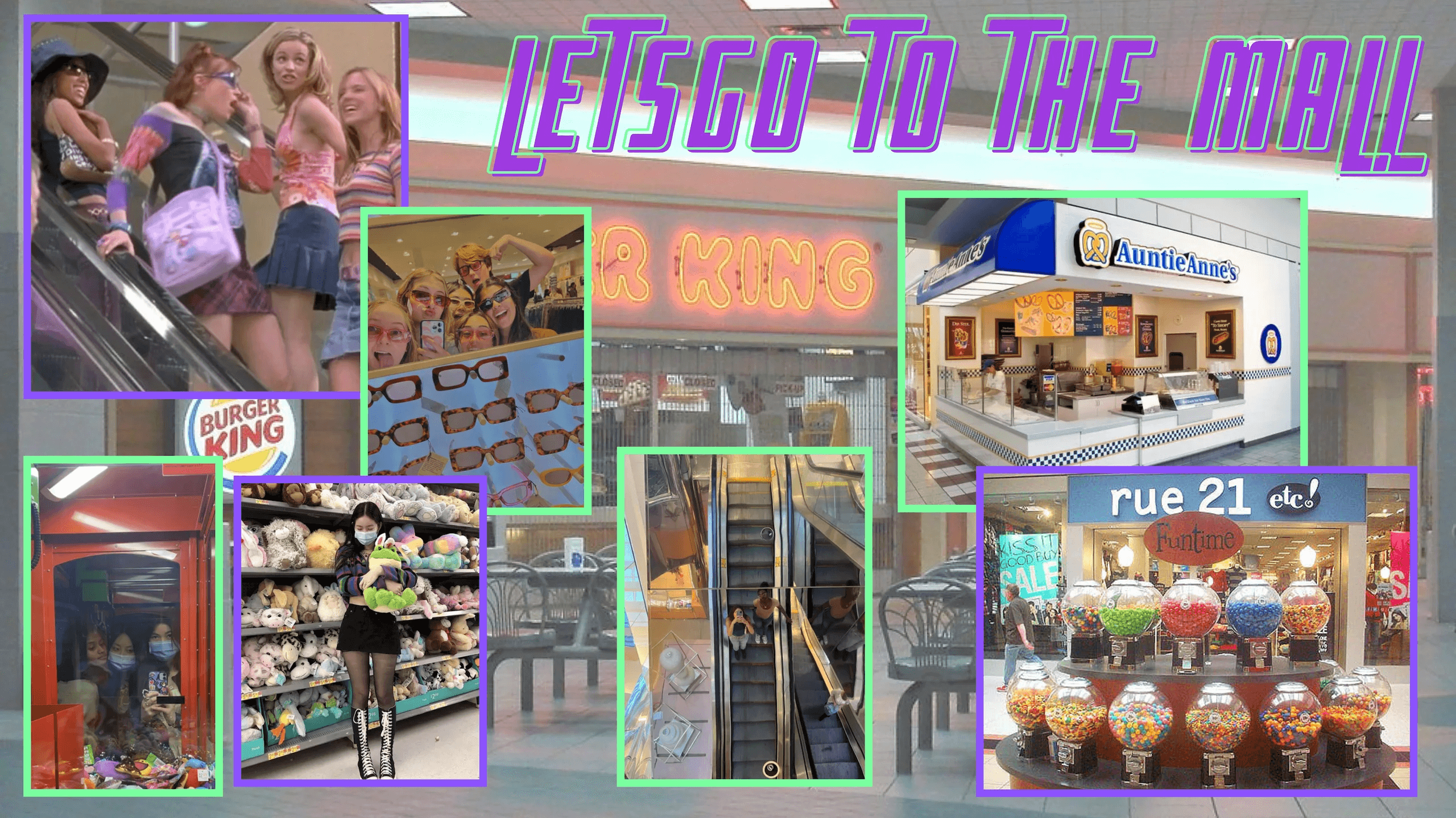
These spreads were created for NC State's Platform Magazine Volume XIV. The article was based on the nostalgic feeling of going to a mall. The visual are retro because mall culture has steeply declined over the years.
These spreads were created for NC State's Platform Magazine Volume XIV. The article was based on the nostalgic feeling of going to a mall. The visual are retro because mall culture has steeply declined over the years.
These spreads were created for NC State's Platform Magazine Volume XIV. The article was based on the nostalgic feeling of going to a mall. The visual are retro because mall culture has steeply declined over the years.
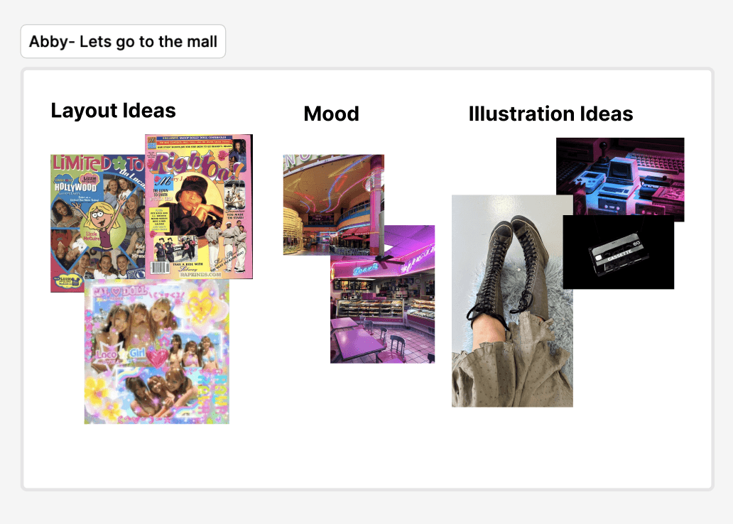
I was given a mood board by the author of the article to get a better idea how they wanted the layout to look and to give me insight into the meaning and feel of their article. I was also in charge of providing an illustration for the article, so the author also included inspiration for that as well.
From the author's mood board, I gathered some images to direct my vision for the spread. Since the author provided me with a nostalgic feeling of a 2000s mall in their mood board, I took that and decided to interpret it through 2000s teen magazine style that used bright colors and funky layered fonts. I was also creating an illustration for the article, and since the author liked the idea of knee-high converse, I decided to draw a pair to add to the nostalgia in the article.
The Dating Method
The Dating Method
The Dating Method
This spread was created for NC State's Platform Magazine Volume XVII. The article was about dating culture and is formatted as a letter.
This spread was created for NC State's Platform Magazine Volume XVII. The article was about dating culture and is formatted as a letter.
This spread was created for NC State's Platform Magazine Volume XVII. The article was about dating culture and is formatted as a letter.
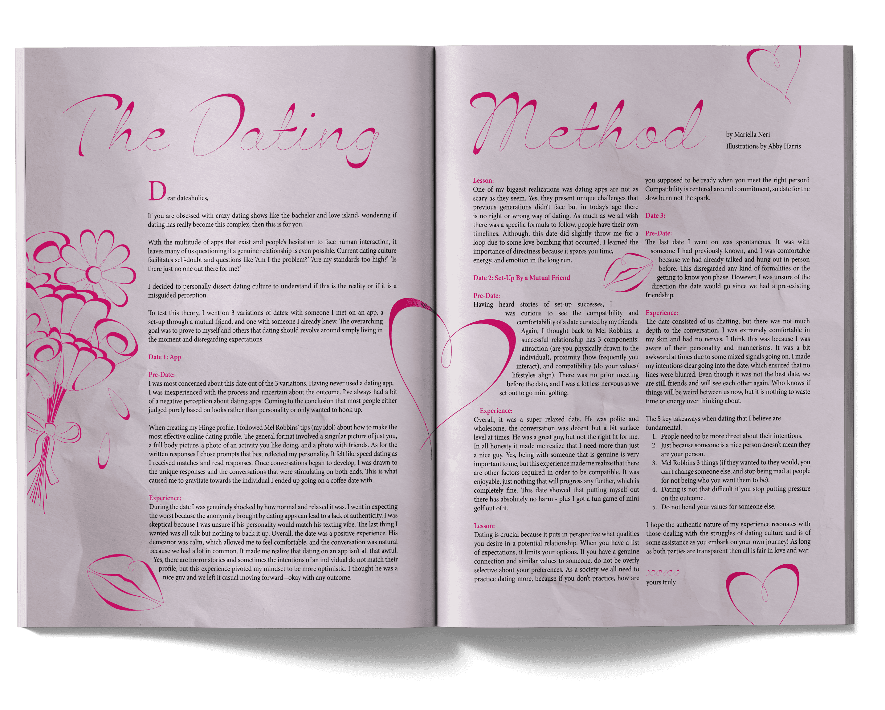
For this article, I started by talking with the author of the article, who told me they wanted a flower illustration on crumpled paper. I didn't create a mood board for this article, but rather started by finding a whispy font for the title and creating flowers that imitated the look of the font. I did the same with the other motifs for the article to keep a cohesive look for the article.
For this article, I started by talking with the author of the article, who told me they wanted a flower illustration on crumpled paper. I didn't create a mood board for this article, but rather started by finding a whispy font for the title and creating flowers that imitated the look of the font. I did the same with the other motifs for the article to keep a cohesive look for the article.
For this article, I started by talking with the author of the article, who told me they wanted a flower illustration on crumpled paper. I didn't create a mood board for this article, but rather started by finding a whispy font for the title and creating flowers that imitated the look of the font. I did the same with the other motifs for the article to keep a cohesive look for the article.